Results 1 to 17 of 17
-
19th February 2012, 03:21 PM #1

- Join Date
- Dec 2011
- Location
- Northampton UK
- Posts
- 12
- Real Name
- Steve
Portrait with a slight difference
-
19th February 2012, 03:25 PM #2

- Join Date
- Dec 2011
- Location
- Northampton UK
- Posts
- 12
- Real Name
- Steve
-
19th February 2012, 05:49 PM #3
Re: Portrait with a slight difference
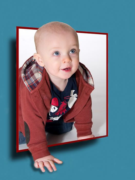
I never understood why some people likes to edit an otherwise flawless photograph like with the first one shown here. Then it looks fake and artificial. Maybe it would look more natural with both hands outside the frame.
-
19th February 2012, 07:41 PM #4
Re: Portrait with a slight difference
Steve:
I like both effects. Great way to take an ordinary photograph and make it special. What software program did you use, especially the one with baby crawling out of frame?
-
19th February 2012, 08:08 PM #5

- Join Date
- Dec 2008
- Location
- New Zealand
- Posts
- 17,660
- Real Name
- Have a guess :)
-
19th February 2012, 08:23 PM #6

- Join Date
- Jan 2009
- Location
- South Devon, UK
- Posts
- 14,636
Re: Portrait with a slight difference
Yes it can be overdone, but when done well it makes a nice 'fun' photo.
I would prefer both hands outside the frame though, as Mario mentioned.
-
19th February 2012, 08:28 PM #7

- Join Date
- Dec 2011
- Location
- Northampton UK
- Posts
- 12
- Real Name
- Steve
Re: Portrait with a slight difference
No special software other than photoshop. If you search on the internet for OOB (out of bounds) there are plenty of tutorials about it.
Regarding the first image, it wasn't flawless to start with, but this is a method for perhaps sometimes rescuing a not so good image.
The hand was left inside the frame to give the impression of depth inside, maybe it didn't work as well as I had intended.
Its bound to look fake/artificial, thats the whole point surely, to give it a little surreal feel. Its obvious the frame isn't supported and that a child would not be climbing out of the picture. I suppose its all down personal taste which is fair enough.
Thanks all for the comments
-
19th February 2012, 08:33 PM #8

- Join Date
- Dec 2011
- Location
- Northampton UK
- Posts
- 12
- Real Name
- Steve
Re: Portrait with a slight difference
My apologies for the multiple edits, for some reason the spell check sent things a little mad.
-
19th February 2012, 09:57 PM #9
Re: Portrait with a slight difference
I love this and it is a great way to make a normal child portrait a whole lot more like a child would be if they had a frame in front of them... if there was a stuffed toy in front of them or something they liked... if you understand what i mean?
paul.
-
20th February 2012, 01:16 AM #10

- Join Date
- Jan 2012
- Location
- Mountains in a small town of Saxton, PA (one stop light town)
- Posts
- 11
Re: Portrait with a slight difference
Do like this effect! Would like to try this myself

-
20th February 2012, 01:21 AM #11
Re: Portrait with a slight difference
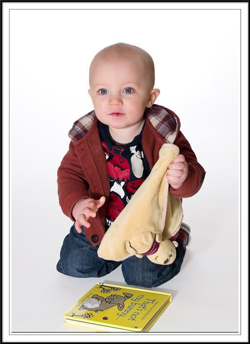
I personally do not like the first one. I would rather see a well captured photo of the baby crawling through the real thing- (picture frame, or a box) - i like the bright colors and the facial expression you captured. Regarding the second photo- it lacks emotion- just doesn't do anything for me.
Last edited by Captured; 20th February 2012 at 01:29 AM.
-
20th February 2012, 02:17 AM #12
Re: Portrait with a slight difference
No worries. I once sent a customer of mine an email that said "I apologize for the incontinence"
As for the Photos I like the use of photoshop to make things different. New design has to be born somewhere and making these can help you stumble upon something never done before. As I have learned it's practice, practice, practice. I agree the hand should be out on the first one. As for the second one I cant put my finger on it but I think their is too much white... I would possible crop it tighter? IDK.
-
20th February 2012, 07:34 AM #13

- Join Date
- Dec 2011
- Location
- Northampton UK
- Posts
- 12
- Real Name
- Steve
Re: Portrait with a slight difference
Brilliant :-)
Its always the case that you never see these things when proof reading, they only become apparent once the send button has been clicked.
A customer of mine recently meant to sign off "see you shortly" but actually put "Shorty". I'm not very tall either but it gave me and my colleagues a good laugh.
Many thanks for the comments everyone.
-
22nd February 2012, 01:36 PM #14

- Join Date
- Aug 2008
- Posts
- 28
Re: Portrait with a slight difference
What a great use of the OOB concept! Super shot and effect!
-
22nd February 2012, 06:44 PM #15

- Join Date
- Dec 2011
- Location
- Northampton UK
- Posts
- 12
- Real Name
- Steve
Re: Portrait with a slight difference
Many thanks raghunath
-
25th February 2012, 01:59 AM #16
Re: Portrait with a slight difference
To be honest, I'm not really a fan of the effect on the first one.
What really kills it for me is the way his left hand has 'almost' disapeared. It may have worked better (IMO) if the whole hand could be seen, or totally hidden. His other hand 'floating' also seems strange to me.
I'm sure with practice (and the correct original image) you will perfect the look you were aiming for.
-
26th February 2012, 04:33 AM #17
Re: Portrait with a slight difference
Steve, I think I am in agreement with most when I say that the first image was probably a pretty good photo without the extra photoshop stuff (or whatever program you use). However, if you were to develop this technique to where the editing didn't appear quite so obvious, it could be really cool.

 Helpful Posts:

 Reply With Quote

