Hi, this is my first post and I'm looking for honest feedback.
I'm new to landscapes and not good with panoramas, so I try to focus on minimalism and emotional depth of the picture. Just tell me what do you think, if it's good or bad or either. On what to focus on and where to get better.
Thanks
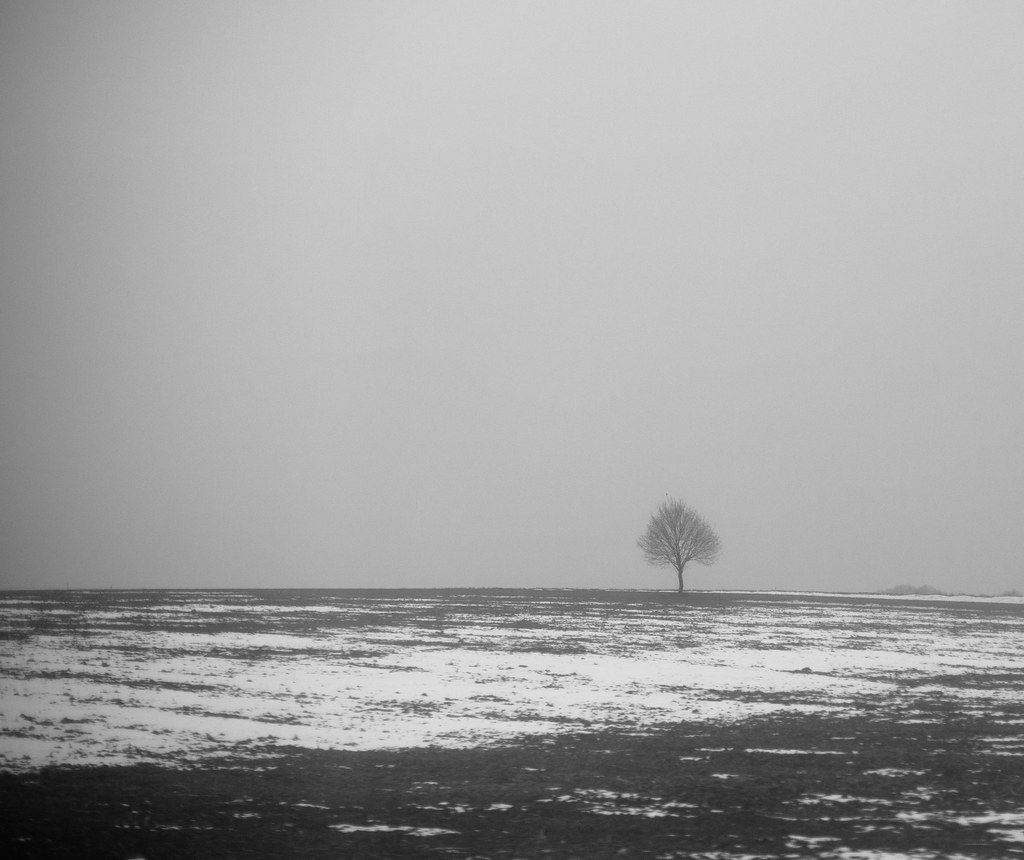
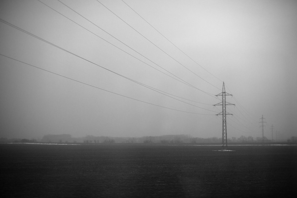
Piece of land 4 by lukas.kuzma, on Flickr
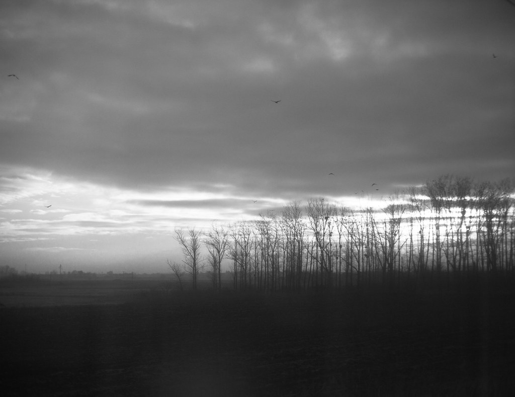
Piece of land by lukas.kuzma, on Flickr
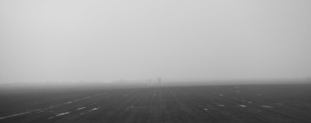
Piece of land 2 by lukas.kuzma, on Flickr
Piece of land 3 by lukas.kuzma, on Flickr
Piece of land 5 by lukas.kuzma, on Flickr
Results 1 to 20 of 25
Thread: Landscape,train, Slovakia.
-
27th February 2012, 02:27 PM #1

- Join Date
- Feb 2012
- Location
- Slovakia
- Posts
- 54
- Real Name
- Lukas

Landscape,train, Slovakia.
-
27th February 2012, 04:19 PM #2
Re: Landscape,train, Slovakia.
Lukas
In your first image, I understand that you are trying for minimalism. But the light coming through the trees from the background is too distacting for my likes, even in the minimal look you are going for.
I think your forth image works much better towards your goal.
-
27th February 2012, 05:59 PM #3Moderator


- Join Date
- Feb 2009
- Location
- Glenfarg, Scotland
- Posts
- 21,402
- Real Name
- Just add 'MacKenzie'
Re: Landscape,train, Slovakia.
Lukas
I understand the point Pierre makes, but from a compositional point of view, I think #1 is the strongest image. I like how the elements in the image are arranged and there are good tones in it.
In the second one, I can see that you have adhered to the Rule of Thirds and placed the tree strategically on an intersection. But, the the result, I think, is that the particular ratio (close to 5:4) does not suit it as well as some other might. I feel we have too much land in front of the tree that does not hold our interest.
I think you can keep the tree on that intersection, but do so by trying alternative crops. The following are two such examples. The first one is cropped square (1:1). The second one is cropped at a 16:9 ratio. You may feel these are not as good as your original.
1:1

16:9
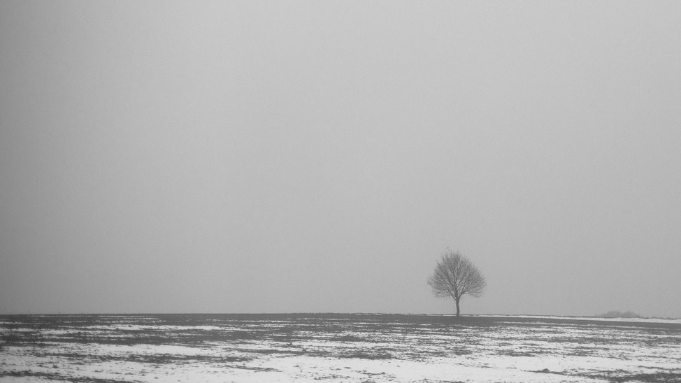
I feel the others do not have a strong composition.
But I do like your approach and style. This is something that, I am sure, will develop and you become more experienced.Last edited by Donald; 27th February 2012 at 06:31 PM.
-
27th February 2012, 06:16 PM #4

- Join Date
- Feb 2012
- Location
- Slovakia
- Posts
- 54
- Real Name
- Lukas

-
27th February 2012, 06:22 PM #5

- Join Date
- Feb 2012
- Location
- Slovakia
- Posts
- 54
- Real Name
- Lukas

Re: Landscape,train, Slovakia.
Thanks for the advice! I like the second example, and I think its better than original. I really appreciate the examples.
-
27th February 2012, 08:29 PM #6

- Join Date
- Jan 2009
- Location
- South Devon, UK
- Posts
- 14,556
Re: Landscape,train, Slovakia.
My first thoughts, Lukas, were that some cropping of the bottom would be desirable. Then I scrolled down to find that Donald had done exactly what I was thinking.
I would suggest that the others may be worth trying with similar editing
-
27th February 2012, 09:02 PM #7

- Join Date
- Feb 2012
- Location
- Slovakia
- Posts
- 54
- Real Name
- Lukas

-
27th February 2012, 09:08 PM #8

- Join Date
- Apr 2011
- Location
- Ontario (mostly)
- Posts
- 6,667
- Real Name
- Bobo
Re: Landscape,train, Slovakia.
Cool shots - conditions are just like what we are having around here....
-
27th February 2012, 11:26 PM #9

- Join Date
- Feb 2012
- Location
- Slovakia
- Posts
- 54
- Real Name
- Lukas

-
18th March 2012, 05:57 PM #10

- Join Date
- Feb 2012
- Location
- Slovakia
- Posts
- 54
- Real Name
- Lukas

-
18th March 2012, 08:51 PM #11

- Join Date
- Jan 2009
- Location
- South Devon, UK
- Posts
- 14,556
Re: Landscape,train, Slovakia.
That looks much better to me, Lukas.
-
19th March 2012, 08:16 PM #12
Re: Landscape,train, Slovakia.
Lukas
I also like the crop of the first image you have made. It seems that removing some of the dark foreground has helped this image.
It is very good of you to take such criticism (although it is all meant for good, not bad).
-
19th March 2012, 09:00 PM #13
Re: Landscape,train, Slovakia.
I love these..!

-
20th March 2012, 05:47 PM #14
Re: Landscape,train, Slovakia.
I really like these images. They are depressing to me but, that adds to the interest; not detracts from it...
-
21st March 2012, 01:53 AM #15
Re: Landscape,train, Slovakia.
Hi Lukas!
I really like your minimalist approach. If you are new to this, then I think you are already off and running! They are great in B&W and as Richard mentioned, really convey a mood.
Would it interfere with your vision to add some contrast to these in an attempt to make them appear a little less flat?
#2, my personal fave, has some darkening in the sky on the left, close to the frame edge that I might be tempted to dodge to make the sky a little more even. In fact, so does 3 through 5 but it works better with them because it is on both sides (almost vignette-like). I might even consider cloning the little bit of hillside on the far right at the horizon line in #2.
By your thread title (train) can we presume you are shooting out of a window? I think I am seeing some reflection in a couple of these and again wonder if the slight irregularities in the skies may be caused by this. I wonder if it is also causing some reflections in the foregrounds. It seems especially prevalent in #1 & #5 where you have a darker foreground. If you should so desire, I would bet that a little dodging/burning would help that a bit.
Great series of shots, Lukas.
-
21st March 2012, 05:44 AM #16
-
21st March 2012, 10:09 AM #17

- Join Date
- Feb 2012
- Location
- Slovakia
- Posts
- 54
- Real Name
- Lukas

-
21st March 2012, 10:10 AM #18

- Join Date
- Feb 2012
- Location
- Slovakia
- Posts
- 54
- Real Name
- Lukas

-
21st March 2012, 10:11 AM #19

- Join Date
- Feb 2012
- Location
- Slovakia
- Posts
- 54
- Real Name
- Lukas

-
21st March 2012, 10:12 AM #20

- Join Date
- Feb 2012
- Location
- Slovakia
- Posts
- 54
- Real Name
- Lukas


 Helpful Posts:


 Reply With Quote


