Results 1 to 20 of 21
Thread: Portrait of my Wife
-
20th August 2012, 07:36 PM #1
-
20th August 2012, 07:49 PM #2

- Join Date
- Jan 2009
- Location
- South Devon, UK
- Posts
- 14,572
Re: Portrait of my Wife
A good composition, Joshua.
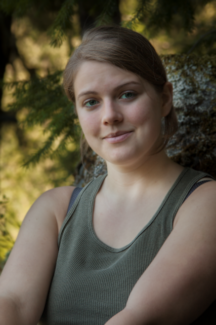
Did you use a tripod? I would consider 1/50 to be a bit borderline for handheld and would have gone up to Iso 200 in that case.
Whatever you did with this scene, was going to create lighting problems. Unless you took some substantial lighting equipment with you.
Particularly problematic as you were shooting into a bright background. I think I would try very slightly increasing the brightness, particularly the highlights, and let the background do what it does. Or, better still, work with an adjustment layer and mask to exclude any over bright background areas.
Then a tiny bit of selective sharpening on her face.
-
20th August 2012, 08:07 PM #3
Re: Portrait of my Wife
I appreciate the advice, as well as the compliments. The location we're in would have been...interesting to bring lighting equipment to, though I wondered if a reflector would have been helpful to throw a little more light onto her face. One of the main problems I was having was that there was a lot of dappled light in most of the positions I was trying.
I will see what I can do about toning down the background more than I already have. It isn't exactly blown out, but it does have some hotter spots to it that draw the eye. As far as selective sharpening goes, where would you suggest I apply it? I did some selective blurring to reduce acne spots, but tried to keep her eyes, eyebrows, hair, lips, and nostrils sharp.
Also, I did hand hold this, even though I know I shouldn't have. My tripod doesn't go quite low enough, so I risked it by shooting several exposures and hoping one would be clear. I was laying on my side with my arm braced on the rocks however which helped me to steady myself.
Again thank you for the suggestions.Last edited by TheArcane; 20th August 2012 at 08:13 PM.
-
20th August 2012, 08:46 PM #4
Re: Portrait of my Wife
Hi Joshua,
I think it a very nice picture, well done.
I agree with some of the comments above, but overall I think it's a good start.
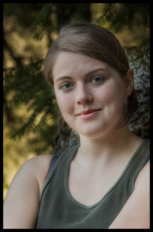
Hope you don't mind but I tried a few tweaks, to see how it would look if I had PP it. I've given a slight surface blur to her face and sharpened it a bit; particularly around her eyes.
I've added the boarder just because it's something that I feel just finishes a portrait.
If I have over-stepped the mark and you want me to remove it, I will of course take it down.

-
20th August 2012, 09:07 PM #5

- Join Date
- May 2012
- Location
- northern Virginia suburb of Washington, DC
- Posts
- 19,064
Re: Portrait of my Wife
You're fortunate to have such a beautiful model, hiking partner and wife, but you already know that.

I'm not a portrait specialist but I do like the direction of the suggestions already made. However, for me, the biggest flaw (and perhaps easiest to fix) is the green tint in the white part of her eyes. I actually wonder if it's a post-processing mistake.
Change that to white, add a little contrast to her eyes, and sharpen them using a rather high intensity, small radius and very small threshold. Be sure to review the eyes at 100% to make sure the sharpening doesn't create any artifacts. You can find lots of stuff on the Internet, perhaps among the CiC tutorials, about using standard settings for treating eyes. I would give you my settings but the sharpening parameters in my post-processing software are not the norm.
-
20th August 2012, 10:00 PM #6

- Join Date
- Dec 2008
- Location
- New Zealand
- Posts
- 17,660
- Real Name
- Have a guess :)
Re: Portrait of my Wife
Hi Joshua,
Just reading through the conversation so far.
I appreciate that shots like this are "unplanned" in that the primary purpose of the exercise was probably the outing, not a photoshoot -- so often folks don't take an arsenal of equipment. Having said that, an on-camera flash that you can swivel/bounce into a reflector would make a world of difference.
For dappled lighting, consider taking a small circular diffuser - I think I covered them in my school of portraiture series (have you read that?).
If you're forced to shoot at low shutterspeeds - and you don't have flash - then put the camera in multiple shot drive mode and fire a burst of 3 to 5 shots - some will be considerable sharper than others. Make sure you shoot RAW, and don't blow the highlights -- there's more than enough dynamic range captured to reveal any dark shadow detail in post-processing.
I like your composition - lighting was actually pretty good - what it needs most is levels adjustment and sharpening - happy to give you a demo if you'd like to flick me the full-resolution original.
-
20th August 2012, 10:08 PM #7
-
20th August 2012, 10:42 PM #8
Re: Portrait of my Wife
-
21st August 2012, 12:38 AM #9

- Join Date
- May 2012
- Location
- northern Virginia suburb of Washington, DC
- Posts
- 19,064
-
21st August 2012, 12:50 AM #10
-
21st August 2012, 01:38 AM #11

- Join Date
- Jul 2012
- Location
- Chicago, IL, USA
- Posts
- 803
- Real Name
- Gretchen
Re: Portrait of my Wife
Joshua, I really like that you brought out her eyes in the re-edit. Her lips also seem to have more color which I like too!
Do all photographers have wives with beautiful eyes?
-
21st August 2012, 02:57 AM #12
Re: Portrait of my Wife
Your wife is a lovely portrait subject and this is a lovely portrait of a lovely woman.
However, I am not keen on the expanse of bare arm visible and very demanding of my attention.
As I was scrolling down the image, I noticed that I liked the image a bit better with a crop just below the bottom of the neckline or if she were wearing a dress/blouse with sleeves.
-
21st August 2012, 05:00 AM #13

- Join Date
- Nov 2009
- Location
- Chandigarh, India
- Posts
- 1,541
- Real Name
- Sahil Jain
Re: Portrait of my Wife
I agree with all other on you having a beautiful wife/model to practice your portraits skills on.
John's processing does show a significant improvement in the shot. You gotta take Colin's offer
Again, using an external flash is being stressed at here. I so wanna buy it. But being recently married, I am postponing my expenses on gadgets.
-
21st August 2012, 10:02 AM #14

- Join Date
- May 2012
- Location
- northern Virginia suburb of Washington, DC
- Posts
- 19,064
-
22nd August 2012, 02:06 AM #15
-
22nd August 2012, 02:34 AM #16

- Join Date
- May 2012
- Location
- northern Virginia suburb of Washington, DC
- Posts
- 19,064
Re: Portrait of my Wife
Each version is better than the previous one. Keep up the great work!
If you feel the crop is a little tall and narrow, it won't hurt to crop a little off the top to remedy that situation.
-
22nd August 2012, 03:00 AM #17
Re: Portrait of my Wife
I agree with mike, each version is better than the last, what i love is how her eyes "pop", lovely model you have. I believe soon, if not now, you got a good print for your home.
-
22nd August 2012, 03:26 AM #18

- Join Date
- May 2012
- Location
- northern Virginia suburb of Washington, DC
- Posts
- 19,064
Re: Portrait of my Wife
Joshua,
Every time you revise an image, be sure to check the histogram. If you do that now, you'll notice that there is no data on the right side. I think you'll like the image quite a bit more if you move the far right slider in the Levels tool to the left so data is displayed across the entire horizontal axis.
-
22nd August 2012, 06:18 AM #19

- Join Date
- Dec 2008
- Location
- New Zealand
- Posts
- 17,660
- Real Name
- Have a guess :)
Re: Portrait of my Wife
Hi Mike,
I can see what you're trying to say - and I agree with it (largely) in this case - but I think it's also important to point out that having a histogram "touch at the right" isn't always correct; it really depends on what the tones of the image are. If the histogram touches the right hand side then that portion would represent a highlight (and be white) ... however in the above image (as a "reasonable" example) there really aren't any great areas of highlight.
As I say, not a shining example of what I'm meaning - but - one may well have images that are correctly tone mapped and levels adjusted that don't have the histogram touching because there aren't any max-out highlights that should be in the image.
-
22nd August 2012, 01:25 PM #20

- Join Date
- May 2012
- Location
- northern Virginia suburb of Washington, DC
- Posts
- 19,064

 Helpful Posts:

 Reply With Quote


