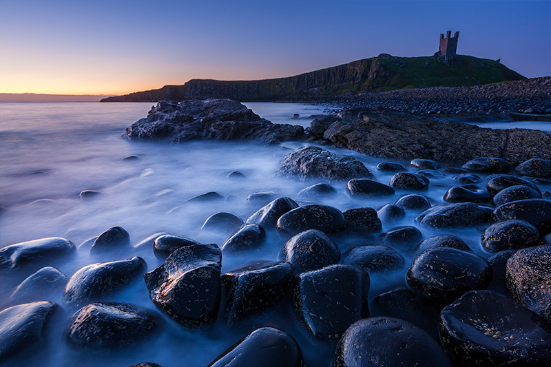
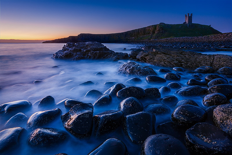
Following the popularity of the Morte Hoe Anatomy of an image thread I thought you might like to see another.
This was shot pre dawn and although the sun was starting to illuminate the sky it was still some way below the horizon.
The scene contrast range was such that I decided to take two exposures, one stop apart to capture the image.
First unadjusted RAW frame from camera. Focal length 21mm Full Frame. Exposure 15 Seconds f/16 iso.100
Second unadjusted RAW frame. Focal length 21mm Full Frame. Exposure 30 Seconds f/16 iso.100
As converted from Lightroom to Photoshop: Process 2012: Light balance Daylight as shot, Exposure +0.6, Highlights -100 Shadows +40, Clarity +21, Vibrance +31. Input Sharpening, noise reduction and lens corrections applied.
Smart Object placed as layer two.
As converted from Lightroom to Photoshop: Process 2012: Light balance Daylight as shot, Contrast +19, Highlights -40 Shadows +33, Clarity +31, Vibrance +26. Input Sharpening, noise reduction and lens corrections applied.
Smart Object placed as layer one. (Bottom)
A curve adjustment layer, masked out and then brushed back in on the rock to help separate it from the cliff in the background.
Layer two blended in with a graduation, black to transparent on a layer mask and direct brush work to ensure that the rock from layer one showed through.
A curve adjustment layer clipped to layer two, masked out then brushed back in on the cliff to further help separation.
This was then stamped (Shift, control, alt E) to make a separate composite layer.
A selection was made around the tower and then warped to correct its apparent perspective.
Another layer was added and final spotting applied.
Another Curve adjustment layer, masked and then brushed in to improve the lighting on the tower.
This was then stamped twice to make two composite layers which were then converted to smart objects.
The first Smart Object had a Highlight Adjustment to bring a bit more colour out of the sky and improve the tones in the sea at the left.
The second Smart Object had a Shadows Adjustment to bring out the texture of the rocks, the beach and the cliff. It was then masked out and brushed in just where needed.
I also clipped a curve adjustment layer to this Smart Object to further improve the contrast in those areas and also add a little warmth to the light.
Added a Vibrance Adjustment layer.
Then a Colour Luminosity adjustment layer (Black and White Adjustment with blend mode set to luminosity.) to darken the blues slightly. This was then masked from the sky with a graduation in the layer mask.
A Graduation layer (Clear layer set to Soft Light blend mode.) was added and two black to transparent graduations applied, one for the sky, the other for the sky and sea on the left.
This was masked from the cliff and tower with a simple colour range selection of the sky converted to a mask.
An edge burn was added with another graduation layer and graduations applied from each edge.
Another Graduation layer this time to balance the lighting a bit from the left.
A levels adjustment just to restore the white point that had been dulled down a bit in the process.
Add a touch of sharpening and were all finished.
Once again, I'm happy to answer any questions you may have.
Results 1 to 4 of 4
-
27th April 2013, 02:06 PM #1
The Anatomy of an Image - Dunstanburgh.
-
27th April 2013, 03:07 PM #2
Re: The Anatomy of an Image - Dunstanburgh.
Fascinating, informative and educational. Thank you for sharing.
A very basic question as I'm still learning but I would like to know why you decreased the highlights in the photo (twice). I thought highlights were always to be preserved unless totally blown out, ie; overexposed sky or the like.
-
27th April 2013, 03:24 PM #3
Re: The Anatomy of an Image - Dunstanburgh.
I usually expose to the right of my histogram to get as much out of my shadows as possible.
That can leave the highlights looking a bit washed out even if they are not actually blown.
Decreasing the highlights in Lightroom activates the recovery algorithms and pulls the colour information out without darkening the mid tones too much.
A lot depends on the image, sometimes dropping the exposure does the job but I usually find that dropping the highlights puts a bit of richness into skies in particular.
-
27th April 2013, 03:31 PM #4
Re: The Anatomy of an Image - Dunstanburgh.
Thank you


 Helpful Posts:


 Reply With Quote