
 Helpful Posts:
 Purple Clematis
Results 1 to 6 of 6
Thread: Purple Clematis
-
22nd April 2014, 07:37 PM #1


- Join Date
- Feb 2014
- Location
- Plano, Texas (USA)
- Posts
- 420
- Real Name
- John
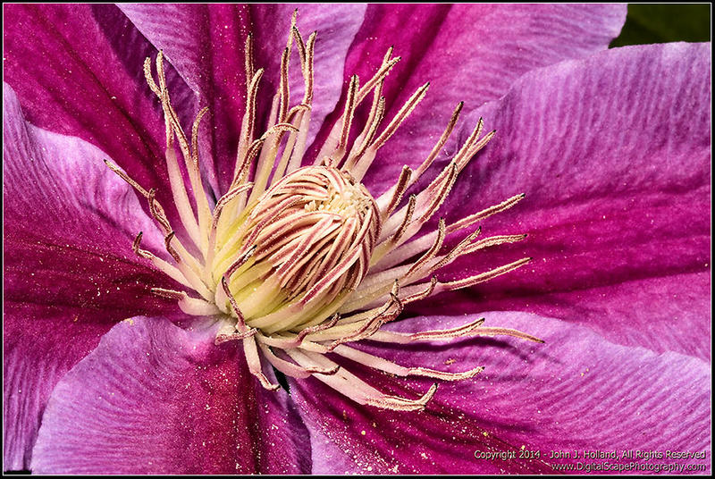
Purple Clematis
-
22nd April 2014, 08:06 PM #2

- Join Date
- Jul 2011
- Location
- British Columbia, Canada
- Posts
- 7,244
- Real Name
- Christina
Re: Purple Clematis
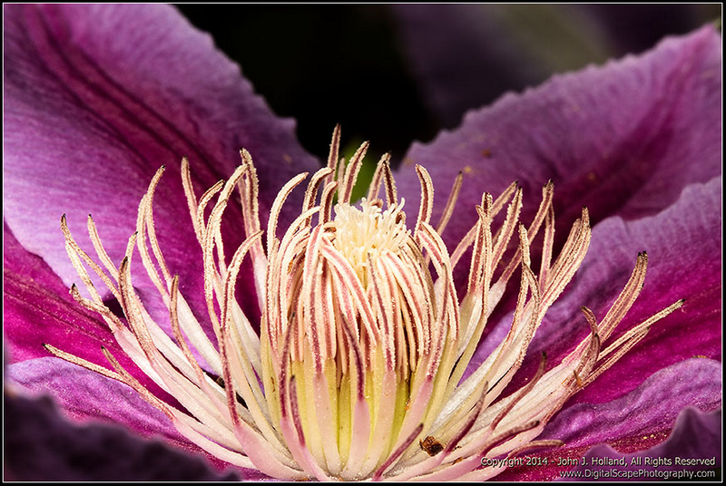
Absolutely gorgeous! I prefer the 1st image simply because the composition is especially beautiful to me.
Aside... All the flowers you have just posted are absolutely gorgeous. Beautiful detail, colour and stunning compositions. (Saving time by commenting in just one thread.)
-
23rd April 2014, 05:26 PM #3
- Join Date
- Dec 2013
- Location
- Turkey
- Posts
- 12,779
- Real Name
- Binnur
Re: Purple Clematis
Again very nice shots. I like the comp.better in #1

-
23rd April 2014, 06:16 PM #4

- Join Date
- Jun 2011
- Location
- Deep in the heart of Texas and Fort Wayne Indiana
- Posts
- 1,629
- Real Name
- Kristianna-Marie - I listen to Kris too.....
Re: Purple Clematis
#1 - great capture!
-
23rd April 2014, 06:45 PM #5

- Join Date
- May 2011
- Location
- Fort Mill, South Carolina, USA
- Posts
- 6,294
- Real Name
- Frank Miller
Re: Purple Clematis
Hi John, there are three things I notice right away that set the first image off better than the second one.
1. More effective use of eye directing diagonals in the center of the blossom - in the second, the strong purple edges pull the eye out of the frame at the top.
2. The off-center position of the blossom is more pleasing than the centered position of the second one which has the additional disadvantage of being cut off at the bottom.
3. The textual advertisements are less noticeable and therefore less distracting in the first image.
-
24th April 2014, 02:57 PM #6
- Join Date
- Feb 2014
- Location
- Plano, Texas (USA)
- Posts
- 420
- Real Name
- John
Re: Purple Clematis
Thank you Christina, Binnur, Kristianna-Marie, and Frank for the comments/analysis - very helpful.

 Reply With Quote