Results 1 to 14 of 14
-
18th July 2014, 11:04 PM #1
Joaquin and the value of good labor
Last edited by juznobsrvr; 20th July 2014 at 01:27 AM. Reason: Per Binnur, Donald and Manfred. Thanks for your input.
-
18th July 2014, 11:25 PM #2
Re: Joaquin and the value of good labor
Your work capturing people is inspiring.
-
19th July 2014, 05:53 AM #3
Re: Joaquin and the value of good labor
nice shot Rob...i see you are in chino, i'm down the street in corona.nice to meet you neighbor
Dedric
-
19th July 2014, 06:46 AM #4

- Join Date
- Nov 2012
- Location
- Australia (East Coast)
- Posts
- 4,524
- Real Name
- Greg
Re: Joaquin and the value of good labor
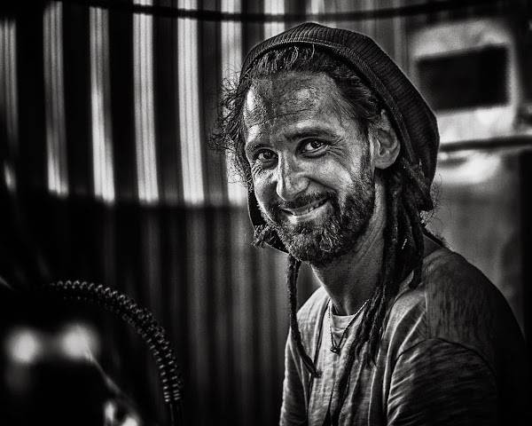
Good environmental portrait, Rob, but I think the background is too bright. The upper two thirds of the face is brighter than the lower third (skin/dark beard), and is 'divided' about the level of the mouth. In the background the bottom of the row of bright vertical stripes forms another bright horizontal line that just about coincides with the level of the mouth. So, all this gives the effect of a horizontal line running across the image and through the face.
If you pull the highlights down in the background I think you can overcome much of this and give the image more depth.
-
19th July 2014, 09:12 AM #5
Re: Joaquin and the value of good labor
Nicely captured.
-
19th July 2014, 09:32 AM #6
-
19th July 2014, 01:30 PM #7

- Join Date
- Dec 2013
- Location
- Turkey
- Posts
- 12,779
- Real Name
- Binnur
Re: Joaquin and the value of good labor
Hi Rob . He looks so straight at me that although there are some bright parts in the BG I'm not distracted by them. There are two bright circles on the lower left side, you might as well tone them down but I wouldn't touch any other thing in the image , it looks great this way

-
19th July 2014, 03:14 PM #8
Re: Joaquin and the value of good labor
Very nice shot!
-
19th July 2014, 03:27 PM #9Moderator


- Join Date
- Feb 2009
- Location
- Glenfarg, Scotland
- Posts
- 21,402
- Real Name
- Just add 'MacKenzie'
Re: Joaquin and the value of good labor
A beauty. Only suggestion would be about those two bright spots at the lower left-hand corner. Worth darkening them up a bit?
-
19th July 2014, 03:38 PM #10
Re: Joaquin and the value of good labor
I find that the bright background works in this image, as the light areas mirror the lighting on your subject's face. I would go with Donald's suggestion as the bright spots on the bottom left really do add unwanted competition to the subject (i.e. the draw our eyes away from the subject).
That being said, another fine image; both compositionally and the way you handled the B&W conversion.
-
19th July 2014, 09:47 PM #11
Re: Joaquin and the value of good labor
Wonderful shot but those glowing eyes at the bottom left distract me.
-
20th July 2014, 01:29 AM #12
Re: Joaquin and the value of good labor
Thanks to all for noticing and constructive comments.
-
20th July 2014, 07:37 AM #13

- Join Date
- Jun 2013
- Location
- North West of England
- Posts
- 7,178
- Real Name
- John
-
21st July 2014, 03:49 AM #14

 Helpful Posts:


 Reply With Quote


