Results 1 to 7 of 7
Thread: Few Cat pictures
-
22nd November 2014, 05:08 AM #1
Few Cat pictures
Last edited by yooray; 22nd November 2014 at 04:26 PM.
-
22nd November 2014, 09:36 AM #2


- Join Date
- Dec 2013
- Location
- Chesterfield, Missouri/Melbourne, Australia
- Posts
- 17,827
- Real Name
- Izzie
Re: Few Cat pictures
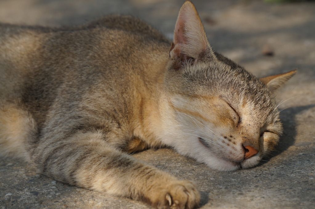
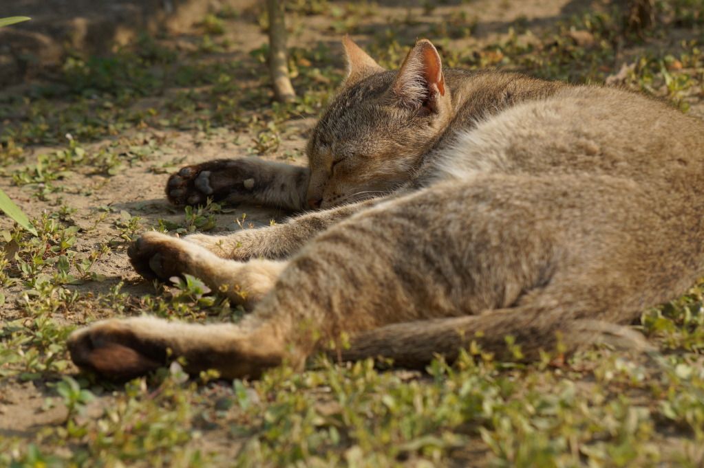
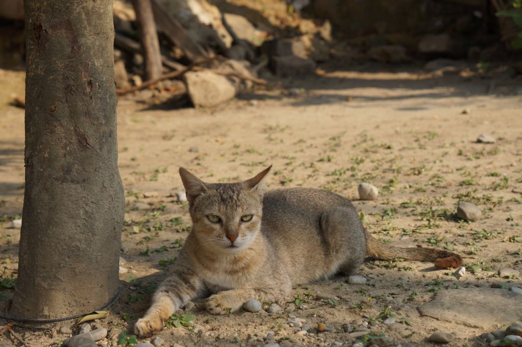
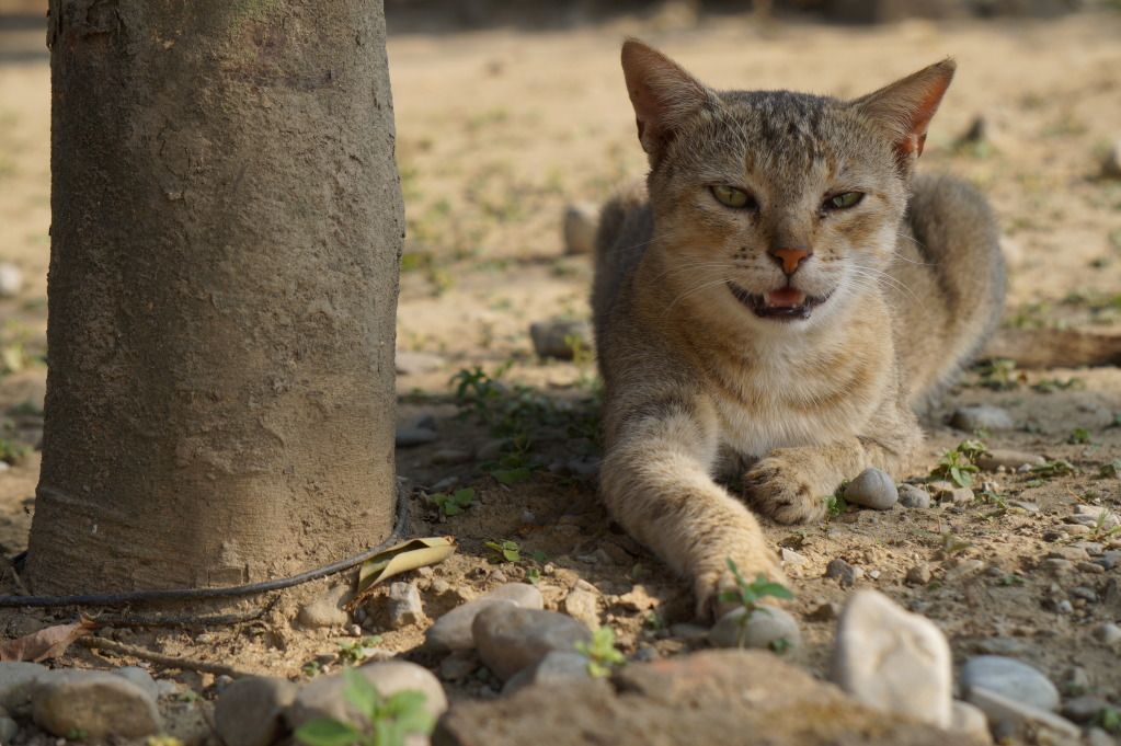
Yuvraj -- I like #1 photo but I would prefer that you put a little bit more space on the paw so it does not looked cut off. Your framing is too tight on the head too. #2 could have been shot in another angle. My best favourite here is #3. I like the composition better. #4 is just an OK shot in my eyes. What these shots lack are two things -- 1) please, for my convenience and some others, put a number to your uploaded shots if you are indeed wanting me (us) to comment on them. It is just easier to remember the number. 2) #3 and #4 cats' eyes need a little bit of brightening so the catchlight will be prominent. It will make it nicer.
-
22nd November 2014, 12:56 PM #3
Re: Few Cat pictures
The first two work well as you fill the frame with the subject, the third and fourth show the environment with the fourth being better selection than the third. All could use a bit of sharpening and contrast adjustment. Nice efforts.
-
22nd November 2014, 01:11 PM #4

- Join Date
- Aug 2013
- Location
- cornwall
- Posts
- 1,340
- Real Name
- Jeremy Rundle
Re: Few Cat pictures
nice pussy
-
22nd November 2014, 04:32 PM #5
Re: Few Cat pictures
Its good to know what it has been lacking in my photography by your helpful comments. I really appreciate that !
IzzieK, I have done just like as you said and i will follow your advice next time shooting the picture
Shadowman, Its great to see your comment too. Actually I kept my photo natural and untouched, thats why i didn't edited with any apps. May be i should have thought earlier while shooting the pic. But as i am a beginner i still don't know what to use and how to in specific situation.
Anyways thanks a lot all of you!
-
22nd November 2014, 05:07 PM #6

- Join Date
- Dec 2013
- Location
- Turkey
- Posts
- 12,779
- Real Name
- Binnur
Re: Few Cat pictures
Hi Yuvraj
 The sleeping cat has a very nice expression in #1, I can feel how peacefully he/she is sleeping. May be it would have been better to shoot #2 from the cat's front side instead of its back. IMO there is too much environment in #3.
-
22nd November 2014, 11:59 PM #7New Member

- Join Date
- Nov 2014
- Location
- Sydney
- Posts
- 6
- Real Name
- Julia Avenell
Re: Few Cat pictures
I love Cat #1 and Cat #4. I agree that #1 could have been more successful if the paw wasn't cut off. Overall the suggestion I offer would be to saturate the colour just a tiny bit (like the greenery in #4) or make the shadows a little darker. I say this because the cats colouring is similar to it's environment so a little more definition would have been nice. This is personal taste though. I know not everyone likes to see the colours saturated. cute cat too btw


 Helpful Posts:


 Reply With Quote