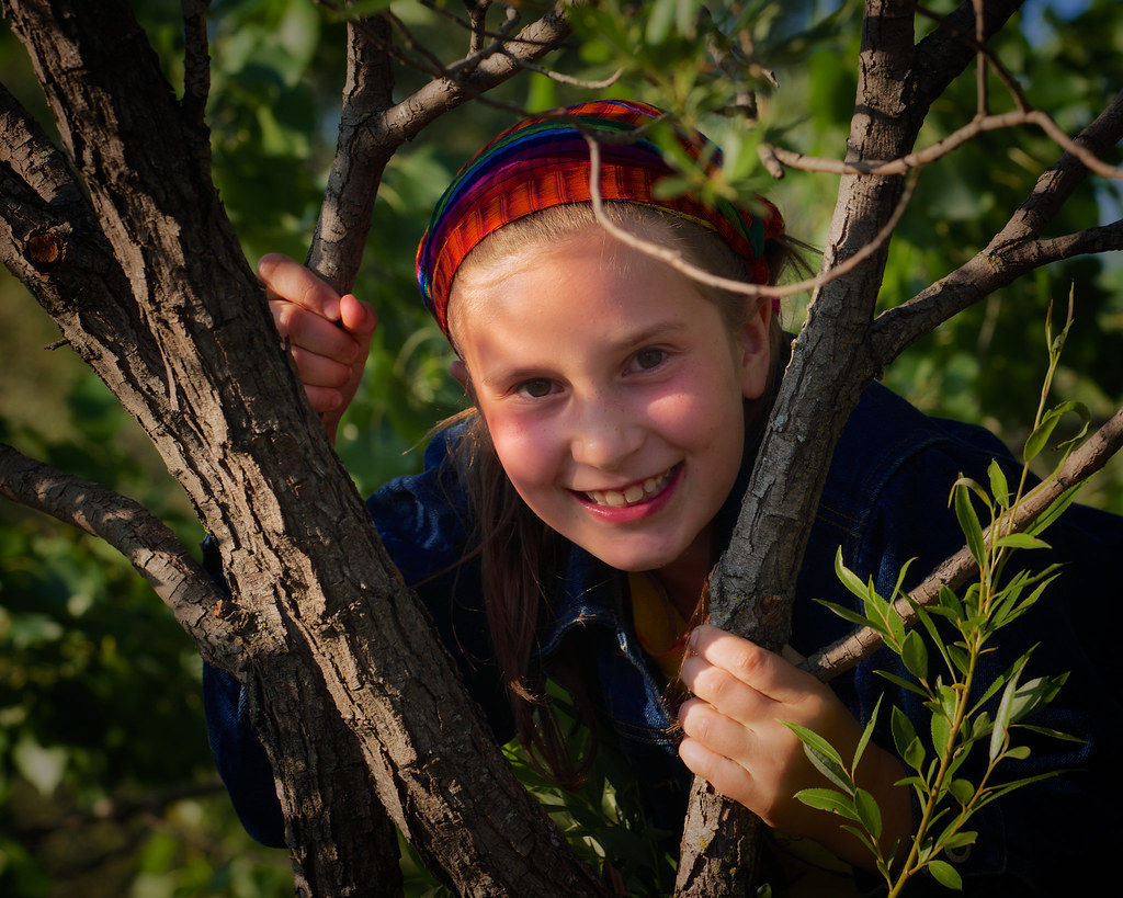
Portrait of a friend that I would like to print for her. I've been struggling with this off and on since the summer. Her face was too dark in the original and the front hand too bright. I tried to correct both without flattening the contrast. I also tried to convey some of the warmth of the evening sun. Please let me know what you think.
The Tree Climber by onesun1moon, on Flickr
Results 1 to 5 of 5
Thread: The Tree Climber
-
18th December 2014, 07:14 AM #1
The Tree Climber
-
18th December 2014, 09:07 AM #2


- Join Date
- Dec 2013
- Location
- Chesterfield, Missouri/Melbourne, Australia
- Posts
- 17,827
- Real Name
- Izzie
Re: The Tree Climber
In my opinion the exposure is OK now and no overexposure but I am not sure about that twig running along her head/forehead.. have you tried to remove that? Content Aware might be your friend here...The stray leaves on the RHS her head needs to be a bit clearer to match/balance the leaves in the foreground. Just my opinion...
-
18th December 2014, 12:09 PM #3
-
18th December 2014, 01:15 PM #4

- Join Date
- May 2011
- Location
- SE Michigan
- Posts
- 4,511
- Real Name
- wm c boyer
Re: The Tree Climber
Janice...99% of the problems with this image, after your well-done adjustments, revolve around the
foreground foliage covering various body parts. All too often we get hung up on the subject and
ignore the surroundings.
To my way of thinking, unless you are skilled at removing that foliage in PP (a serious pain in the butt),
you might be better served, using the lessons learned, by doing a reshoot.
Judicious pruning goes a long way.
-
19th December 2014, 01:21 AM #5
Re: The Tree Climber
Thanks Izzie, John, William... Perhaps I should not have used the word 'portrait' as it is in fact a grab shot stolen during one of the rare moments when this girl, who is a veritable ball of kinetic energy, actually stops moving. I guess I think of it as a portrait because it shows her in her element, being herself, having fun. As a result, I don't mind the foliage (though perhaps I should), but was more concerned about the colour generally, the colour cast on her hand, and getting good contrast. I have not made any headway in Photoshop, so I wouldn't at this point even try to get rid of the branch, I don't think. As far as the leaves you are talking about, Izzie, I am not sure what you mean by 'clearer'. If you mean the ones I think you mean, against her headgear, they are foreground leaves that were out of range of my depth of field.
I don't know that my responses will ever be fast enough to get exactly the right framing for this type of shot. To be honest, I am happy when I get good focus and exposure, and have reasonable depth of field.

 Helpful Posts:

 Reply With Quote