
 Helpful Posts:
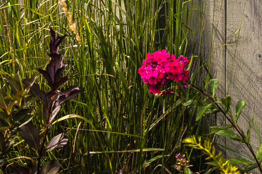
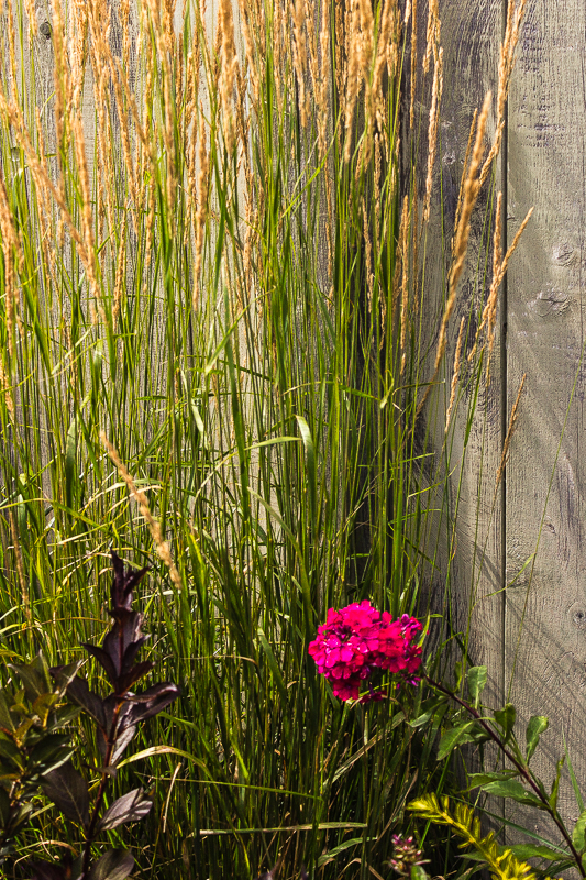
 I took this photo in a private garden. The contrast between the almost circular shape of the flower and the strong vertical lines of the tall grass and the fence boards is what I tried to capture. The vivid red color of the phlox against the much blander background also appealed to me. While I am generally pleased with the composition of this shot, I would appreciate suggestions on how to improve it. Should I have included the top of the grass? Would a narrower or wider crop be more effective? Did I include too much negative space?
All C & C will be welcomed
ISO 100, f/5.0 1/250 sec fl 40mm on a 1.6 crop factor camera
Andre
Results 1 to 18 of 18
Thread: Red Phlox
-
12th August 2015, 12:27 PM #1


- Join Date
- Apr 2015
- Location
- Ottawa, Ontario, Canada
- Posts
- 1,595
- Real Name
- André
Red Phlox
-
12th August 2015, 01:01 PM #2

- Join Date
- Dec 2009
- Location
- WNY
- Posts
- 36,716
- Real Name
- John
Re: Red Phlox
I actually like the vibrancy of the greenery more than the flower. Needs more flower within the composition to hold my attention. Nice effort.
-
12th August 2015, 02:11 PM #3

- Join Date
- Feb 2015
- Location
- Brighton, UK
- Posts
- 223
- Real Name
- Max
Re: Red Phlox
Agreeing with John. You have to search to find the flower. I would crop it to be in the bottom third intersection (that has a name. No idea what it is) and to be about a quarter of the total picture area. if you can crop out much of the fence by doing this, even better.
I do like the fact that you started out with (and stated) your compositional aim. That is excellent practice and enables us to help you evaluate whether you have met that aim. And the aim is a good one; the contrast between two colours and geometrical shapes. I am interested to see whether a different crop helps you get there with this one.Last edited by Max von MeiselMaus; 12th August 2015 at 02:18 PM.
-
12th August 2015, 03:28 PM #4
- Join Date
- May 2011
- Location
- SE Michigan
- Posts
- 4,511
- Real Name
- wm c boyer
Re: Red Phlox
I am one of those that cannot compose in the viewfinder...I feel your pain.
-
12th August 2015, 07:31 PM #5
- Join Date
- Jan 2009
- Location
- South Devon, UK
- Posts
- 14,876
Re: Red Phlox
I like the idea behind this composition and think you can just about get away with the position of your main subject; but it is oversaturated in the reds. I use the term 'saturated' very loosely to cover over exposure etc in general.
Very difficult to get the colour under control though. You may have to use some negative exposure compensation or avoid direct sunlight which will tend to tone down the woodwork.
-
12th August 2015, 07:54 PM #6
- Join Date
- Feb 2012
- Location
- Texas
- Posts
- 6,956
- Real Name
- Ted
Re: Red Phlox
Not so loosely, I reckon. Without any analysis, those purples are telling us that, during conversion, the greens have been forced down to zero - and that makes the HSV or HSB saturation clipped at 100%. Of course, Mr. Anal has downloaded the pic and will have more to say or show directly . . . Originally Posted by Geoff F

-
12th August 2015, 08:17 PM #7
- Join Date
- Feb 2012
- Location
- Texas
- Posts
- 6,956
- Real Name
- Ted
Re: Red Phlox
As promised. This is a view of the flower, showing only saturation, lighter = more saturated (not brighter): Originally Posted by xpatUSA

The arrow in the petals area is where I put the picker, more or less. In the picked data, as I forecast, RGB green is zero (i.e. bottomed out during conversion). See also that saturation is at 1.000 (100%). In the histogram - which is of saturation, not luminosity - look at the cramming on the right. So the image has lost detail and has false colors. Take a look at those hue values - in HSV/HSB, 323.9 degs is quite a long way away from nominal red (360 degs).
Backing off the saturation a bit (until the greens in the petals just take on a small value) before saving would improve matters. If your favorite working space is ProPhoto, you would never even notice this over-saturation - so you might want to think about viewing in sRGB while editing flowers?
There are several other ways to skin this cat, too . . .Last edited by xpatUSA; 12th August 2015 at 08:27 PM.
-
12th August 2015, 08:20 PM #8

- Join Date
- Jun 2012
- Location
- Suva, Fiji
- Posts
- 7,076
- Real Name
- Grahame
Re: Red Phlox
In my opinion Andre you have it just about right and I base that on what I see the image portrays. The emergence of a colourful flower amongst a rather bland and overgrown area. Originally Posted by Round Tuit
-
12th August 2015, 09:16 PM #9
- Join Date
- Apr 2015
- Location
- Ottawa, Ontario, Canada
- Posts
- 1,595
- Real Name
- André
Re: Red Phlox
John, Originally Posted by Shadowman
I like the greenery too. I did not mean to imply that it was bland per se but that it is not as eye catching as the red flower. I'm not sure what you mean by more flower though. If you mean that the photo should be cropped to make the flower more prominent then the result is a nice photo
but I loose my original intent of contrasting the vertical lines with the round flower. If on the other hand you mean adding more blooms then I would need a magic wand and I think that I might still miss my original intent.
In any case thank for your comments. Anything that forces me to think about my compositions is always welcomed.
Andre
-
12th August 2015, 09:27 PM #10
- Join Date
- Apr 2015
- Location
- Ottawa, Ontario, Canada
- Posts
- 1,595
- Real Name
- André
Re: Red Phlox
Max, Originally Posted by Max von MeiselMaus
I find it hard to miss the flower when looking at the full length picture. I agree though that if you have to scroll up and down to see the photo then it becomes difficult to evaluate the composition as a whole. I believe that cropping to the rule of third or golden ratio would destroy what Manfred refers to as the balance of the picture.
I would welcome examples of the crop that you have in mind.
Thank for your interest,
Andre
-
12th August 2015, 09:30 PM #11
- Join Date
- Apr 2015
- Location
- Ottawa, Ontario, Canada
- Posts
- 1,595
- Real Name
- André
Re: Red Phlox
William, Originally Posted by chauncey
I take it that you are not impressed with my composition")
Thanks for your input.
Andre
P.S. I do feel the pain!
-
12th August 2015, 09:32 PM #12
- Join Date
- Apr 2015
- Location
- Ottawa, Ontario, Canada
- Posts
- 1,595
- Real Name
- André
Re: Red Phlox
Grahame Originally Posted by Stagecoach
Thank you
Andre
-
12th August 2015, 09:38 PM #13
- Join Date
- Apr 2015
- Location
- Ottawa, Ontario, Canada
- Posts
- 1,595
- Real Name
- André
Re: Red Phlox
Geoff, Originally Posted by Geoff F
It is encouraging that you like the composition and you are right about the flower being over saturated. Please see my reply to Ted below for an explanation (my excuse) for the saturation problem.
Thanks
Andre
-
12th August 2015, 09:53 PM #14
- Join Date
- Apr 2015
- Location
- Ottawa, Ontario, Canada
- Posts
- 1,595
- Real Name
- André
Re: Red Phlox
Ted (or is it Mr. Anal), Originally Posted by xpatUSA
Thanks for the in depth analysis of my photo. You are of course right that the flower and most of the tall grass are grossly over saturated. You have also identified the source of the problem as being the conversion to the sRGB space from ProPhoto. My dilemma is that the original shot in ProPhoto space look great on my monitor and that the saturation problem is minimal when printed on Harman glossy paper. Since I have no control over what device the shots that I post on this (or any other) site are viewed on, I convert them to the most commonly used color space. The process unfortunately cannot handle out of gamut colors very well.
Andre
P.S. I can post the original if you would like to analyse it. I suspect that even it has some saturation problems.
-
12th August 2015, 11:58 PM #15

- Join Date
- Sep 2014
- Location
- Ohio
- Posts
- 3,242
- Real Name
- Jim
Re: Red Phlox
I kind of like it as posted.
Maybe just a 1/3 crop down from the top.
-
13th August 2015, 11:25 AM #16
- Join Date
- Apr 2015
- Location
- Ottawa, Ontario, Canada
- Posts
- 1,595
- Real Name
- André
Re: Red Phlox
Thank you Jim Originally Posted by Ziggy
Andre
-
13th August 2015, 02:44 PM #17
- Join Date
- Feb 2012
- Location
- Texas
- Posts
- 6,956
- Real Name
- Ted
Re: Red Phlox
Hi Andre, Originally Posted by Round Tuit
No need to post the original. As you say, from an original there can be several different output files for different purposes. An oddball example might be sending me a ProPhoto JPEG (it's legal and possible), not that I'm asking you to.
I don't know what editor(s) you use but, in mine, if I set a working space of sRGB, the review image changes to sRGB but the RGB values in the original file do not. So, if I am viewing in ProPhoto working space, highly saturated colors are not usually clipped - by which I mean saturation-clipped - by which I mean hard up against the ProPhoto gamut boundary causing (in some editors) out-of-gamut warnings if you have them enabled. Pardon the long sentence!
Now, if I select a smaller working space, e.g. sRGB, the file RGB numbers still do not change but the color histogram does and also the color-picker numbers do, because you are now looking at how your image would look after conversion or transformation to sRGB. At this point, you can make any adjustment your image needs and when you 'save as' a file for here, it would turn out the same as it appears in your editor review image. (By 'saving as' your original remains unchanged, of course.)
I generally recognize saturation-clipping by areas where one of the RGB numbers is zero. For that reason, I have the low level warning set to 1 (out of 255).
Hope this helps you to overcome flower shots with those false colors - they are fixable.Last edited by xpatUSA; 13th August 2015 at 02:53 PM.
-
14th August 2015, 12:22 PM #18
- Join Date
- Apr 2015
- Location
- Ottawa, Ontario, Canada
- Posts
- 1,595
- Real Name
- André
Re: Red Phlox
Hi Ted, Originally Posted by xpatUSA
I use Lightroom 5 and Photoshop CS4 for editing my photos and both can be used to fix out of gamut colors. I simply have not bothered to do it when posting on the web on the assumption that most monitors used for web browsing are either not calibrated or have such a poor gamut coverage (my laptop monitor only covers 83% of sRGB!) that letting the conversion get done automatically was good enough.
This thread has shown that, at least on CiC, I was wrong and will be sure to include out of gamut corrections before I post in the future.
Thanks,
Andre

 Reply With Quote