Results 1 to 7 of 7
-
8th February 2016, 01:10 PM #1

- Join Date
- Oct 2013
- Location
- Philippines
- Posts
- 12,181
- Real Name
- Brian
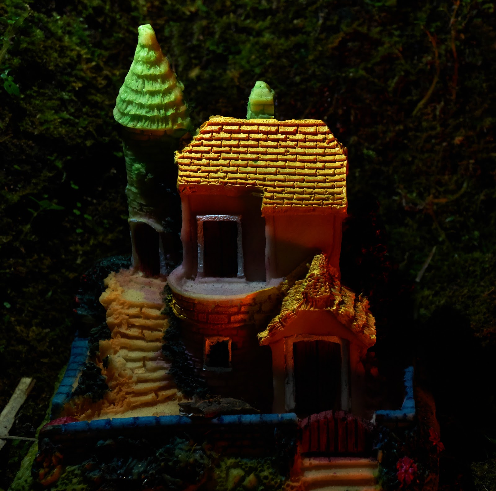
One more attempt at light painting.
-
8th February 2016, 04:31 PM #2
Re: One more attempt at light painting.
Very nice.
-
8th February 2016, 05:43 PM #3
Re: One more attempt at light painting.
Liked it; i think there should have been more light at the main entry door in the ground floor

-
8th February 2016, 08:09 PM #4
Re: One more attempt at light painting.
Hi Brian,
I tend to agree with Nandakumar about it needing a little more light at the front.
Not sure if you're after any more critique; but if this were mine and I was presenting it as a finished image, there are a few things I'd do:
crop a slither off the right hand side
clone out the pale thing and stick/cable on the left hand side
Hope that's helpful, Dave
-
9th February 2016, 12:37 AM #5

- Join Date
- Oct 2013
- Location
- Philippines
- Posts
- 12,181
- Real Name
- Brian
Re: One more attempt at light painting.
Would i be posting here if I didn't hope for critique? I do have others with more light on the bottom part. It's raining today so i shall probably work on one. I could remove the plank from the left but it is just a natural for here where canals and mud make planks part of the landscape.
-
9th February 2016, 01:22 AM #6
Re: One more attempt at light painting.
Brian - the light looks like it was coming from the top in this image; the roofs of the buildings are brighter than any other part of the shot. Try bringing in the light at different angle and different places (high, low, left, right) and see how that changes the image you are getting.
-
9th February 2016, 02:17 AM #7

- Join Date
- Oct 2013
- Location
- Philippines
- Posts
- 12,181
- Real Name
- Brian

 Helpful Posts:

 Reply With Quote
