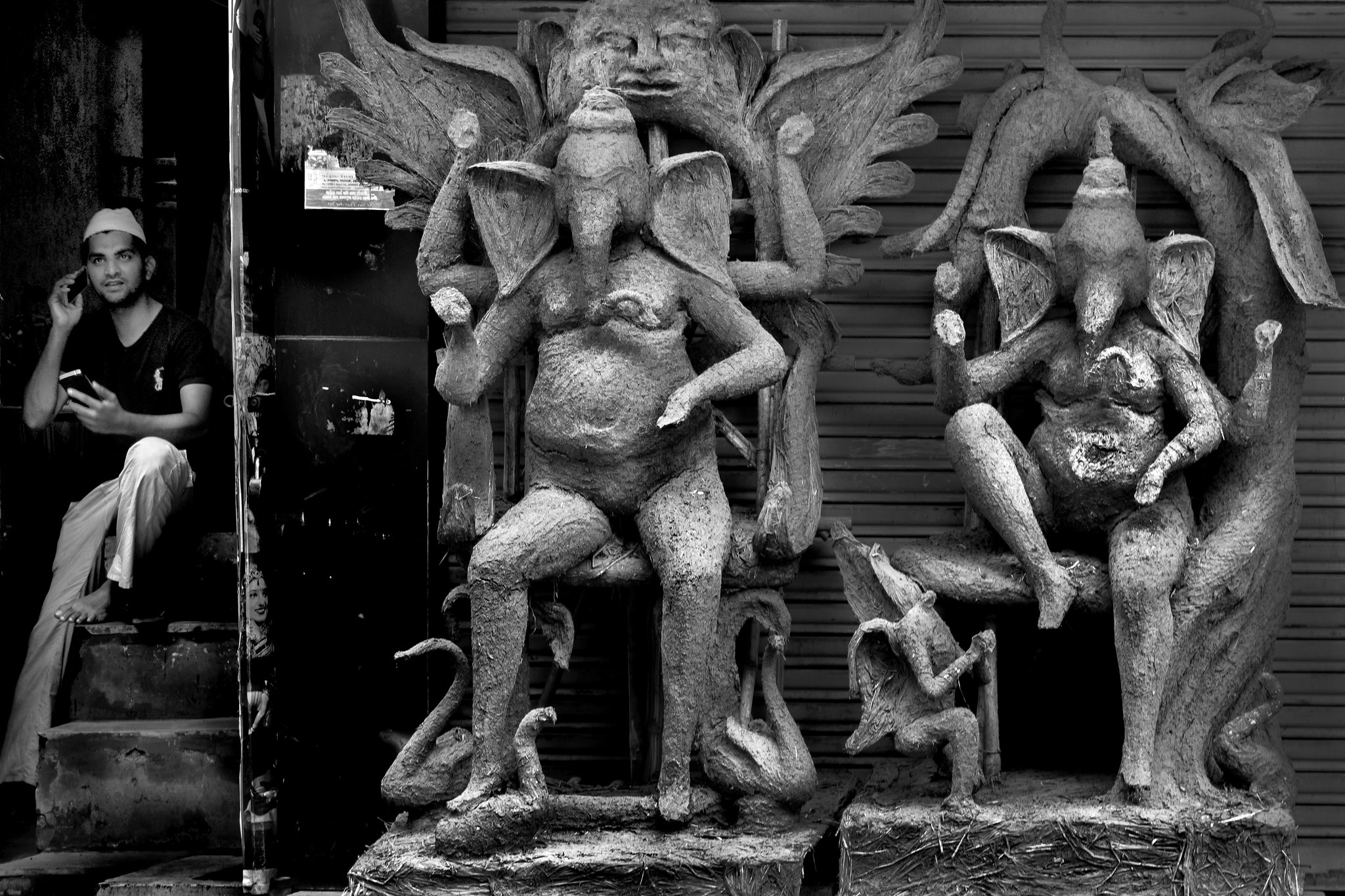
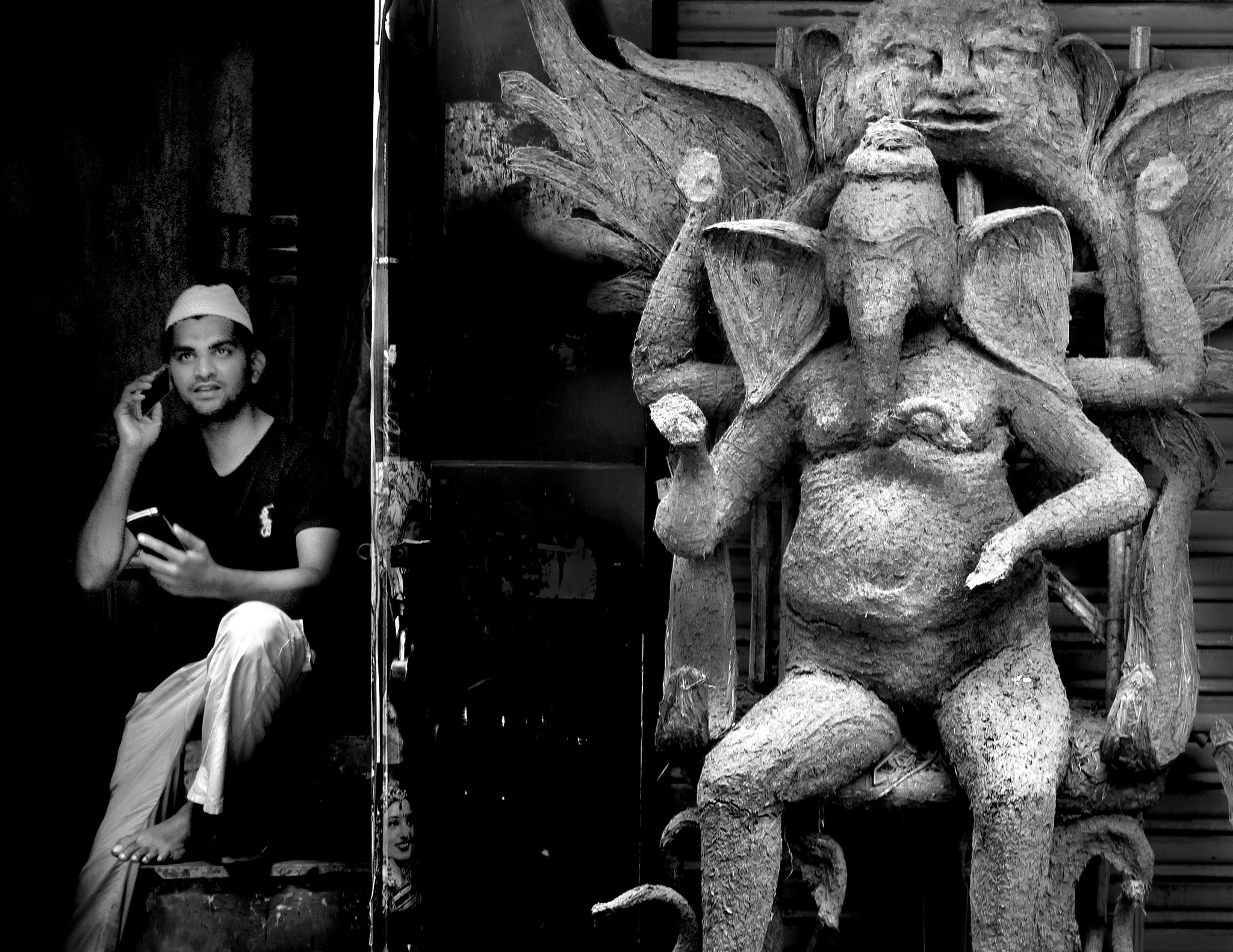
Kindly share your C&C for my below image.
Regards,
Tejal
Untitled-1 by Tejal Imagination, on Flickr
Results 1 to 15 of 15
Thread: Duo - C&C are welcome
-
17th October 2016, 08:37 AM #1
Duo - C&C are welcome
-
17th October 2016, 08:49 AM #2
Re: Duo - C&C are welcome
Interesting concept, composition a bit off though, would've worked better if Ganesh were in full view. Nice conversion.
-
17th October 2016, 09:01 AM #3
Re: Duo - C&C are welcome
Thank you John. Original frame is here -

Untitled-1 by Tejal Imagination, on Flickr
-
17th October 2016, 09:03 AM #4
Re: Duo - C&C are welcome
Hi Tejal,
I like this version more than the first. Must be that unwritten rule about three subjects rather than two.
-
17th October 2016, 09:08 AM #5
-
17th October 2016, 09:10 AM #6
-
17th October 2016, 09:13 AM #7
-
17th October 2016, 03:52 PM #8

- Join Date
- Jul 2016
- Location
- Ireland
- Posts
- 2,195
- Real Name
- Maurice
Re: Duo - C&C are welcome
Original much better. I like it.
-
17th October 2016, 05:43 PM #9
-
18th October 2016, 10:31 PM #10
Re: Duo - C&C are welcome
I like the last image with the three subjects. It is really a nice piece of "street photography"...
I usually am not in favor of an image with a line of any kind from top to bottom because it separates the image into two distinct portions. However, with his image, it works perfectly...
-
18th October 2016, 10:53 PM #11
Re: Duo - C&C are welcome
I prefer the image with three figures. There is something about odd numbers and the photograph that seems to work. Yes the figures are dominant in size and they are lighter in tone which attracts the eye (more visual weight), but don't underestimate the power of a human figure to ""outweigh" every other element in the image (within reason of course). The eye here may start with the idols, but will be pulled strongly to the human form. In this case in the opposite direction to that which the eye naturally want to travel, so it also introduces a tension. The human figure can come as a nice little surprise which draws more emotional connection and holds the viewers attention for that much longer. It's like, "oh nice shot of the Hindu gods, cool texture and tone... oh look a person! Oh look he's in the same position as the idols, great timing! How clever!... Hmm let me think about this idea more deeply for a while etc." Sure the right foot of the guy could have been included, but hey, you're only human and the strength of this image is testimony that a great idea always trumps perfect technical application of no idea.
I think this is a very well composed and intentional image (original). Congratulations, well done!Last edited by Hans; 18th October 2016 at 10:58 PM.
-
19th October 2016, 04:45 AM #12
-
19th October 2016, 04:52 AM #13
Re: Duo - C&C are welcome
Thank you Pete for your comment. The human was standing bit inside in a room kind of place and the idols were outside. He was not much visible. I have opened the shadow to make it bit more visible. The edge where the pic ends in left, there was a door. So there was no dark space in left, which i have increased (in PP) in my original post with only two figures. (Since all of you liked the one with 2 figures now i will increase dark space in that frame in PP).
Thanks once again .
.
-
19th October 2016, 08:27 AM #14
Re: Duo - C&C are welcome
Hi Tejal,
I also much prefer your original, as shot, framing and Pete has explained why, very well.
If this were mine, I would, as you have recently said, deal with some issues in the door area between the idols and the human, but I'd also subtly dodge and burn various parts of the image to improve our perception of the overall scene.
e.g.
slightly brighten parts of the human
slightly dim the edge of the division between the human and idols
slightly dodge and burn parts of the right hand idol
I might even add a little canvas to the left hand side, filled with basically black (but some cloned content), to just move the human away from 'touching' the edge of frame.
HTH, Dave
-
19th October 2016, 08:47 AM #15

 Helpful Posts:

 Reply With Quote
 .
.
