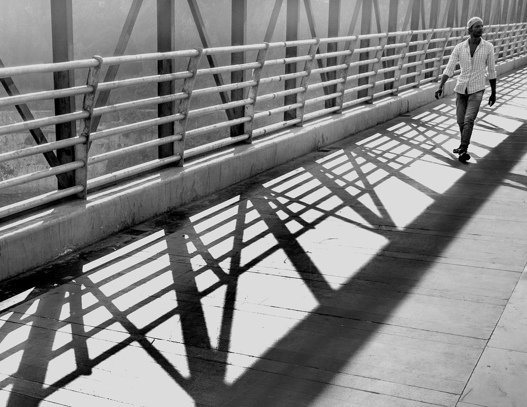
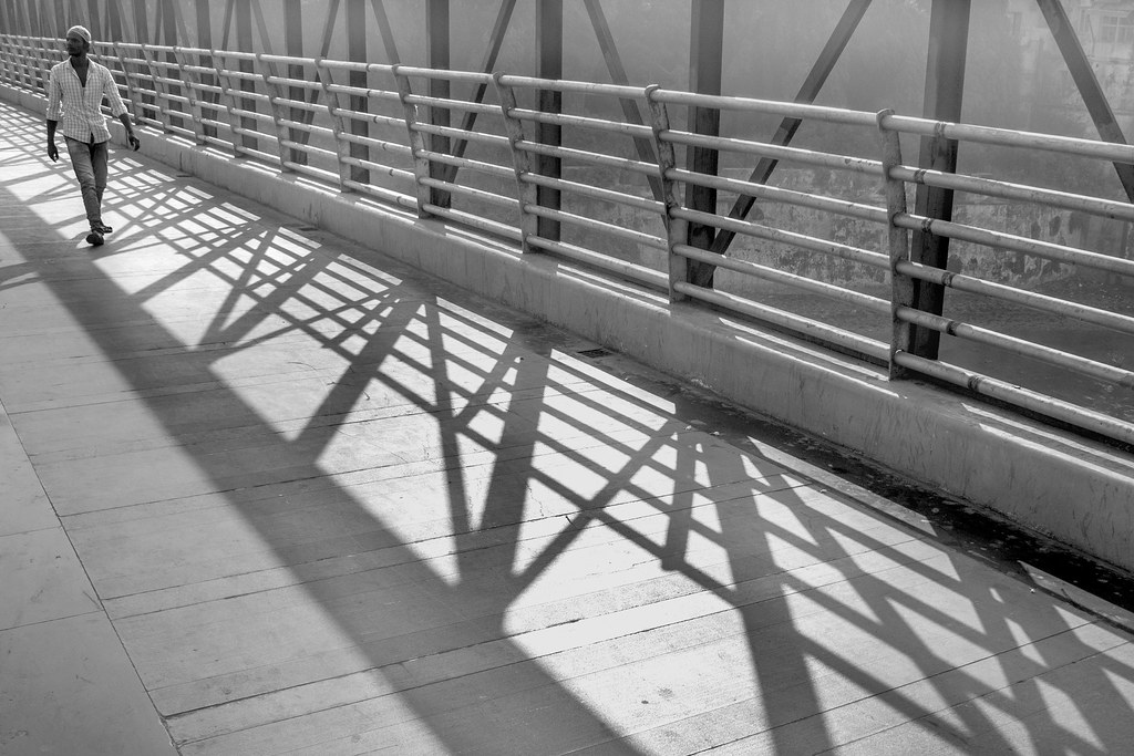
Kindly share your C&C for my below image.
Regards,
Tejal
x by Tejal Imagination, on Flickr
Original frame :
IMG_2597 by Tejal Imagination, on Flickr
Results 1 to 19 of 19
-
7th December 2016, 08:34 AM #1
On the bridge- C&C are welcome !!
-
7th December 2016, 09:35 AM #2
Re: On the bridge- C&C are welcome !!
Is it an illusion or does the first one seem to have a bit more contrast? I think it's the feeling of more contrast that draws me to the first one, however the cropping at top seems a bit severe; yet it could add to one's interpretation that the weight of the world is on his shoulders.
-
7th December 2016, 10:13 AM #3
-
7th December 2016, 07:14 PM #4
-
7th December 2016, 07:29 PM #5

- Join Date
- Jan 2009
- Location
- South Devon, UK
- Posts
- 14,547
Re: On the bridge- C&C are welcome !!
Works OK but I wonder about keeping the original size ratio; possibly crop slightly tighter than the original size but same ratio.
Somehow or other, your crop loses a bit of the scene 'depth' and the increased contrast make that more noticeable.
-
7th December 2016, 11:06 PM #6

- Join Date
- Jul 2016
- Location
- Ireland
- Posts
- 2,195
- Real Name
- Maurice
Re: On the bridge- C&C are welcome !!
Nicely done.
-
8th December 2016, 06:03 AM #7
-
8th December 2016, 06:20 AM #8
-
8th December 2016, 06:21 AM #9
-
8th December 2016, 06:52 PM #10

- Join Date
- Dec 2013
- Location
- Turkey
- Posts
- 12,779
- Real Name
- Binnur
Re: On the bridge- C&C are welcome !!
The original frame has more depth Tejal

-
9th December 2016, 04:07 PM #11
Re: On the bridge- C&C are welcome !!
Tejal, I have come back to this image several times. I think what bothers me is that the subject is so close to the edge of the frame and is looking out of the frame. This seems to lead my eye away from the image...
I think that I would really like the original image better if the subject had been looking into the image - more toward image right!
-
9th December 2016, 06:01 PM #12

- Join Date
- Dec 2012
- Location
- Alaska
- Posts
- 7,604
- Real Name
- Dan
Re: On the bridge- C&C are welcome !!
IMO the original comp gives a better sense of scale and location. Second is more about the person. So which is the subject?
-
9th December 2016, 06:06 PM #13
Re: On the bridge- C&C are welcome !!
The first image posted is, to me, the more interesting. He seems very isolated, not connecting with anything we can see, up above everything, and even treading on shadows. I like this though I would like just a tiny more space above his head. Other comments seem valid depending on your purpose. We each have our own aesthetic.
-
10th December 2016, 02:04 AM #14
Re: On the bridge- C&C are welcome !!
Just my opinion, so take it or leave it.
@#1: The image has lots of structure (triangles, lines, contrast), rhythm (pattern), movement (diagonals) and tonal contrast. It is also a simple composition which is a good thing. It also seems to work in all four quadrants with something in each. If you cut the image in half either horizontally or vertically, it is still an image of some sort of design. B&W works well. The focal point, even though the supportive space is busy and strong, is obvious. So well done on all those things.
I am agitated and uncomfortable looking at it. The dude looks lost, confused, disorientated, alone. The cutting off of the space he is looking into does that for me. He is also squeezed up into the top corner and really draws attention and creates a strong feeling of unease for me. My eyes first go to the centre left, then straight up the top right and back the start and back up again so the eye path is very linear from bottom left to top right. almost an anxious pattern. So there is an element of imbalance here for me.
I like the crop in #2 better to reinforce all of these ideas for me. Focal point is smaller and more isolated. I like the contrast in #1 though.
So, if that is what you were intending me to feel, well done I think you might be aware of much of this though.
Thanks for sharing and take care.
Kind regards,
Pete
-
10th December 2016, 03:51 AM #15
-
10th December 2016, 03:54 AM #16
-
10th December 2016, 03:55 AM #17
-
10th December 2016, 03:56 AM #18
-
10th December 2016, 03:57 AM #19

 Helpful Posts:


 Reply With Quote
