Results 1 to 20 of 30
-
27th November 2017, 06:11 AM #1

- Join Date
- Oct 2013
- Location
- Philippines
- Posts
- 12,181
- Real Name
- Brian
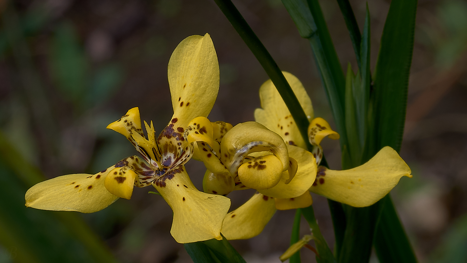
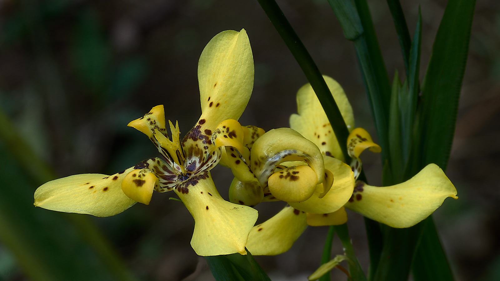
M'Lady says my brights should be brighter: I'm working on it
-
27th November 2017, 07:26 AM #2
Re: M'Lady says my brights should be brighter: I'm working on it
very nice ...and your lady said it right

-
27th November 2017, 07:53 AM #3

- Join Date
- Oct 2013
- Location
- Philippines
- Posts
- 12,181
- Real Name
- Brian
-
27th November 2017, 09:17 AM #4
Re: M'Lady says my brights should be brighter: I'm working on it
Nice shot.
-
27th November 2017, 11:29 AM #5

- Join Date
- Aug 2014
- Location
- Melbourne, Australia
- Posts
- 3,012
- Real Name
- Ole
Re: M'Lady says my brights should be brighter: I'm working on it
Brian, background is good. M'lady is right.
Cheers Ole
-
27th November 2017, 12:03 PM #6

- Join Date
- Oct 2013
- Location
- Philippines
- Posts
- 12,181
- Real Name
- Brian
-
27th November 2017, 01:30 PM #7
Re: M'Lady says my brights should be brighter: I'm working on it
-
27th November 2017, 01:45 PM #8
Re: M'Lady says my brights should be brighter: I'm working on it
Nice composition. However, when I blow it up in the litebox (lytebox? light box?), it seems oversharpened. There are some halos around many of the edges, and it looks a little crunch in places.
-
27th November 2017, 02:00 PM #9

- Join Date
- Oct 2013
- Location
- Philippines
- Posts
- 12,181
- Real Name
- Brian
-
27th November 2017, 02:02 PM #10

- Join Date
- Oct 2013
- Location
- Philippines
- Posts
- 12,181
- Real Name
- Brian
-
27th November 2017, 04:19 PM #11
Re: M'Lady says my brights should be brighter: I'm working on it
People often use the word "Crunchy" to refer to the odd, harsh and exaggerated textures one can get with too much sharpening. I am taking a break at work and don't have software here, so I can't send you an example. However, when I look at yours in the litebox, I think I see this in several places on the petals toward the left.
This is one reason why most people recommend adjusting sharpening at 100% (although I start there and go down to 1:2). At that enlargement, one can easily see halos and crunchiness as they appear and decide how much of them, if any, one is willing to accept.
-
27th November 2017, 09:54 PM #12
-
27th November 2017, 11:41 PM #13

- Join Date
- Oct 2013
- Location
- Philippines
- Posts
- 12,181
- Real Name
- Brian
-
28th November 2017, 06:48 AM #14

- Join Date
- Oct 2013
- Location
- Philippines
- Posts
- 12,181
- Real Name
- Brian
-
28th November 2017, 08:25 PM #15
Re: M'Lady says my brights should be brighter: I'm working on it
Last one has gone too green Brian

-
29th November 2017, 12:31 AM #16

- Join Date
- Oct 2013
- Location
- Philippines
- Posts
- 12,181
- Real Name
- Brian
-
29th November 2017, 12:36 AM #17
Re: M'Lady says my brights should be brighter: I'm working on it
Brian,
I wonder if you are trying to do more than you need to. There is no reason why brightening should change the color. Just select the flower and then do one of two things:
--use a curves adjustment, and pull the upwards somewhere around the middle. You can play with where you pull, but the main issue is how far you pull.
--use a levels adjustment, and move the midpoint.
There are fancier things one can do, but either of these will brighten the image without changing color. I used the first for my edit.
Dan
-
29th November 2017, 02:00 AM #18

- Join Date
- Oct 2013
- Location
- Philippines
- Posts
- 12,181
- Real Name
- Brian
-
29th November 2017, 02:03 PM #19
Re: M'Lady says my brights should be brighter: I'm working on it
Brian,
I'm going to make a general suggestion. I hope you find it helpful.
If I recall, you have posted a number of comments like this one, focusing on the software package. The issue here is not the specific software package. The main contenders do differ in some respects, but the core, basic editing approaches are similar and in some cases identical from one package to the next. There are some differences, of course, but these aren't the issue here.
In this case, there are two essential steps:
1. Select the area on which you want to effect changes--either create a mask or apply adjustments locally in some other way.
2. change the tonality (brightness)
Regardless of the software, these changes should not change the color balance.
I don't use capture 1, but I just googled, and it includes the same conventional tools for #2 that I used in Photoshop: a curves tool and a levels tool. (Lightroom lacks a levels tool, but you don't use that anyway.) I assume that Capture 1 has selections or masks, or some other way of making local adjustments.
So I think for the purposes of this thread--not for many other questions--the choice of software is really a bit of a distraction. The question you posed is about brightness, and you can adjust that in similar ways regardless.
Dan
-
29th November 2017, 07:01 PM #20
Re: M'Lady says my brights should be brighter: I'm working on it
+1 to Dan's comments, Brian. You are doing something other than just adjusting the brightness here as there is definitely a bit of a colour shift.
As for what Dan mentions with regard to the different software packages; Capture One is a bit different than ACR / Lightroom as it is purely driven by ICC profiles, as part of the underlying design. This comes a bit from the "roots" of Capture One; it is developed by the Phase One company that is well known for its digital backs and cameras that are largely used in the publishing market, so supreme colour fidelity for what was largely a paper print based industry flavoured its development. This adherence to ICC profiles restricts how edits are handled..
As an occasional Capture One user (mostly because it does tethered capture better than other software), the only thing I miss is the "Clarity" slider found in ACR / Lightroom. Everything else is well aligned with other editing packages, although its user interface takes some time to get used to.

 Helpful Posts:

 Reply With Quote


