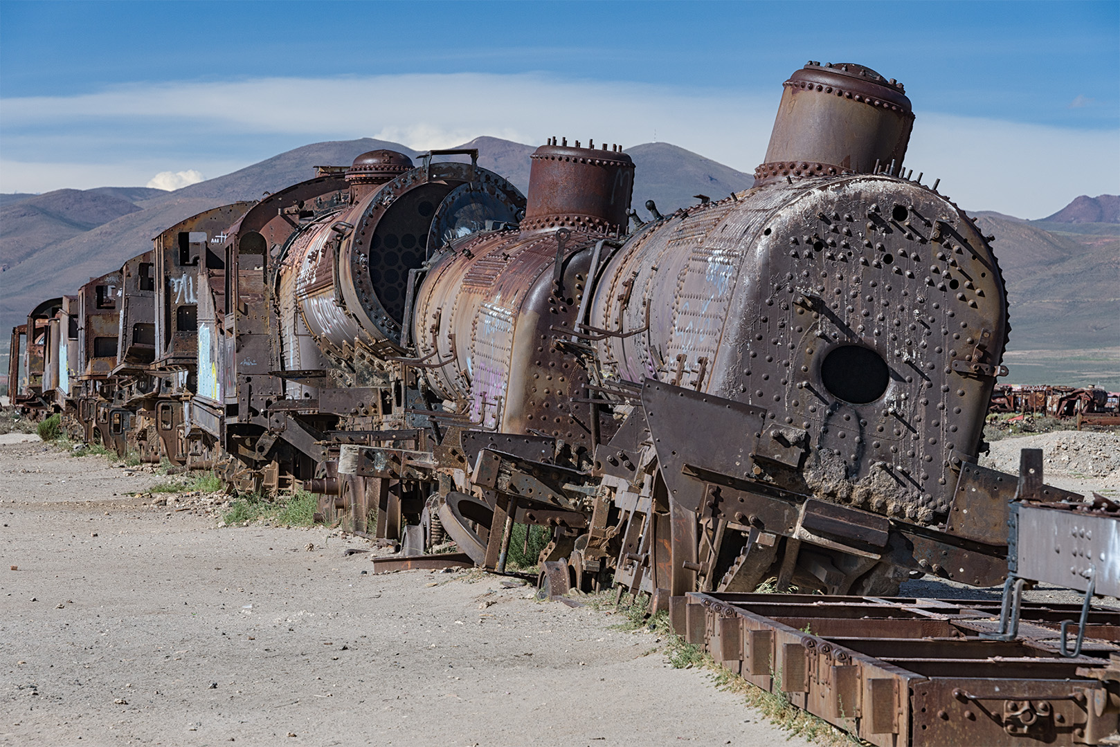
This has been our last full day in Bolivia and we will be starting our long journey home tomorrow morning. We spent the past three days in a very remote part of the country; in the mountainous, desert part of Bolivia close to the border with Chile.
One of my favourite spots was the train graveyard at the town of Uyuni. This is one of many images that I too and suspect I will stick with my original vision that B&W is the way to go with this subject.
Results 1 to 17 of 17
Thread: Train Graveyard
-
17th March 2019, 10:11 PM #1
Train Graveyard
Last edited by Manfred M; 25th March 2019 at 03:44 AM.
-
18th March 2019, 12:07 AM #2

- Join Date
- Aug 2016
- Location
- west midlands
- Posts
- 726
- Real Name
- les norman
Re: Train Graveyard
What a great picture
-
18th March 2019, 12:20 AM #3
Re: Train Graveyard
I like it in black & white. I think it shows deterioration better although I would like to see a color version.
-
18th March 2019, 12:23 AM #4

- Join Date
- Aug 2014
- Location
- Melbourne, Australia
- Posts
- 3,008
- Real Name
- Ole
Re: Train Graveyard
Just great.
Cheers Ole
-
18th March 2019, 12:45 AM #5
-
18th March 2019, 02:00 AM #6
-
18th March 2019, 02:07 AM #7

- Join Date
- Aug 2014
- Location
- Melbourne, Australia
- Posts
- 3,008
- Real Name
- Ole
Re: Train Graveyard
Black & white version is so much better. Colours can be very nice, even vibrant. I find B&W versions in many cases has that extra punch to them.
Cheers Ole
-
18th March 2019, 02:17 AM #8

- Join Date
- Jun 2013
- Location
- Abbotsford, BC Canada
- Posts
- 2,362
Re: Train Graveyard
This is great. I do agree that B&W is the way to go, the colour version loses something.
-
18th March 2019, 03:09 AM #9
Re: Train Graveyard
I find that photographers tend to have an affinity to either B&W or colour work. I personally am drawn to colour as I find it to be more challenging than B&W. That being said, I also recognize the B&W will be superior in certain cases because it both simplifies the image and adds a level of abstraction to the piece.
I generally make this assessment at time of capture and rarely change my mind when I get to post. When I saw the setting, the broad tonal range and age of the trains (late 1800s) suggested that this was the right way to go. I captured quite a few images at this site and suspect I will end up with somewhere between 6 and 10 large format prints.
-
18th March 2019, 03:17 AM #10
Re: Train Graveyard
The B & W version is a very nice image but it does not show the corrosion that is taking place very well which to me is an important component of old equipment graveyards. It looks somewhat like a sanitized image and is therefore not as strong as the colour version.
-
18th March 2019, 03:29 AM #11
Re: Train Graveyard
It depends on what one is trying to achieve with the image. If one is trying to show the level of corrosion that has occurred in a high altitude desert environment over the past 120 years, then I would be tempted to agree. If one is trying to show the current condition of the trains in a more aesthetic way, then B&W is a a more suitable approach.
-
18th March 2019, 08:02 AM #12
Re: Train Graveyard
If anything, I find the position of the distant mountains slightly jarring and a lower or higher viewpoint may have avoided this occurring. I love the skies in the colour version and feel that along with the corrosion, give great context to the shot. Whilst the old boilers might date from the days of black and white photography, and such rendering is often used to create a feeling of the past, the location comes across better in colour.
-
18th March 2019, 12:45 PM #13
Re: Train Graveyard
I envy you this. I can only assume you spent a considerable time working the area. Massive amount of variability available.
I like both images. As you have said, or implied, they are different in intent and character. The decision to go for one version is artistic.
-
18th March 2019, 01:04 PM #14New Member

- Join Date
- Mar 2019
- Posts
- 5
Re: Train Graveyard
I'm a newbie here and I don't see a photograph. Do I need to post a certain amount to see others?
-
18th March 2019, 01:53 PM #15
-
18th March 2019, 02:42 PM #16New Member

- Join Date
- Mar 2019
- Posts
- 5
-
18th March 2019, 07:49 PM #17
Re: Train Graveyard
Absolutely, and you as the photographer is the only one who knows for sure what that is. As a viewer, I interpreted your image as depicting the underlying concept of decay of man made objects abandonned in a natural environment. My comments were aimed at emphasizing that interpretation. However, it is your picture. The B&W version is certainly a better representation of your original concept of depicting old machinery in an aestetic way. You could add a hint of sepia toning to the B&W to emphasize the concept of "old". That would result in yet another interpretation. Not necessarily better nor worst, just different. The choice will always remains yours.
As an aside, I find that the limited palette in the colour version ties the natural and man-made elements very well.

 Helpful Posts:

 Reply With Quote


