Looks good to me.
I suspect that angle has somewhat 'shortened' the apparent engine length so the actual distance between front of the engine and driver would naturally cause a little softening of focus by that point when using F8. Not really a problem for me because gradual focus softening helps with the perspective.
Results 61 to 80 of 93
Thread: Project 52 - Q3 - David (Rufus)
-
3rd September 2019, 08:11 PM #61

- Join Date
- Jan 2009
- Location
- South Devon, UK
- Posts
- 14,552
Re: Project 52 - Q3 - David (Rufus)
-
3rd September 2019, 09:01 PM #62

- Join Date
- Feb 2016
- Location
- Cambridge, UK
- Posts
- 928
- Real Name
- David
Re: Project 52 - Q3 - David (Rufus)
Thank you for your comments. A bit more history and enginneering detail, courtsesy of the preservation society... The total number built was 251. The last of the class, 92220 Evening Star, was the final steam locomotive to be built by British Railways, in 1960. Withdrawals began in 1964, with the final locomotives removed from service in 1968. There were many problems associated with locomotives of such a long wheelbase, but these were solved by the design team through a series of compromises. The driving wheels were 5 feet 0 inches (1.5 m) in diameter, and the centre driving wheels were without flanges, whilst those on the second and fourth coupled wheels were reduced in depth. This enabled the locomotive to round curves of a radius as small as 400 feet (120 m).
I, too, remember seeing steam locos as a lad. The railway track ran at the bottom of the gardens of the houses across the road from us. I remember hearing them as I tried to go to sleep, as there was a goods marshalling yard not that far away and there was often the sound of engines suffering from wheel slip and then recovering as sand was applied to the rails.
The subject this week was indeed moving slowly as it drew into the station. I considered using a little rotational blur on the wheels; but I need to experiment some more with that as my hasty efforts so far have been unconvincing.
My intention is to select each individual wheel excluding the smooth outer rim, apply the rotational blur and then paint out the connecting rods and any non-wheel items that overlap the wheel; and use one layer per wheel.
If I can do that satisfactorily (my standards of necessity will be lower than yours ) then I will do some dodge and burn on the loco and improve the colour of the carriages. I shall leave the sky as it is because I have already replaced what was an extremely plain largely overcast sky.
I think I could learn a lot from this excercise if I can devote enough time to it.
-
3rd September 2019, 09:38 PM #63

- Join Date
- Feb 2016
- Location
- Cambridge, UK
- Posts
- 928
- Real Name
- David
Re: Project 52 - Q3 - David (Rufus)
Thank you Bruce and Geoff for commenting.
As I have not yet practised shooting moving subjects with the focus/subject tracking options I have limited myself to focusing on single points or areas. On this occasion the locomotive was moving slowly enough for me to either focus on the train (which probably means the front of it) or, as I think happened here, I focused on a person out of view, recomposed and waited for the train to arrive at that point.
I selected the shutter speed to mitigate the effect of camera shake and F/8 as the largest sized aperture that the desired depth of would permit (I agree a smaller aperture/higher f/ number would have been better) and ISO was on auto. I had tested what ISO the camera would use before the train arrived and it was as high as I wanted to go to. In the event it went a bit higher still .
.
Have I produced a sufficiently sharp image in line with this quarter's objective? I think I probably did reasonably well as the front portion is in focus and the focus further in does not fall off too dramtically.
-
10th September 2019, 12:10 PM #64

- Join Date
- Feb 2016
- Location
- Cambridge, UK
- Posts
- 928
- Real Name
- David
Re: Project 52 - Q3 - David (Rufus)
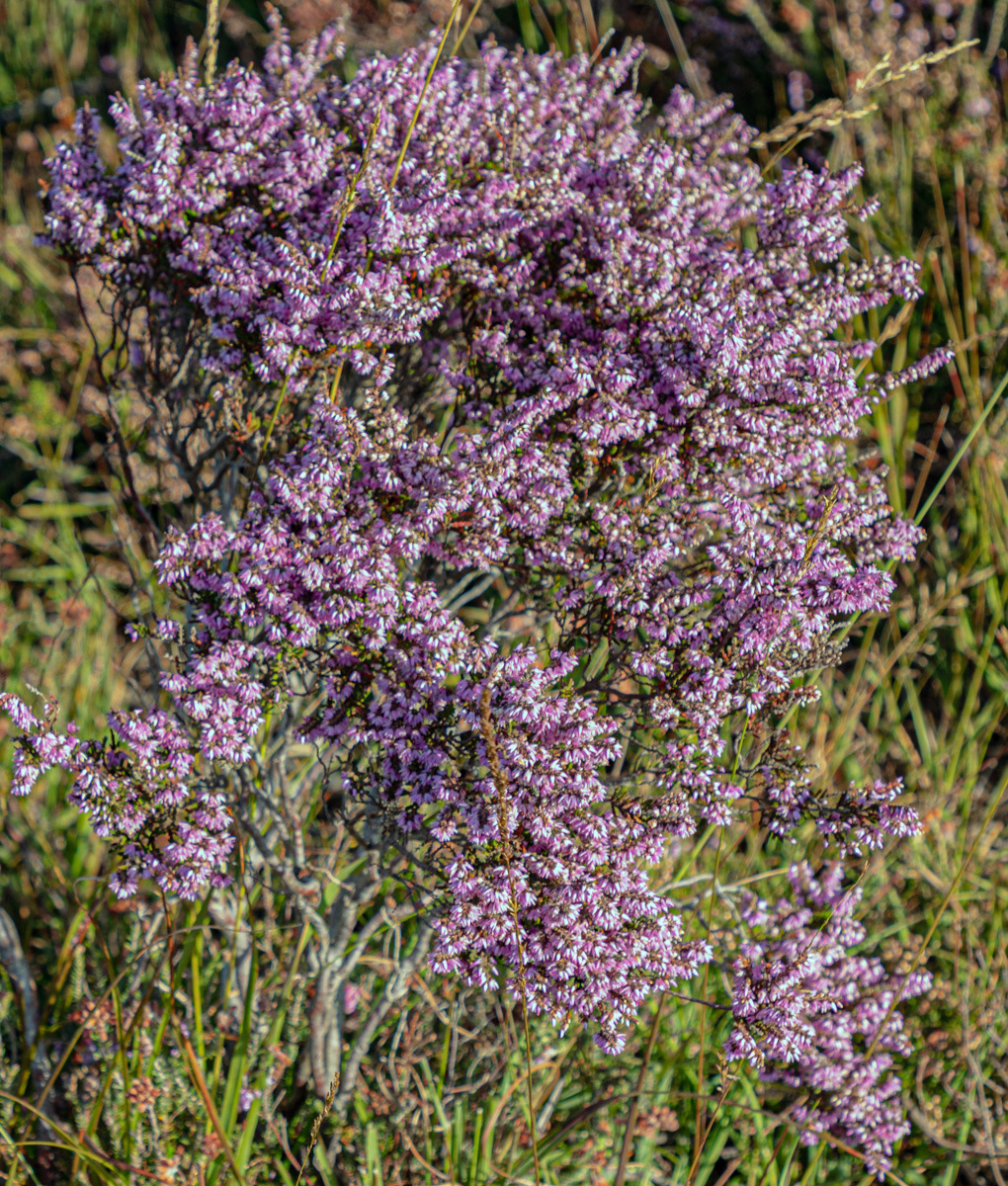
Week 36. This was not a very productive week with some poor images in terms of both content and sharpness, as I fear the image below illustrates. The morning light was low-ish and gave some modelling to the flowers but they lack sharpness. It was hand held so camera shake or poor focusing must be the cause.
#82 - Heather (1/90sec - f6.7 - ISO 100 - zoom set at 70mm):
-
10th September 2019, 07:40 PM #65

- Join Date
- Jan 2009
- Location
- South Devon, UK
- Posts
- 14,552
Re: Project 52 - Q3 - David (Rufus)
Too big a subject to tackle in one image, David.
I find that it is better to concentrate on just a few flowers; although sometimes it is possible to include more of the whole plant/plants gradually fading into the distance.
Virtually impossible to get everything well focused when suitably close to show any detail. Exposure is another tricky problem with so many different individual flowers giving different light angles. So you end up with some parts in shadow with others being over exposed; particularly when shooting in sunshine.
I have tried this sort of thing many times, using a tripod and around F11 to F16, but I have very few successful images to show for my efforts. Bluebells are a subject which I try every year but I have had very little success. My best results have been when there was another main subject item and the flowers were just a background so I could get a bit of distance between my camera and subject with a fairly narrow aperture to improve focus depth.
-
10th September 2019, 09:01 PM #66

- Join Date
- Feb 2016
- Location
- Cambridge, UK
- Posts
- 928
- Real Name
- David
Re: Project 52 - Q3 - David (Rufus)
I take some comfort from the fact that you find this a difficult type of subject.
My thought process was that I had found a small isolated plant to fill the frame, albeit not well visually seperated from its surroundings, and there was some variation in lighting of the tiny flowers which I hoped would provide some texture. I realised this was not a good image but posted it anyway as it is helpful to understand why it turned out that way. Thank you for looking and commenting Geoff as you have helped me with that understanding.
Edit: The image also has no compositional strengths, but that was okay by me as my objective for this quarter is to obtain acceptably sharp images.
-
10th September 2019, 10:07 PM #67
Re: Project 52 - Q3 - David (Rufus)
Week 36, foliage usually foils me as well, nice effort but most of subject is very soft.
-
10th September 2019, 10:56 PM #68

- Join Date
- Feb 2016
- Location
- Cambridge, UK
- Posts
- 928
- Real Name
- David
-
12th September 2019, 02:07 AM #69
Re: Project 52 - Q3 - David (Rufus)
A lovely bunch of lilac flowers....
-
12th September 2019, 12:59 PM #70

- Join Date
- Feb 2016
- Location
- Cambridge, UK
- Posts
- 928
- Real Name
- David
-
20th September 2019, 09:44 AM #71

- Join Date
- Feb 2016
- Location
- Cambridge, UK
- Posts
- 928
- Real Name
- David
Re: Project 52 - Q3 - David (Rufus)
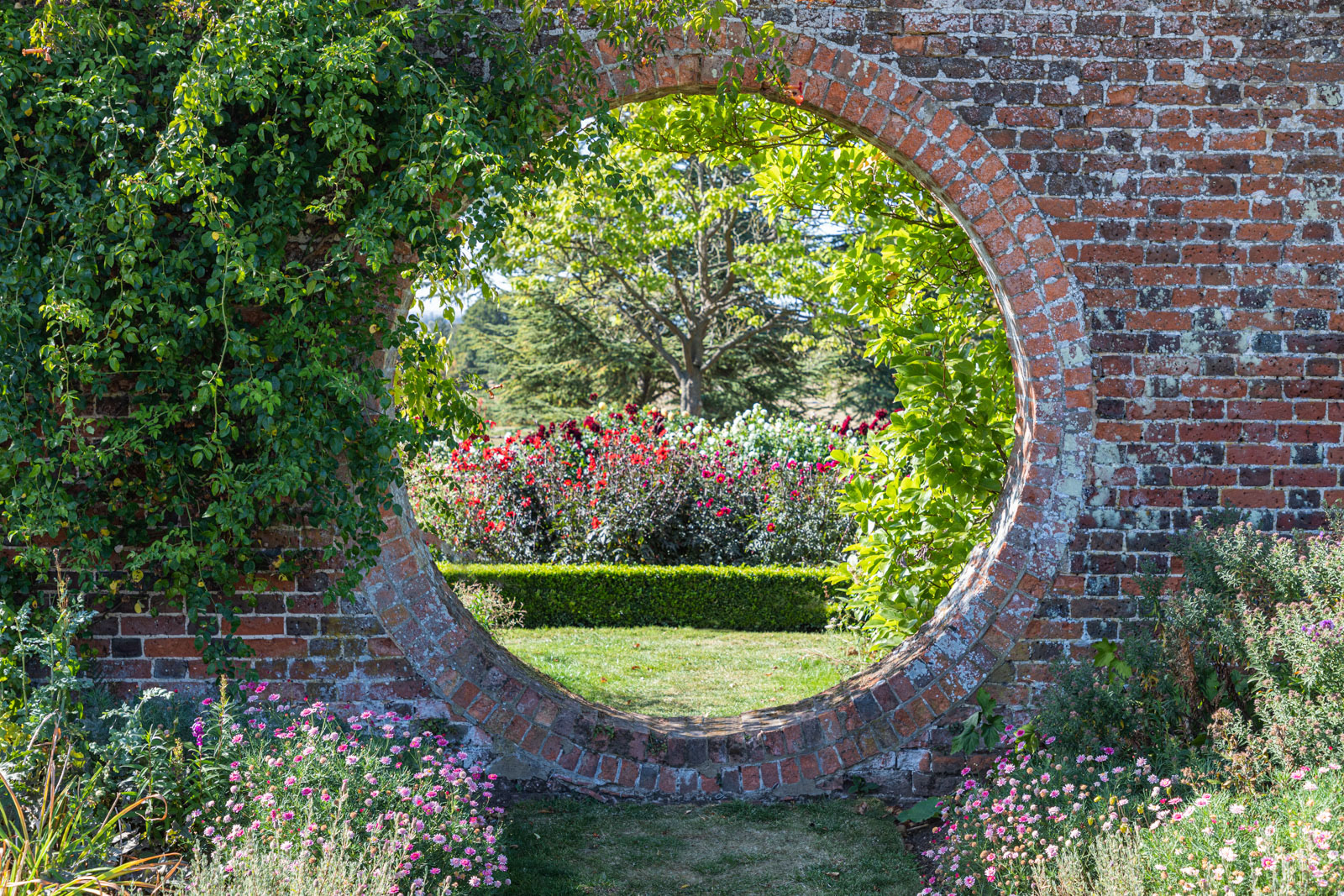
Week 37 - The image for this week is of a hole in a wall

The wall is in focus as it is the main subject, as well as a framing device, while the distant scarlet and burgundy dahlias in the distance are in softer focus.
I think it would be better with the bottom cropped tighter to remove, say, two-thirds of the foreground grass.
#83 - Walled Garden (1/125 Sec - f5.6 - ISO 100 - zoom set at 50 mm):
-
20th September 2019, 09:54 AM #72
Re: Project 52 - Q3 - David (Rufus)
Nice effort on week 37, composition does have great possibilities, is it possible to return at different hours of the day?
-
20th September 2019, 10:21 AM #73

- Join Date
- Feb 2016
- Location
- Cambridge, UK
- Posts
- 928
- Real Name
- David
Re: Project 52 - Q3 - David (Rufus)
Thank you for commenting. Sadly, the location is not in our vicinity, but could be a stopping-off point in the future en route to visiting family.
The wall was in flat light in the shade on this occasion, and lacks some "pop", and a different time of day might well help with that. I like the distant tree in the top half of the circle, and the height of the dahlias helps the composition. The scene could be quite different earlier in the year.
-
20th September 2019, 02:36 PM #74
-
20th September 2019, 03:19 PM #75

- Join Date
- Feb 2016
- Location
- Cambridge, UK
- Posts
- 928
- Real Name
- David
Re: Project 52 - Q3 - David (Rufus)
[QUOTE=Manfred M;741299] David - I think the grass is needed to act as a frame for the hole in the wall, but it needs to be tamed a bit by burning it down.
The centre foreground grass had suffered wear and tear of people looking through the hole in the wall. I reduced the impact of that by burning the area and cloning over the paler, browner patches.
Now that you have demonstrated the effect of burning the plants in the bottom corners as well, the benefit is immediately obvious: their flowers are more apparent and the balance of scene is much improved. I do appreciate these insights.
-
22nd September 2019, 11:13 AM #76

- Join Date
- Feb 2016
- Location
- Cambridge, UK
- Posts
- 928
- Real Name
- David
Re: Project 52 - Q3 - David (Rufus)
I have taken on board Manfred's comments and re-edited my image to burn down the corners, increase the contrast in the brickwork and tweak the view beyond the circular hole.
I shall be interested to see on screen how these edits compare to Manfred's.
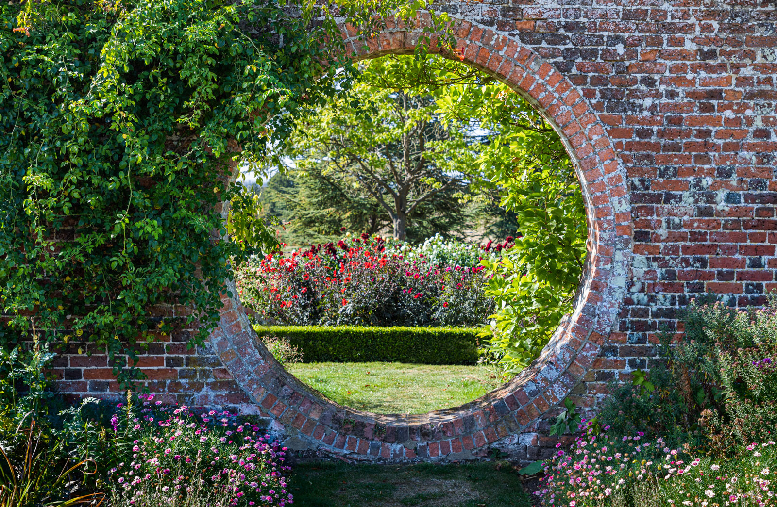
(BTW - I realise now that my original image on this thread may end up being replaced by the updated version as I have substituted the new one for the original in Adobe Portfolio. If so, apologies in advance for any confusion.)
-
22nd September 2019, 12:48 PM #77

- Join Date
- Feb 2016
- Location
- Cambridge, UK
- Posts
- 928
- Real Name
- David
Re: Project 52 - Q3 - David (Rufus)
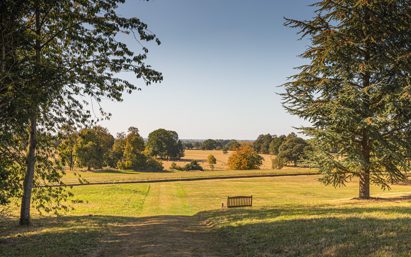
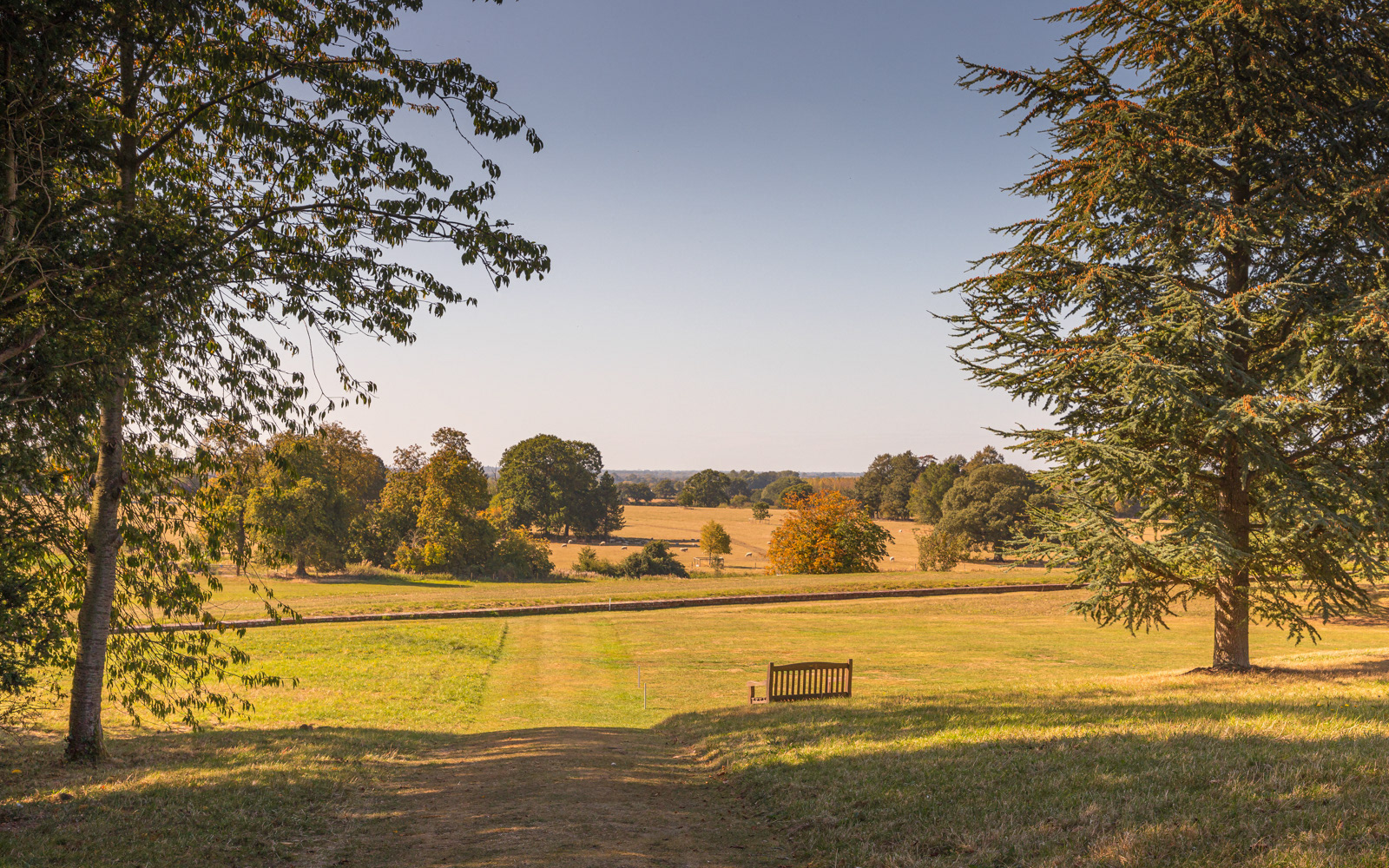
Week 38 This week I have a landscape view which I found to be an interesting one to critique.
I like the trees on the left and right that give foreground interest and, along with the foreground shadows, frame the distant view. I like the simplicity of the empty seat that gives some central interest.
Moving further into the image, I initially felt the straight line, which demarcates the end of the terrace, served only to cut the image in two; but then I decided it actually helps to define the foreground and the distance.
Unfortunately, the distant view is flat and lacks interest despite the various shapes, sizes and colours of the far-off trees.
As for the sky, well I toyed with cropping some of it out because it is cloudless and accounts for a significant percentage of the image, but on balance I preferred to keep it as I thereby also retained the structure and size of the foreground trees.
Finally, I tried two edits: one largely as shot and one with more of a "golden hour" look.
Your comments (on the images or my critique) are always welcome.
#84 Landscape (1/ 125 Sec - f9.5 -ISO 100 - zoom set at 45 mm):
#85 Landscape (re-dited for a golden hour look):
-
22nd September 2019, 06:12 PM #78

- Join Date
- Jan 2009
- Location
- South Devon, UK
- Posts
- 14,552
Re: Project 52 - Q3 - David (Rufus)
There are a couple of stray leaf bits from the left side tree just visible on the top edge.
I think, because of the cloudless sky, I would be tempted to crop tighter at the top and go to a panoramic size ratio. Maybe also lose just a fraction of the foreground shadow area ?
Probably depends on whether the tree height or the far distance scene are the more important to you.
-
22nd September 2019, 06:19 PM #79
Re: Project 52 - Q3 - David (Rufus)
Week 38 comment...
I'm looking at both of your edits and Ansel Adams's words "There is nothing worse than a sharp image of a fuzzy concept." comes to mind.
I'm not sure what the subject or area of interest is. The bench? Too far away. The cluster of trees in the middle ground? You don't sound to sure either.
-
22nd September 2019, 07:10 PM #80

- Join Date
- Feb 2016
- Location
- Cambridge, UK
- Posts
- 928
- Real Name
- David
Re: Project 52 - Q3 - David (Rufus)
If it is not stretching the point too far, I can take the positive view and infer that at least the image is sharp, in which case my declared objective in Q3 was achieved; but feel free to disillusion me

Exactly. That summarises my own critique. There were positive elements that I liked, but overall the image did not work well.

 Helpful Posts:
 Reply With Quote


