Results 1 to 9 of 9
Thread: Scaffold
-
8th December 2019, 08:03 PM #1

- Join Date
- Feb 2016
- Location
- Cambridge, UK
- Posts
- 928
- Real Name
- David
Scaffold
-
8th December 2019, 10:11 PM #2
Re: Scaffold
I like this David !

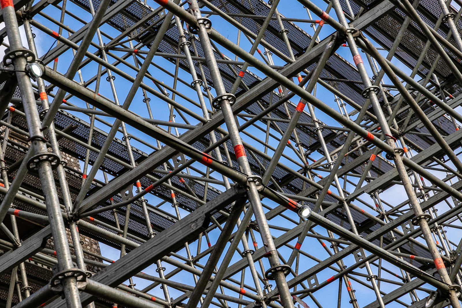
The red stripes interestingly punctuate the structure. Even if the image can be somehow confusing...
Cheers !
-
8th December 2019, 10:46 PM #3
Re: Scaffold
Sorry David, this one is not working for me.
Lots of random lines which has the potential to make an interesting image, but there is no flow. The viewer's eyes have no guidance as to how to explore this image. I wonder if a tighter crop of just some part of this structure might be worth exploring, just as a way of simplifying the concept?
-
9th December 2019, 12:56 AM #4

- Join Date
- Jan 2015
- Location
- Maryland , U.S.
- Posts
- 1,234
- Real Name
- raymond
Re: Scaffold
Many angles,interesting yet too busy for me and lacking of substance.For those that like lines and angles this is terrific.
-
9th December 2019, 05:08 AM #5

- Join Date
- Aug 2014
- Location
- Melbourne, Australia
- Posts
- 3,019
- Real Name
- Ole
Re: Scaffold
There are lots of angles to explore in this image. (I, certainly would). As it stands there are too many angles. I would cut them down and have plenty of fun.
Cheers Ole
-
9th December 2019, 06:39 PM #6

- Join Date
- Feb 2016
- Location
- Cambridge, UK
- Posts
- 928
- Real Name
- David
Re: Scaffold
Thank you for your comments everyone; I guess you have confirmed my suspicion.
I have tried several crops but cannot find a better one.
-
12th December 2019, 03:18 AM #7
Re: Scaffold
I think you could bring some life to an otherwise static theme by giving an inclination with vertical.... could have increased the contrast a it. Lacking a point to focus cannot be overlooked. Only if some worker were seen tightening some screw standing on one of the platform!!!
-
12th December 2019, 10:16 AM #8
Re: Scaffold
Don't give up! The comments are much as you would have expected but there is a possible focal point in the intersection about 2/3 of the way in from the LH edge and about 2/3 down from the top. You could also have fun going abstract and playing with the liquefy or warp tools.
-
12th December 2019, 02:42 PM #9

- Join Date
- Feb 2016
- Location
- Cambridge, UK
- Posts
- 928
- Real Name
- David
Re: Scaffold
You have motivated me to take another look, Bill.
 I tried the various distort filters, as I have not investigated them previously. This one (wave) seems to bring out the abstract elements, but it seems even busier; so all the earlier comments probably still apply. I can see how this might be used in future if I can cultivate some artistic ability.

 Helpful Posts:

 Reply With Quote

