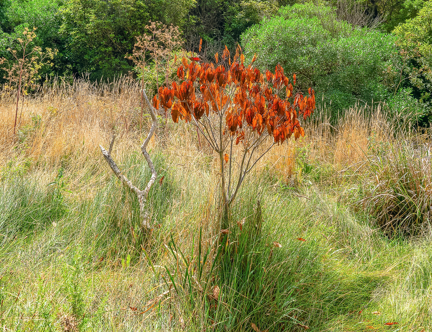
I really liked the colour combination in this scene with the bush so prominent. C&C welcome.
The burnished bush by Ole Hansen, on Flickr
Results 1 to 6 of 6
Thread: The burnished bush
-
30th January 2022, 11:58 AM #1

- Join Date
- Aug 2014
- Location
- Melbourne, Australia
- Posts
- 3,023
- Real Name
- Ole
The burnished bush
-
30th January 2022, 01:10 PM #2
-
30th January 2022, 04:04 PM #3
-
30th January 2022, 05:09 PM #4
Re: The burnished bush
Really like the image Ole.
I do agree with the crop, maybe not as extreme as Dan's. Very cool topography.
-
30th January 2022, 06:43 PM #5
Re: The burnished bush
+1 to both André's and Dan's comments.
A quote from the renowned photojournalist, Robert Capa, comes to mind: "If your image isn't good enough, you're not close enough". I feel that sums up the issues with your original image and how André and Dan fixed it.
-
30th January 2022, 07:54 PM #6
Re: The burnished bush
I agree, but I also would have offered another bit of unsolicited advice: pay attention to the background! We often see photos that have an interesting core subject but that are weak images because the background is bad--too cluttered, too large, or whatever. For those of us who were glasses, this is a challenge, as it takes work to see the entire frame.
One of the benefits of using a tripod is that it give you more time to think about the entire frame.

 Helpful Posts:

 Reply With Quote


