Results 1 to 10 of 10
Thread: Spring
-
13th April 2024, 12:33 PM #1

- Join Date
- Feb 2016
- Location
- Cambridge, UK
- Posts
- 928
- Real Name
- David
Spring
-
13th April 2024, 12:56 PM #2
Re: Spring
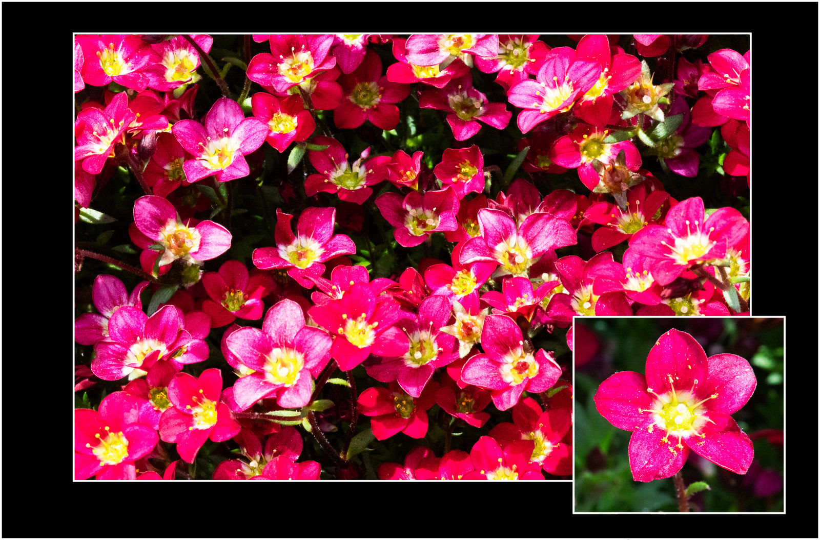
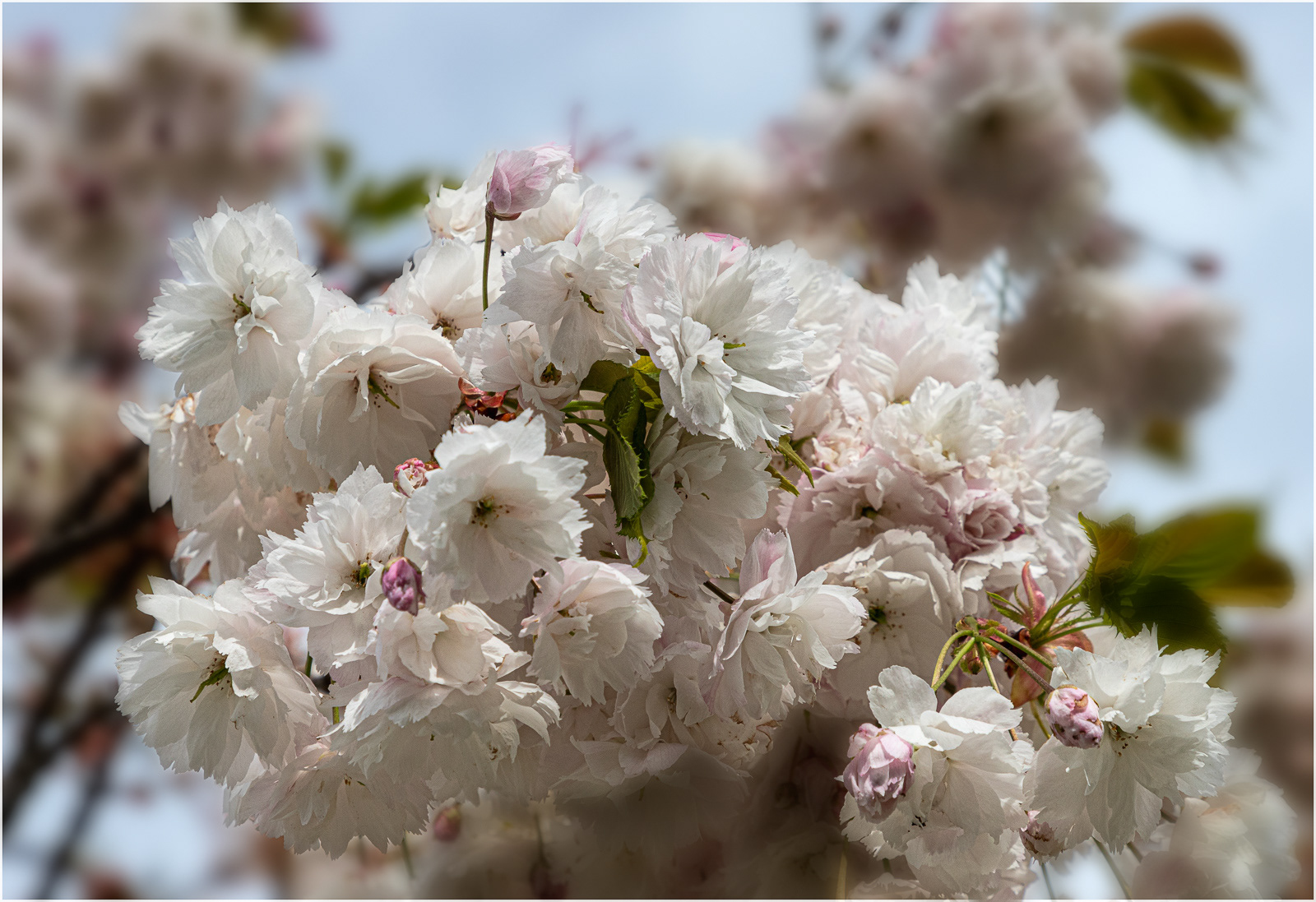
I'll pass on "better image" but happy to say that the larger blossoms image is the one I prefer - the impact of cherry trees in blossom is all about the gorgeous masses of the flowers.
-
13th April 2024, 02:07 PM #3

- Join Date
- Feb 2016
- Location
- Cambridge, UK
- Posts
- 928
- Real Name
- David
-
13th April 2024, 03:31 PM #4
Re: Spring
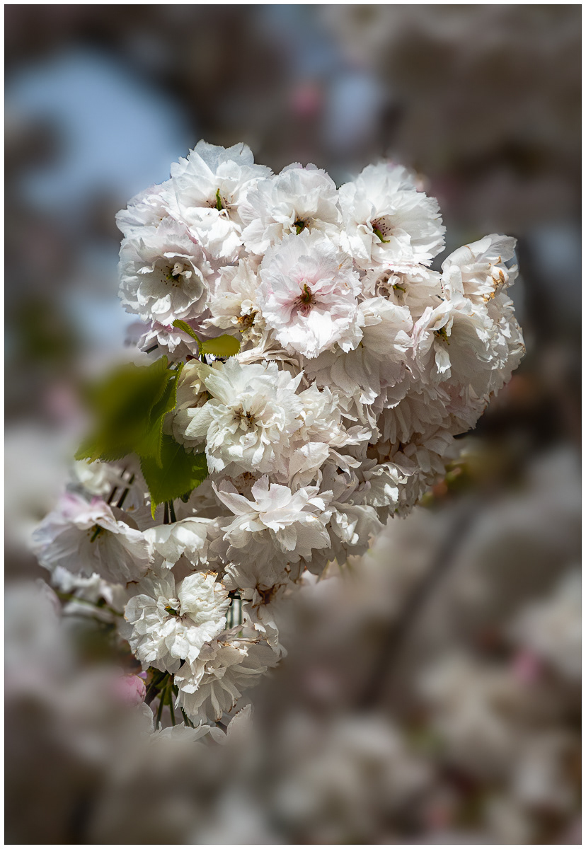
I personally prefer the second cherry blossoms because the lighting seems better and the amount blue sky showing through in the first one is a bit distracting. Ideally a shot with just the blossoms and a soft background that is neutral, rather than gray might work better.
I suspect you will have to wait until next year to shoot the cherry blossoms again, but try doing so on an overcast day to see how that lighting works out.
-
13th April 2024, 04:35 PM #5

- Join Date
- Feb 2016
- Location
- Cambridge, UK
- Posts
- 928
- Real Name
- David
Re: Spring
I agree.
With a subject like this the background in the scene itself is likely to be the sky or other areas of the tree and blossom. So the advice seems to be to try shooting on an overcast but not grey day with the sky as background. My reservation then would be the lack of contrast between the background and the subject.
I certainly want to avoid replicating the gardening catologues' typical illustration of blosoom against blue sky.
Maybe I went too far with blurring and reducing the exposure on the background.
-
14th April 2024, 03:19 AM #6
Re: Spring
I too prefer the second cherry blossom picture. The separation of the subject from the background is better. The green blurry blob in the middle is somewhat distracting though.
-
14th April 2024, 12:20 PM #7
-
14th April 2024, 04:00 PM #8

- Join Date
- Feb 2016
- Location
- Cambridge, UK
- Posts
- 928
- Real Name
- David
-
14th April 2024, 05:15 PM #9
Re: Spring
I use that technique quite regularly. The desaturation can usually be done quite aggressively but the blurring in a case where the offending area is within or very close to the main subject must be more subtil. Otherwise, it creates too much of a contrast in texture with the main subject and contrast attracts attention.
In the case of your blossoms, I would use a blurr radius of 1 or 2 pixels; definitely no more than 3 pixels. I doubt that it would make the picture into a "wall hanger" but it could make it useable.
-
15th April 2024, 08:57 AM #10

- Join Date
- Feb 2016
- Location
- Cambridge, UK
- Posts
- 928
- Real Name
- David

 Helpful Posts:


 Reply With Quote

