Thank you for your comments and I do agree that the leafery is a bit off putting and the woodpecker is the star of the show.
Results 101 to 120 of 151
Thread: Wildlife pictures, please post!
-
8th January 2011, 02:43 AM #101
Re: Wildlife pictures, please post!
-
8th January 2011, 06:21 PM #102
-
8th January 2011, 06:49 PM #103
Re: Wildlife pictures, please post!
Hi Nicola,
I think they're great, especially the focus on #2.
2.5 small suggestions;
On both; I would clone out the distant blurry bird in top left area
On #1, I'd significantly tone down the girl's hair clasp where it has caught the light
The composition and exposure look good.
Well done,
-
8th January 2011, 07:37 PM #104
Re: Wildlife pictures, please post!
thanks Dave! for the appreciations and (overall) for suggestions!
in the first image, I have just cloned the blurry bird, in fact it was in the center of the frame. I tought that in the top-left position it can contribute to create a line from the top-left corner towards the biscuit (below-right) where the seagull is looking to.... however I try to erease it as you have mentioned.
about the girl's hair, I blurred it a bit, but you're right, it isn't enough. I'm going to tone down once again.
-
8th January 2011, 10:47 PM #105
Re: Wildlife pictures, please post!
Hi Nicola,
On the first, if the image is viewed large on fairly big screen (that's close), so that the eye has to rove around the image, I completely see what you mean about having that blurry bird as the beginning of a line down through the main subject and to girl's hand. It is only when reduced to 700px and the whole image can be taken in at once that (oddly, I think) I then find it a distraction that should be removed. I'm not sure that I am making much sense, so I hope someone else comes in to the thread to give an opinion.
The bright hair clasp in #2 could be cloned out, but that might look odd, so really, making it look more like it does in #1 is what I had in mind, by darkening with the dodge tool - I don't think blurring will do it as you've found.
Cheers,
-
9th January 2011, 08:26 PM #106
Re: Wildlife pictures, please post!
dear all
Hi Dave, I've just darkened the hair clasp...
I'm showing the last 2 pics of this seagull's serie.. hope I'm not boring you!!
I've an "order" for some seagull pictures, so I'm searching in my archive..
the first one is closely correlated to the previous 2 images, and I show that pic IN ORDER TO DAMN THE AF THAT FAILED EXACTLY IN THE MOST IMPORTANT FRAME OF THE SERIE!!!

I was using AI servo....
(50D+ 70-300 f/4-5.6 "USM" + low quality UV filter)
in the second shot, all worked well and I like the result. what's your opinion?
does the cut works? (a little bit wider than 3:2)
thanks!
N


Last edited by Nicola; 9th January 2011 at 09:17 PM.
-
26th April 2011, 01:42 PM #107
Re: Wildlife pictures, please post!
just one word... marvelous...

-
26th April 2011, 03:28 PM #108
-
26th April 2011, 04:23 PM #109

- Join Date
- Dec 2010
- Location
- Vermont
- Posts
- 304
- Real Name
- Tim
Re: Wildlife pictures, please post!
Jim,
Nicely done. I might crop it a little closer and center the squirrel, but the orange of the squirrel with the fresh green of the leaves is very nice.
-
26th April 2011, 04:36 PM #110
Re: Wildlife pictures, please post!
Thanks,Tim.
I was going to crop tighter,but was trying for a 3D look by leaving more BG showing.I'll give your suggestion a go.
-
26th April 2011, 04:45 PM #111
Re: Wildlife pictures, please post!
Actually, I think a tighter crop is going to result in the squirrel not being able to be center. If you crop too much, the tail would get cut off, or you'd have to put the squirrel's face further away from center. Which might not be a bad thing.
If anything, I'd say pull down the brightness of that background so that the spots of sky showing through the trees in the background don't overshadow that fantastic catchlight you captured in the squirrel's eye.
Perhaps a tighter crop works if you go away from the square format and go for a vertical crop. Put the squirrel's tail on the left vertical 1/3rd and then rest the squirrel on the upper horizontal 1/3rd, with his face right on the power point.
That's an aggressive crop though.
Do I get change, or is that the full $0.02?
- Bill
-
26th April 2011, 04:47 PM #112
Re: Wildlife pictures, please post!
Yeah - nix my cropping suggestion. I don't think it would work out the way I described.
-
26th April 2011, 05:00 PM #113
-
26th April 2011, 05:11 PM #114

- Join Date
- Dec 2010
- Location
- Vermont
- Posts
- 304
- Real Name
- Tim
Re: Wildlife pictures, please post!
I like that much better. Maybe a little spot sharpening on the head and body, but I would vote for this in a mini, for sure.
-
26th April 2011, 06:39 PM #115

- Join Date
- Jul 2009
- Location
- Nottingham.UK
- Posts
- 409
- Real Name
- Martyn
-
26th April 2011, 06:50 PM #116
-
26th April 2011, 07:47 PM #117

- Join Date
- Apr 2011
- Location
- Toronto
- Posts
- 57
- Real Name
- Chris
Re: Wildlife pictures, please post!
On Saturday March 26th I took a trip to the Muskoka Wildlife Centre and got a few shots of the gorgeous animals there. If you're ever in the neighbourhood it is well worth your time to stop by.
All the pics are flickr links where you can learn a bit about the animals.
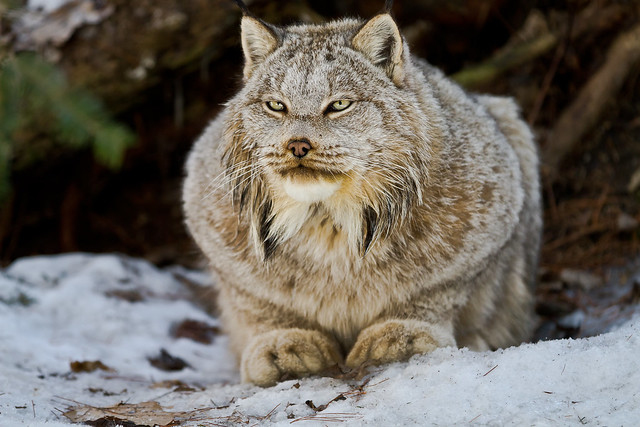
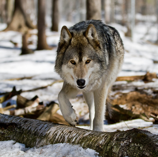
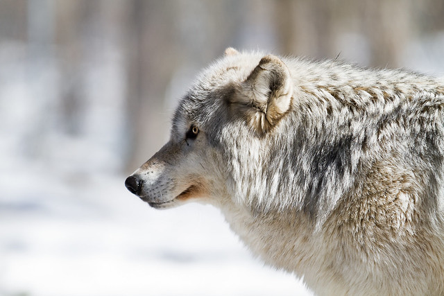
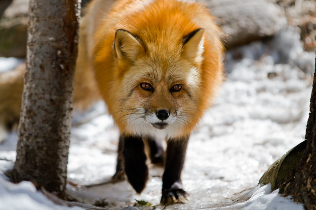
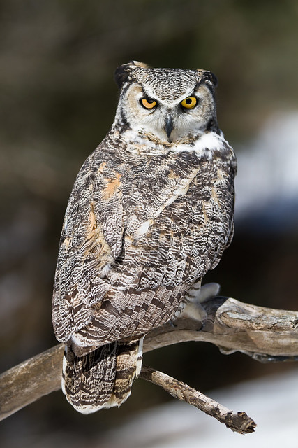
There'll be a couple more coming...
-
27th April 2011, 08:34 PM #118

- Join Date
- Jan 2011
- Location
- Tennessee
- Posts
- 1,732
- Real Name
- james
-
27th April 2011, 08:43 PM #119

- Join Date
- Jan 2011
- Location
- Tennessee
- Posts
- 1,732
- Real Name
- james
-
27th April 2011, 08:51 PM #120

- Join Date
- Jan 2011
- Location
- Tennessee
- Posts
- 1,732
- Real Name
- james

 Helpful Posts:
 Reply With Quote


