 Helpful Posts: 0
Results 1 to 17 of 17
Thread: Oh, help! (post processing woes)
-
20th May 2011, 07:36 PM #1

- Join Date
- Sep 2010
- Posts
- 2,064
Oh, help! (post processing woes)
-
20th May 2011, 07:39 PM #2rob marshall
Re: Oh, help! (post processing woes)
Katy, my dear.
We share your pain. Do you have the original RAW, or original JPEG? Would you post it here http://www.mediafire.com/myfiles.php
as it would help to see the original, and perhaps do an edit?
-
20th May 2011, 07:46 PM #3

- Join Date
- Mar 2009
- Posts
- 2,522
Re: Oh, help! (post processing woes)
I will leave a PS expert to this. I run GIMP but what I can tell you is that you will be far better discarding the iPhoto image and opening for PP direct into PS. The background already looks a little stretched and overprocessed to me. This will be one for Jiro et al. It is puzzling me why you seem to be getting so much noise. i have never noticed it on your images until recently. Are these underexposed shots to start with? That would explain the noise if you are trying to recover the exposure.
-
20th May 2011, 08:12 PM #4

- Join Date
- Sep 2010
- Posts
- 2,064
Re: Oh, help! (post processing woes)
Go for it! I'd love to see what you can do with it. I only have jpegs, though.
 Thank you!
This one is the "original" in color.
http://www.mediafire.com/i/?w6ho2y3o6qec8sz
This is the B&W one that I worked on.
http://www.mediafire.com/i/?gma2q5d47qy82gb
and, I've never used mediafire, before and am not sure if I did this right.
-
20th May 2011, 08:19 PM #5

- Join Date
- Sep 2010
- Posts
- 2,064
Re: Oh, help! (post processing woes)
Yes, Steve, it's underexposed. The light has been strange because of the rain that we've had all week. I know that it's not making sense but that's how it's turning out.
I've been shooting in RAW the whole year but recently found out that iphoto won't surrender them. (It's a long story.) I'm having to take one technical stretch at a time, these days, and am definitely looking forward to figuring another library out in the next month (or two - but, hopefully not that long.) The worst part is that iphoto doesn't save what I worked on in edit. It's such a sad story!!! Any suggestions, that way, would be appreciated for sure.
-
20th May 2011, 08:35 PM #6rob marshall
Re: Oh, help! (post processing woes)
Katy
Couple of things...
1. You have some gorgeous (like me ) colours here. Why B&W? The colour is great.
2. You don't need to shoot at 1/800sec unless there's a hurricane blowing. Do you have hurricanes in Vermont?
3. You have a Rebel (which is fine) but I'd stick to ISO200 or less if you can, and you could have in this case. Otherwise, you start to get noise, especially on spot-metering as here.
I put the JPEG through the RAW edit (pretended it was RAW) and increased the saturation a little, the clarity, reduced the noise a bit, a bit of fill-light and tweaked the contrast. I also did a square crop of the second one as I thought getting in closer would help to highlight the best part of the shot - those very nice petals at the front.


-
20th May 2011, 08:50 PM #7
Re: Oh, help! (post processing woes)
That is a Beautiful shot Katy. Glad Rob could help sort out your PP.. I can't wait till I learn to do PP

-
20th May 2011, 09:15 PM #8
Re: Oh, help! (post processing woes)
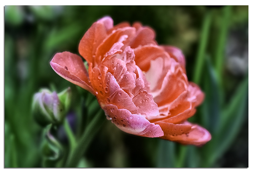
Katy, I downloaded the file you have, processed it first to LR then did some additional editing work inside Photoshop and I came up with this:
Click the image to see it in lightbox.

I'm not sure if this is the concept you want but this is how I would probably edit this image if this was my shot. May I ask what flower is this?
This is how I would probably interpret this in b&w:

Btw, this is Katy's original file:

Last edited by jiro; 20th May 2011 at 09:44 PM.
-
21st May 2011, 04:10 PM #9

- Join Date
- Sep 2010
- Posts
- 2,064
Re: Oh, help! (post processing woes)
Firstly, thank you very much, everyone, for your help and input!
It's an Angelique Tulip. The problem that I'm having with the color is sort of a Red Queen issue. They're the wrong color (well, this one is). I've grown them in the past and I don't remember this first flush of strong color - indeed, some of them are what I expected and some of them are like this one. They're supposed to be a softer pink - that was my garden plan, anyway, but, as it turns out, my earlier blooming tulips are all blooming at the same time as my late blooming tulips and entirely ruining the effect anyway (the early blooming tulips color is not what was advertised and are too strong, too. (Rob, this may, honestly, be more of a case of needing help from your wife!) The point is - I want to paint the roses white!
Alright, I have an example to give but it's been a spectacularly distracted morning and I need to take my parents to the airport, now. (I mean, now!) I'll be back!Last edited by Katy Noelle; 21st May 2011 at 06:36 PM.
-
21st May 2011, 05:18 PM #10
Re: Oh, help! (post processing woes)
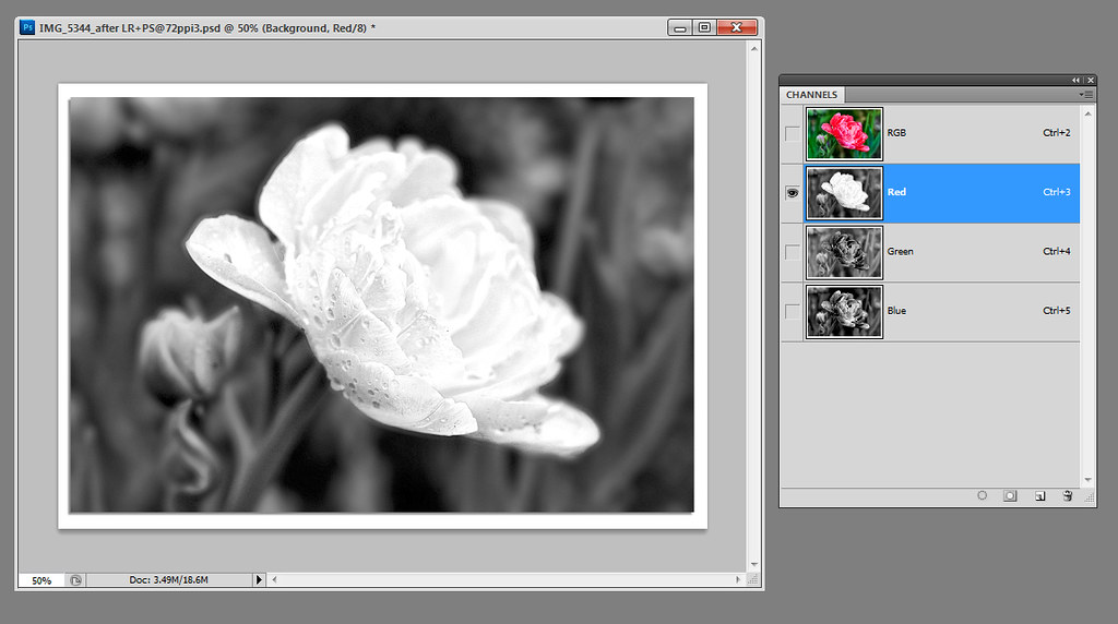
I gave this image another try, Katy knowing now your vision on the edit. I think the easier way to achieve your vision is to use the "red channel" and use that as your b&w layer. On the channels palette, your image is broken down to three components - namely the RED, GREEN, and BLUE channels. This is a screen capture of the flower's RGB components. By the way, I have used my edited image as my base layer or starting image.The point is - I want to paint the roses white!
Click the image to see it in lightbox.

As you can see, just by looking at the Red Channel component, it is already a good b&w rendition of the flower as if the petals are painted white. So, the question is - "How are we then going to extract the red channel so we can use it as our working layer in photoshop?" You use the APPLY IMAGE command.
First, copy the background layer (in case we messed up, we still have the original image intact. ) Then, you go to IMAGE > APPLY IMAGE. A new window will appear with options in it. Choose:
Source = the name of your source image
Layer = Layer 1
Channel = Red
Blending = Normal
Opacity = 100%
Preserve Transparency = Unchecked
Mask = Unchecked
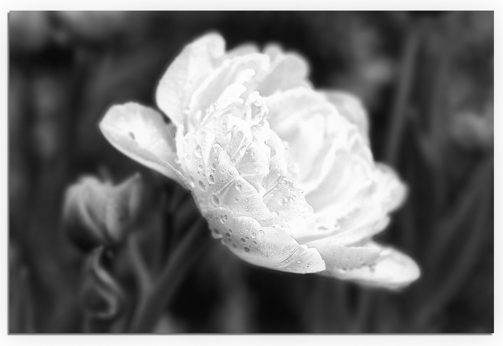
Then press OK. You now have the copied layer (layer 1) with the RED Channel imbedded on it. Now, I think it won't benefit having a very strong sharp image with this kind of subject so I decided to add some softening effect to it by blurring the image a little bit. This is the end result:
Click the image to see it in lightbox.

Hope this helps, if not... Sorry.

Last edited by jiro; 21st May 2011 at 05:54 PM.
-
21st May 2011, 06:54 PM #11

- Join Date
- Sep 2010
- Posts
- 2,064
Re: Oh, help! (post processing woes)
Talk about fresh eyes... you guys don't have that preconceived, personal frustration with the color and see it beautifully. I like all of the edits. Rob, did you crop your edit like that because that's how I, usually, like to crop things or is that just what you saw?
This is what I did with my color version before I switched to B&W. The color was distracting me - I thought the point was more the ruffly petals and the raindrops but, I guess, the B&W's just not carrying it?

This is the "Queen of the Night" tulip that I have planted with them. (They're twerked with a bit more blue just cuz I like it that way.) The ones that I took with more dof were blurry because of that slight breeze and forget the macro! The second, close up one is just a "rough draft" - I didn't finish it. Anyway, that's why I was at ISO400 - I couldn't get it clear with the dof that I wanted. I think, Rob, considering what you've said, the light was beautiful and soft but just wasn't strong enough.


-
21st May 2011, 07:56 PM #12

- Join Date
- Sep 2010
- Posts
- 2,064
-
21st May 2011, 08:36 PM #13
-
21st May 2011, 08:41 PM #14

- Join Date
- Sep 2010
- Posts
- 2,064
-
21st May 2011, 08:59 PM #15
-
21st May 2011, 09:06 PM #16
Re: Oh, help! (post processing woes)
I think they're gorgeous, Katie -- and I love Vandenberg's edit. It's exquisite.
-
22nd May 2011, 02:13 AM #17

- Join Date
- Sep 2010
- Posts
- 2,064
Re: Oh, help! (post processing woes)
I.have.SO much to learn. Thank you for sharing this, though. I had definitely noticed the light filter and almost asked specifically about it. I'm sure that I've seen that you've used it in some of your other shots that I really love but I didn't realize, until now, that it was done in post processing. Ah HA!

I love how you're photoshop widget/thing titles are "alien skins" and "ninjas" and I've been wanting to try using things like Florabella, coffee shop velvet cream and vintage blush. It reminds me of the new lipsticks that I got in NYC - pink parfait, candy and (my favorite name) bois de rose. I love marketing.
Well, now I have a conundrum. I wish that that photo was mine. Hm! All of you show me that it's not so bad, after all. I'll keep working on it.
Last edited by Katy Noelle; 22nd May 2011 at 02:19 AM.


 Reply With Quote


