
 Helpful Posts: 0
Results 1 to 20 of 32
Thread: Hiding.
-
1st June 2011, 05:14 AM #1


- Join Date
- Nov 2010
- Location
- Manila, Philippines
- Posts
- 3,804
- Real Name
- Willie or Jiro is fine by me.
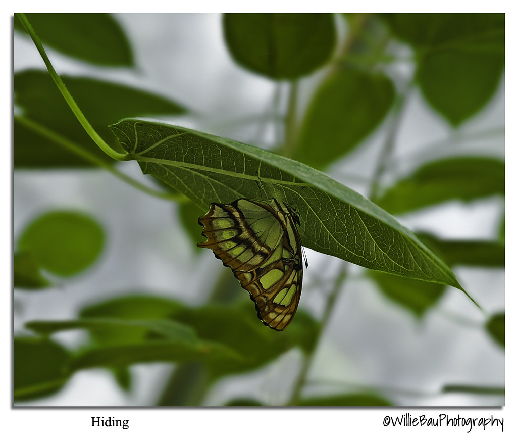
Hiding.
-
1st June 2011, 05:21 AM #2
- Join Date
- Mar 2011
- Location
- Jalandhar, Punjab, India
- Posts
- 73
- Real Name
- Gurvinder
Re: Hiding.
Hi Jiro,
The composition and colors are really great...
But, I get the illusion as if the frame has been turned 180 degrees to make it look that way, since the leaf has its concavity facing down, and one can see the markings on the concave side... (scratching my head!)
Anyways, nice photo...
Gurvinder...
-
1st June 2011, 05:25 AM #3
- Join Date
- Nov 2010
- Location
- Manila, Philippines
- Posts
- 3,804
- Real Name
- Willie or Jiro is fine by me.
Re: Hiding.
Thanks, Gurvinder. That is exactly how it was when I shot it. The butterfly is actually under the leaf and hiding.
-
1st June 2011, 05:43 AM #4

- Join Date
- Jan 2011
- Location
- Seattle Washington
- Posts
- 3,550
- Real Name
- Paul
Re: Hiding.
Very nice Jiro, you have really got the butterfly to pop. Great clearity, sharpness and DOF. Well done.
-
1st June 2011, 05:55 AM #5
- Join Date
- Nov 2010
- Location
- Manila, Philippines
- Posts
- 3,804
- Real Name
- Willie or Jiro is fine by me.
Re: Hiding.
Thank you very much, Paul. Busy with your job? Good to see you back. Originally Posted by jeeperman

-
1st June 2011, 06:20 AM #6
- Join Date
- Jan 2011
- Location
- Seattle Washington
- Posts
- 3,550
- Real Name
- Paul
Re: Hiding.
Yes, thank you Jiro. Busy with a multitude of things. I am hoping things settler down soon.
-
1st June 2011, 06:25 AM #7
- Join Date
- Nov 2010
- Location
- Manila, Philippines
- Posts
- 3,804
- Real Name
- Willie or Jiro is fine by me.
Re: Hiding.
Whatever they are... good luck. Originally Posted by jeeperman
-
1st June 2011, 06:31 AM #8
- Join Date
- Jan 2011
- Location
- Seattle Washington
- Posts
- 3,550
- Real Name
- Paul
Re: Hiding.
Well, thank you Jiro.
-
1st June 2011, 07:24 AM #9

- Join Date
- Jun 2010
- Location
- London, UK
- Posts
- 891
- Real Name
- Tommy
Re: Hiding.
That's stunning Willie!
I'd love to have a PP lesson in colour and sharpening from you!
-
1st June 2011, 07:29 AM #10
- Join Date
- Nov 2010
- Location
- Manila, Philippines
- Posts
- 3,804
- Real Name
- Willie or Jiro is fine by me.
Re: Hiding.
Thanks, Tommy. I don't have a definite color procedure. It always depend on the image that I am working on. If I would re-phrase it it's like saying "The image will tell you what to do". As for the sharpening, I have a straight procedure for it. Thanks. Originally Posted by RockNGoalStar
-
1st June 2011, 07:40 AM #11
- Join Date
- Jun 2010
- Location
- London, UK
- Posts
- 891
- Real Name
- Tommy
Re: Hiding.
Hey Willie, thanks for that! I appreciate what you're saying about the colour... What about your sharpening technique? Is it a closely guarded secret? Or are you willing to share it?
Also, I see that you use Lightroom. I use PS CS5. is Lightroom better? Or can you do everything in CS5?
Cheers.
-
1st June 2011, 01:19 PM #12

- Join Date
- Feb 2011
- Location
- Washington, DC
- Posts
- 324
Re: Hiding.
Awesome shot Willie! With all the different shades of green, it's not easy to get that butterfly to pop (I've tried). And, BTW, that butterfly is a Malachite (Siproeta stelenes) - indigenous to Central and South America.

-
1st June 2011, 01:24 PM #13

- Join Date
- May 2011
- Location
- Fort Mill, South Carolina, USA
- Posts
- 6,294
- Real Name
- Frank Miller
Re: Hiding.
Great shot Willie! I see you resisted the temptation to remove the green color cast on the butterfly and it works well here. Any words of wisdom on when to leave a color cast alone?
-
1st June 2011, 01:35 PM #14
- Join Date
- Nov 2010
- Location
- Manila, Philippines
- Posts
- 3,804
- Real Name
- Willie or Jiro is fine by me.
Re: Hiding.
Thank you very much, Frankie. Yeah, I think I remembered that this one is called Malachite. Glad you like it. Originally Posted by Frankie
-
1st June 2011, 01:38 PM #15
- Join Date
- Nov 2010
- Location
- Manila, Philippines
- Posts
- 3,804
- Real Name
- Willie or Jiro is fine by me.
Re: Hiding.
The butterfly is under the leaf and the sun shines above it so the leaf acts like a softbox but with color tint (in this case, green). If I color-corrected the butterfly it would look too "photoshopped" since you can't fool the eyes and the brain about the color cast. This is a good example (in my opinion) where the image actually "tells" you how to edit it, Frank. I merely increased the contrast on this one and add some sharpening so the butterfly and the leaf would stand out from the background. Hope this helps. Originally Posted by FrankMi
-
1st June 2011, 01:42 PM #16

- Join Date
- Apr 2011
- Location
- florida U.S.A.
- Posts
- 467
- Real Name
- Ron
Re: Hiding.
Beautiful photo Willie.
-
1st June 2011, 02:02 PM #17
- Join Date
- Nov 2010
- Location
- Manila, Philippines
- Posts
- 3,804
- Real Name
- Willie or Jiro is fine by me.
Re: Hiding.
Hello, Tommy. Sorry I wasn't able to reply to you anymore this morning. I did not realize that my eyes are already closed while reading a certain book about composition. Originally Posted by RockNGoalStar
Anyway, as for your question, in my opinion, Lightroom is really good when it comes to transferring your vision to your edit and processing the image using it. I guess they really did their homework on this one. The workflow starts from top to bottom in a very intuitive manner. At first I was struggling using it (well, you know, being accustomed to using photoshop for some time of which there was no workflow whatsoever, actually) but later on, when I came to understand how the flow of the parametric adjustment sliders interact with each other LR is really far more intuitive than any other software that I have used (so far). I think the nearest software that I can think of that would go hand in hand with LR when it comes to intuitive use is ACDSEE Pro 3 or 4 and Corel Paint Shop Pro.
As for Photoshop CS5, Lightroom is "basically" the same as ACR (Adobe Camera RAW). What I don't understand is how in the world did they screw this one up and changed the interface of ACR and not just copy the one in Lightroom. I just read testimonies of 3 authors (not paid by Adobe) that tells the same thing - Lightroom was really very intuitive and instrumental in bringing out the best in their edit due to its awesome interface. For image editing, I'd say LR beats Photoshop hands down. But when it comes to image manipulation... I can still personally say nothing comes close to Photoshop on this one.
My sharpening technique is this:
1. Do all the color and crop edit inside LR in 16-bitt tiff mode.
2. Do some noise correction if necessary but do not use LR's sharpening features.
3. Export the 16-bit tiff image to photoshop
4. Apply a contrast adjustment.
5. make a b&w conversion layer of the image and increase the contrast on this b&w layer.
6. Combine this layer to the original colored background layer and use the blending mode LUMINOSITY.
7. Add a hue/sat adjustment layer on top of the b&w layer and adjust the color saturation if necessary.
8. Combine all the layers and save it as your original edited file as 16-bit tiff image.
9. Duplicate this file and convert it to 8-bit jpeg file and under sRGB color gamut.
10. Resize the image to 1080 pixels on the longest side.
11. Copy the image on another layer and apply the last sharpening step on the the copied layer using the Unsharp Mask and adjust the parameters depending on the quality of the image.
12. If the sharpening is too strong, lower the opacity of this layer so the original unsharp layer can be seen at the bottom of the stack.
13. When satisfied, combine the two and save it as a new file.
14. Upload to your web photo server (I use flickr).
That's it. Hope this helps, Tommy. Cheers.Last edited by jiro; 1st June 2011 at 05:09 PM.
-
1st June 2011, 02:03 PM #18
- Join Date
- Nov 2010
- Location
- Manila, Philippines
- Posts
- 3,804
- Real Name
- Willie or Jiro is fine by me.
Re: Hiding.
Thank you very much, Ron. Originally Posted by Rasbury
-
1st June 2011, 02:43 PM #19
- Join Date
- May 2011
- Location
- Fort Mill, South Carolina, USA
- Posts
- 6,294
- Real Name
- Frank Miller
Re: Hiding.
It does indeed. I knew you'd have a logical reason. Thanks for sharing!
-
1st June 2011, 04:13 PM #20

- Join Date
- Feb 2011
- Location
- India
- Posts
- 408
- Real Name
- Abhi
Re: Hiding.
I see, Jiro, that you do not use unsharp mask for any creative sharpening before resizing. Would that be correct? Also, how is Step 4 different from contrast adjustment in LR, do you use masks for selective adjustments? Originally Posted by jiro

 Reply With Quote