 Helpful Posts: 0
Results 1 to 14 of 14
Thread: I saw movement
-
11th June 2011, 09:34 AM #1
-
11th June 2011, 09:44 AM #2

- Join Date
- Jul 2010
- Location
- Bucharest, Romania
- Posts
- 263
- Real Name
- 2 penny for the guess..
Re: I saw movement
Raylee,
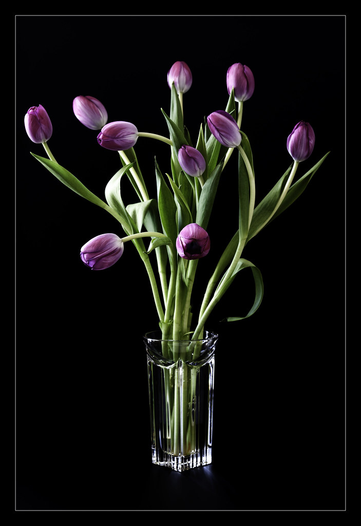
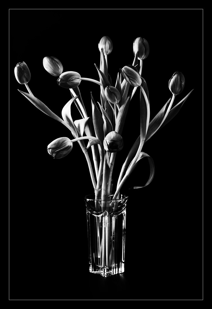
I think the colour one is "moving now", and the B&W is "frozen in time", but both give the sense of movement. I do like more b&w version, both are great
Leo
-
11th June 2011, 10:03 AM #3
Re: I saw movement
In the B&W version I get much more a sense of the movement than the colour.
Both are really quite lovely.
-
11th June 2011, 11:36 AM #4
Re: I saw movement
I think both express the same degree of movement as far as leading lines go. If you are talking about an illusion of movement then I would have to say the b&w does. Every time you blink it takes the eyes a bit of time to adjust to the lack of hue.
-
11th June 2011, 12:04 PM #5

- Join Date
- Aug 2009
- Posts
- 2,342
- Real Name
- Steve
Re: I saw movement
I guess i'm the odd one, because i prefer the color one. Great image raylee.
-
11th June 2011, 12:21 PM #6

- Join Date
- Nov 2010
- Location
- Panama City, FL
- Posts
- 3,540
- Real Name
- Chris
Re: I saw movement
I know this is going to sound absolutely major picky......but from the outset of my first observation of the two, I was far more drawn to the color version with, what to me was a major exception; the centering of the tulips and the little eye drawing reflection on the perplex.
Again, this goes back to my proclivities on how balance makes or breaks the image. I love the sway as if the little fellas are dancing to a song only they can know, but I found the one closest to the left side of the frame, too close...by about 3mm +/- and while that doesn't seem like much, it's enough to split the symmetry one-sided.
I was also immediately drawn to the little flash of blue reflection at the bottom right and you know how it is when your eye gets attracted - nag, nag, nag. So, to keep myself happy, and hopefully to make this image stronger (IMO and only mine), I took some minor liberties.

-
11th June 2011, 02:57 PM #7

- Join Date
- Mar 2009
- Posts
- 2,522
Re: I saw movement
Raylee, I like both but I am swaying to the colour version on this occasion.The lighting is superb and there is a really nice sinuousness to the whole thing. If you had contrived to somehow shoot this without a vase it would have been outstanding in my opinion. I don't know... rubber bands holding the stems together and plonked on an uprighty thing so that the bands could be cloned out later. Nevertheless beautifully photographed.
-
11th June 2011, 10:40 PM #8
Re: I saw movement
Thanks everyone! I've been reading some books on composition and design principles that have given me some ideas. Let's see where they take me.
Thanks again for your feedback.
R
-
11th June 2011, 11:08 PM #9
Re: I saw movement
Both works for me, Raylee.

-
12th June 2011, 11:08 AM #10
-
12th June 2011, 02:05 PM #11

- Join Date
- Aug 2009
- Posts
- 2,342
- Real Name
- Steve
Re: I saw movement
Stick with the vase for now. It's a very beautiful shot.
-
12th June 2011, 03:43 PM #12

- Join Date
- Feb 2009
- Location
- Bucharest,Romania
- Posts
- 1,367
-
12th June 2011, 03:56 PM #13

- Join Date
- Mar 2009
- Posts
- 2,522
Re: I saw movement
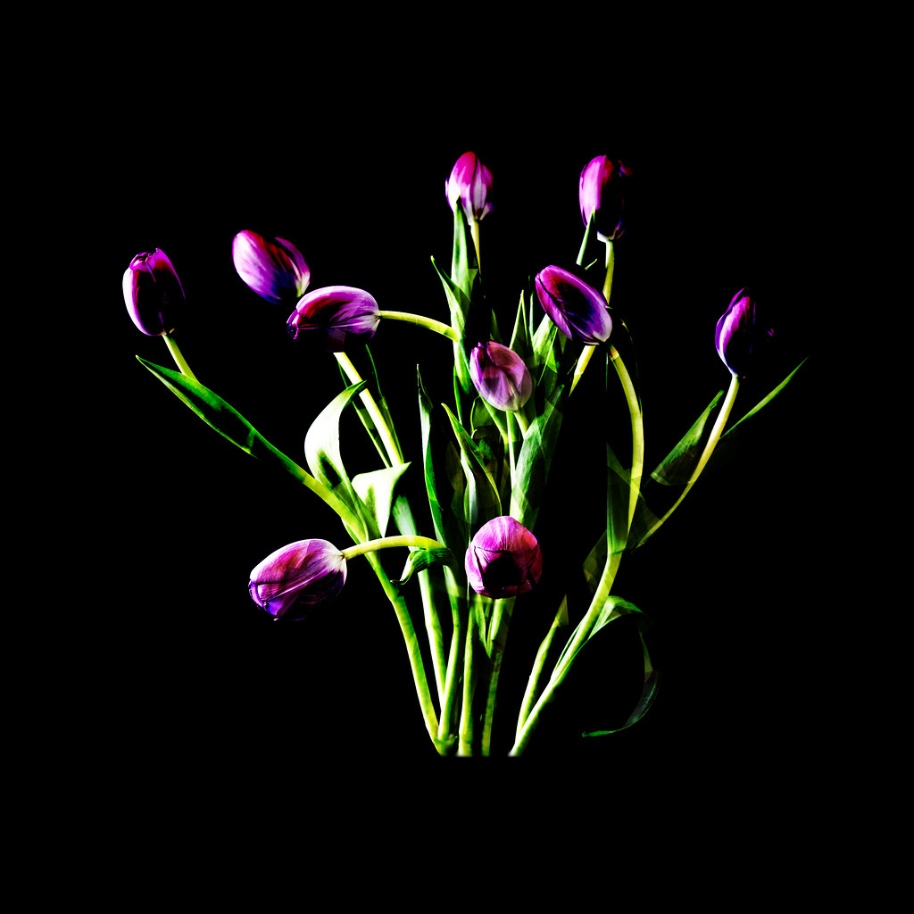
I quite like that treatment. However my comment about the vase was referring to a re-shoot without the vase rather than cropping it. A straight crop loses the flow of the image. None of these comments or suggestions take away anything from the original as others have said it is a beautiful piece of work that certainly stands with the best of them on its own right.I know where you are coming from Steve about losing the vase. As a result, I've gone a bit abstract to emphasise the colour and shapes.
-
12th June 2011, 05:16 PM #14

- Join Date
- May 2011
- Location
- Pico Rivera CA
- Posts
- 77
- Real Name
- Henry
Re: I saw movement
I sense movement more in the B&W, but both are beautiful.


 Reply With Quote


