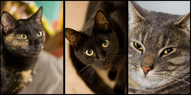
Trio of cats by Tobias Weber, on Flickr
 Helpful Posts: 0
Results 1 to 4 of 4
Thread: Trio of Cats
-
15th June 2011, 02:29 PM #1

- Join Date
- Jan 2011
- Location
- Johannesburg,South Africa
- Posts
- 530
- Real Name
- Tobias Weber

Trio of Cats
-
15th June 2011, 05:35 PM #2rob marshall
Re: Trio of Cats
Tobias
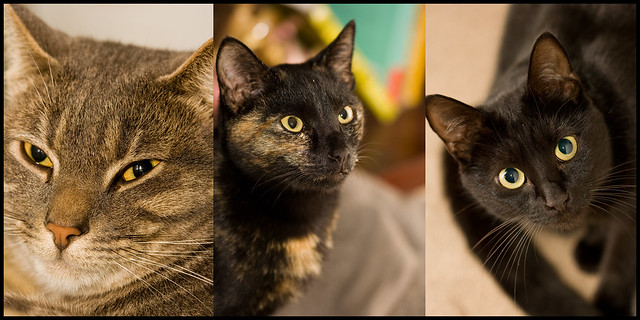
Nice cats, but perhaps they would look better as a whole if arranged differently. With a triptych you need some balance between the three elements - after all that's why you have three. I would have put #1 where #3 is, #2 where #1 is, and #3 in the middle.
Why? - #3 is looking straight at the camera, so middle seems obvious. #1 is looking to the left, out of shot, which creates an imbalance and #2 is doing the same but to the right.

-
15th June 2011, 06:09 PM #3

- Join Date
- Jan 2011
- Location
- Johannesburg,South Africa
- Posts
- 530
- Real Name
- Tobias Weber

Re: Trio of Cats
Thanks for the tip
 this was my first attempt at a triptych so i'm only just starting to learn about it, but the way you changed it looks awesome
  thanks again
-
15th June 2011, 09:30 PM #4

- Join Date
- Jan 2011
- Location
- Johannesburg,South Africa
- Posts
- 530
- Real Name
- Tobias Weber

Re: Trio of Cats
The improved version

Trio of Cats Improved by Tobias Weber, on Flickr


 Reply With Quote
