 Helpful Posts: 0
Results 1 to 5 of 5
Thread: The Hook
-
4th July 2011, 09:27 AM #1
The Hook
Last edited by abhi; 4th July 2011 at 09:56 AM.
-
4th July 2011, 04:08 PM #2Moderator


- Join Date
- Feb 2009
- Location
- Glenfarg, Scotland
- Posts
- 21,402
- Real Name
- Just add 'MacKenzie'
Re: The Hook
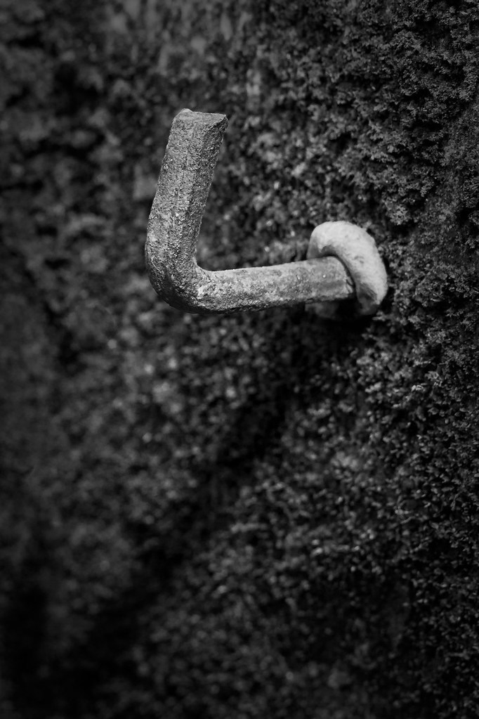
You've brought out the texture on the hook wonderfully well and it is well lit.
I wonder, however, if the hook, given it is the primary subject, occupies too small a proportion of the overall frame? It is quite a small part of the whole picture. I don't know what capacity you had to get in much closer, or whether you could do a tighter crop.
-
5th July 2011, 03:51 AM #3
Re: The Hook
Thanks, Donald. I probably can not get much closer than this, however a crop is a possible. But, for some reason unknown even to me
 , I wanted to have the entire shadow of the hook within the frame. What are your thoughts regarding some dodge and burn to make the shadow of the hook darker?
Here are a couple of quick edits:
#1 A 2x3 crop (almost) from the original, with darker shadow

and a closer crop:

Last edited by abhi; 5th July 2011 at 04:27 AM.
-
5th July 2011, 07:36 AM #4Moderator


- Join Date
- Feb 2009
- Location
- Glenfarg, Scotland
- Posts
- 21,402
- Real Name
- Just add 'MacKenzie'
Re: The Hook
I think both of these are much more effective images. On D & B, I think you are right that it can help. But I think the important point is not to go too far and have it look artificial. I think D & B needs to be applied with a degree of subtlety. And when it is is it can make a huge difference to images.
-
5th July 2011, 07:41 AM #5
Re: The Hook
Thanks, Donald. I have burned the shadow a little (-.5 EV, -20 brightness) for both of these. Still working on the colour version, which was what I had in mind when I took the shot. The background is lush green soft moss growing on the wall, and I thought that it would provide a nice soft contrast to the rusty old iron hook. But, I am having some trouble with pp there. I will probably be posting that in the pp forums soon.


 Reply With Quote
