 Helpful Posts: 0
Results 1 to 5 of 5
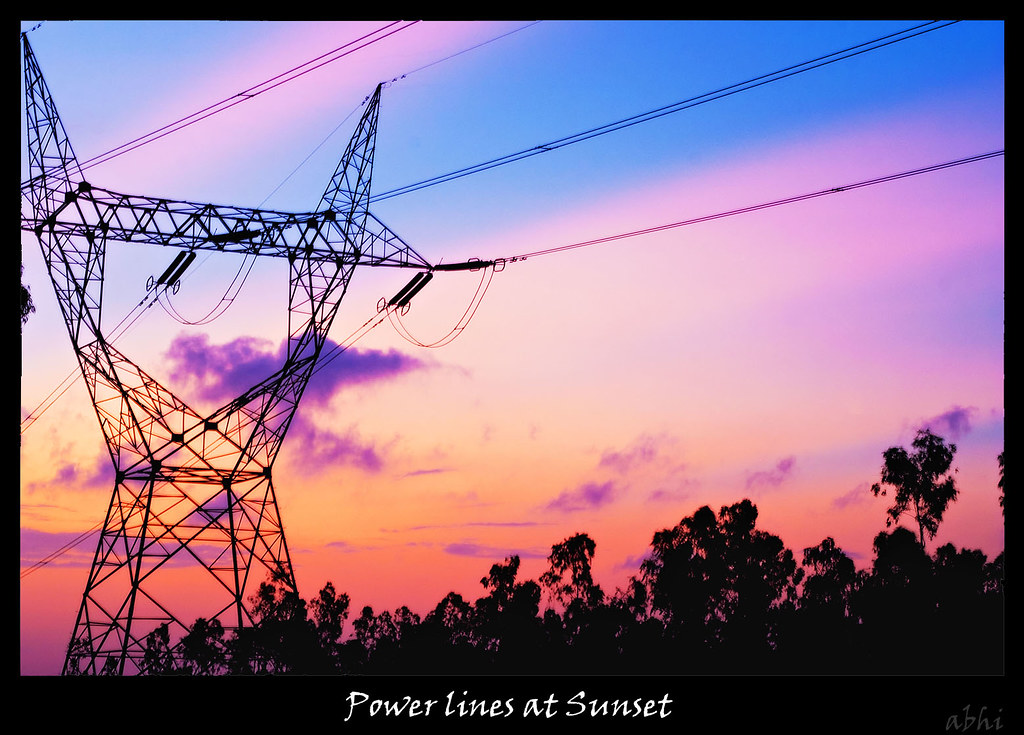
Thread: Power lines at Sunset
-
12th July 2011, 07:24 PM #1
-
12th July 2011, 07:27 PM #2
Re: Power lines at Sunset
I like it, though I was hoping for some more extra space on the left so there would be some balance on the tower to look at. It looks cramped on the left side. Nice colors, Abhi! Good job.

-
12th July 2011, 07:50 PM #3
Re: Power lines at Sunset
-
12th July 2011, 08:08 PM #4
Re: Power lines at Sunset
I think the 2nd image is better SANS the tree on the left of the tower.

-
12th July 2011, 08:10 PM #5


 Reply With Quote

 I would also like to get rid of a couple of wires when I get to that stage.
