 Helpful Posts: 0
Results 1 to 20 of 28
Thread: Not Just Another Pretty Face
-
18th July 2011, 05:16 PM #1
Not Just Another Pretty Face
-
18th July 2011, 06:39 PM #2

- Join Date
- Jan 2009
- Location
- South Devon, UK
- Posts
- 14,572
Re: Not Just Another Pretty Face
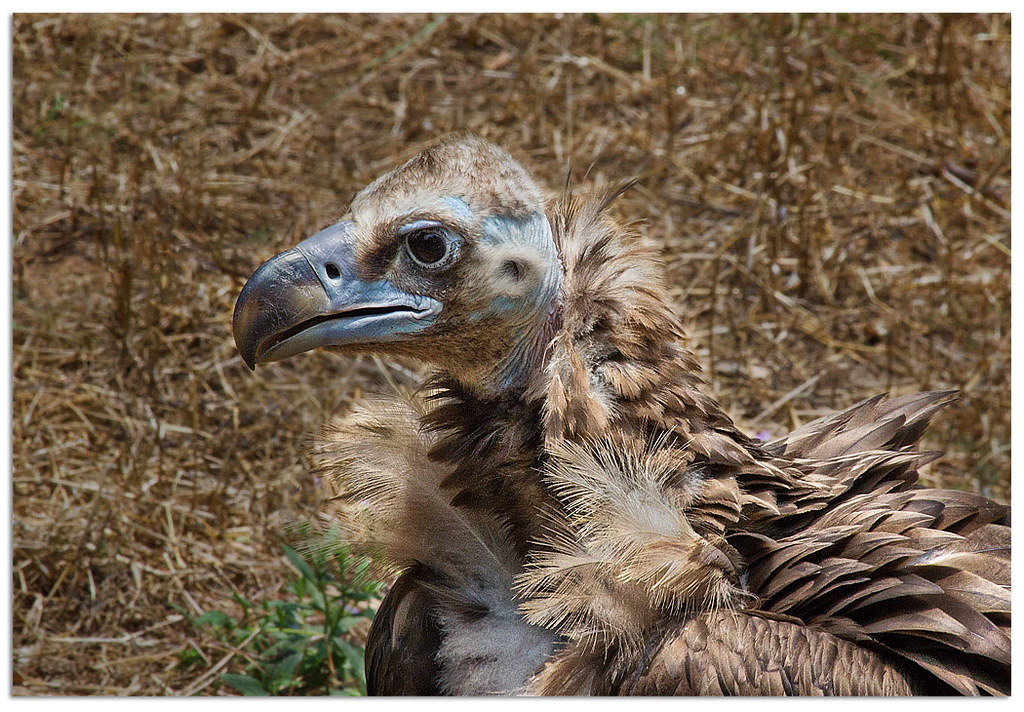
I don't think you can do much else here, Frank.
It is a pity that the feathers and background are so similar. But I suspect that trying anything else will just make everything worse. And you have already cropped as tight as you really want to go.
So I would just consider it to be an excellent example of bird camouflage.
-
18th July 2011, 06:42 PM #3
Re: Not Just Another Pretty Face
I agree with Geoff about the background, but apart from that I think it's a superb portrait of a fascinating bird

Seri
-
18th July 2011, 06:53 PM #4
Re: Not Just Another Pretty Face
Thanks Geoff and Seri. Does anybody know the name of the bird? It looks like a member of the vulture family, probably from Africa.
-
18th July 2011, 07:03 PM #5
Re: Not Just Another Pretty Face
Frank
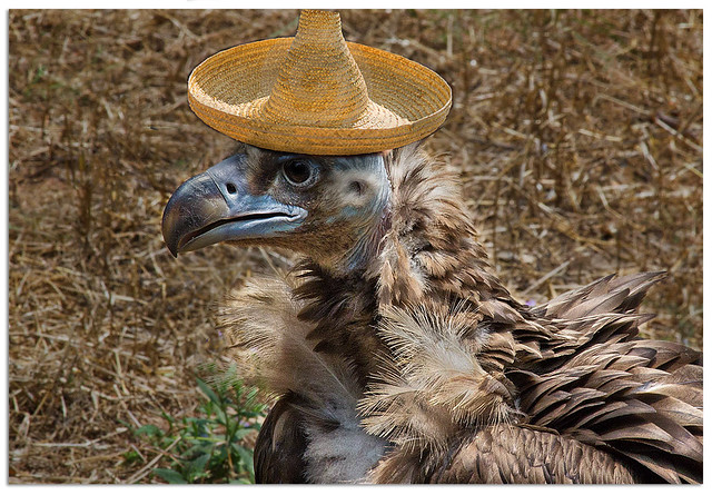
the only thing I would like to add...
is an hat for this guy

it will be more fashinating!
-
18th July 2011, 07:26 PM #6
Re: Not Just Another Pretty Face
Here's one possible edit on your image, Frank:

It was tricky because of the almost similar color tone on both subject and background. A soft brush with small feathering can give you a forgiving mask layer to darken the background without hurting the pixels on the subject. A dodge and burn layer was added to give some contrast boost and more detail on the subject to make it look more forward than the background. Finally, I did some cleanup to get rid of some unnecessary element on the background to keep the focus on the bird when you view it.
Here the link to the .psd file I made on the edit if you want to see how I did it: http://www.mediafire.com/?b5434s3fkphp6i8
-
18th July 2011, 07:44 PM #7
Re: Not Just Another Pretty Face
Fascinating! One of the problems I had was separating the bird from the background. The bird now appears more vibrant, almost metalic, against the rather dull background. Excellent.
I see that you didn't clone out the one green element in the background. Was that because of not being able to separate it from the feathers or for some other artistic reason?
I opened the PSD file but to be honest, I couldn't figure out all of the steps you went through, particularly where you have an almost silvery 'dodge and burn sublayer'. Is there a tutorial somewhere that I could learn the various processes from? I'm still fairly novice at CS5 but I really like the techniques you have employed.
-
18th July 2011, 07:51 PM #8
Re: Not Just Another Pretty Face
I did not clone out the green leaves near the bird since it adds some contrast (element against an element). If all are just dead grasses and brown feathers there's not much for the eyes to look at.
f you would allow me to use this image as a test image, I can make the tutorial on how to make a dodge and burn sublayer today and post it later. I learned the technique from Calvin Hollywood, a famous photographer and photoshop artist from Germany. He's not only good (expert, actually) on using Photoshop but he's an unselfish guy, too. He has some new video tutorials at Kelbytraining.com that talks about the same technique and much more. I have one of his old tutorials. For this technique, it took me 3 days to understand why it works which is pretty cool to use actually.
Let me know if you're OK with the idea, Frank so I can start preparing the images for the tutorial upload. Thanks!
-
18th July 2011, 08:19 PM #9
Re: Not Just Another Pretty Face
Absolutely! Would you like the original DNG file to start from? If so, all I need to know is how to get it to you. Thanks Willie!

-
18th July 2011, 08:21 PM #10
Re: Not Just Another Pretty Face
Nah, you did pretty good with your jpeg edit so I will use it as it is. Or, if you still want to share the RAW file you can simply upload it via www.mediafire.com. Thanks a lot, bruddah.

-
18th July 2011, 08:31 PM #11

- Join Date
- Jul 2009
- Location
- Kolkata - INDIA
- Posts
- 537
-
18th July 2011, 08:32 PM #12
Re: Not Just Another Pretty Face
Looks like I got it up there.
http://www.mediafire.com/?clj507gciy19s2p
Anyone that would like to download a copy to experiment with is welcome to. Enjoy.
-
18th July 2011, 08:40 PM #13
Re: Not Just Another Pretty Face
Thank you Ashwin. I was leary to go that route because the details in the delacate feathers. They could get clipped or have a sharp background showing through and might not look natural. I think that approach works best when you have subjects with clearly defined outlines.
-
18th July 2011, 08:40 PM #14
Re: Not Just Another Pretty Face
Thanks. Will work on it now.

-
18th July 2011, 08:46 PM #15
-
18th July 2011, 08:47 PM #16
Re: Not Just Another Pretty Face
Another nice shot Frank.
I'm not expert in Photoshop - Willie seems to be the expert in that department and his 1st attempt on your image certainly improves it but I wonder if it is possibly to desaturate the background slightly to concentrate the attention more on the bird?
Willie - over to you on that one.
How tight have you cropped the image Frank?
As the bird is staring to the left side of the frame I wonder if you gave it a little more room on the left hand side, space for it to stare into. What do you think?
Regards
Chris
-
18th July 2011, 08:53 PM #17
-
18th July 2011, 09:06 PM #18
Re: Not Just Another Pretty Face
Hi Chris, yes, there is a space about the width of the bird's head to the left so a little more room is available on the left side.
When I shoot, I plan to have a little bit of extra space around the subject to address the possibility of having to tilt the image or compensate for artifacts I may not have seen in the viewfinder.
When I do the actual crop, I try to incorporate the Golden Ratio any time it is practical to do so and if I'm not careful (or haven't had enough coffee) I end up missing the target on one or more other cropping rules.
I usually have difficulty changing the background when the outline of the subject isn't crisp. In this case, there are a number of delicate feathers that you can see the background through. With hairs, you can sometimes sacrifice the detail, but with delicate feathers, it is much harder (for me) to make any dramatic changes to the background without risking an artificial look.
-
18th July 2011, 09:07 PM #19
-
18th July 2011, 09:40 PM #20


 Reply With Quote

 However, I can only push the image this far based on Nicola's suggestion.

