 Helpful Posts: 0
Results 1 to 3 of 3
Thread: The Golden Hour in Black & White
-
20th July 2011, 12:41 AM #1
-
20th July 2011, 01:56 AM #2
Re: The Golden Hour in Black & White
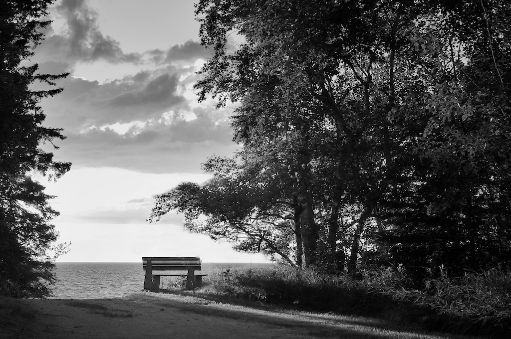
Hello, Janis. I like it. I always love the idea of highlighting a lonely chair or a bench in a photograph. I am not so sure if you have gone too heavy on the blacks. What I could probably comment on is that the main subject (was it the lonely bench?) needs to have more light to create a stronger reaction to me as a viewer. The hanging branches seems to be too closing in on the bench that gets more attention instead of me focusing my attention and reaction to the bench. Although I know it's very hard to make everything right naturally with nature, what I would probably do is to trim down the hanging vines a little bit and then open up the area on the bench by brightening it up on the post processing. Something like this. If the bench is not your main subject, then kindly pardon the edit.

-
20th July 2011, 02:30 AM #3
Re: The Golden Hour in Black & White
You're right, Willie. That certainly looks a lot cleaner. But also a lot of work
 !
!
I have to say I myself regretted posting that version as soon as I did it. I had been playing around with the Highlights & Shadows tool in Aperture and I think I didn't do a very good job with the tonal contrast. I think I will start over from scratch and pay attention to what is happening in the whole of the picture.


 Reply With Quote
