 Helpful Posts: 0
Results 1 to 6 of 6
Thread: BW or Colour
-
14th March 2009, 08:49 PM #1

- Join Date
- Mar 2009
- Posts
- 2,522
BW or Colour
-
14th March 2009, 09:44 PM #2
Re: BW or Colour
Hi Steve,
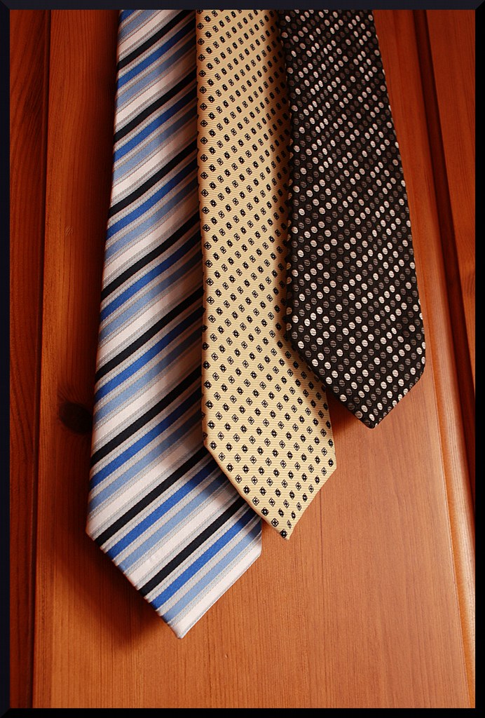
I prefer the monochrome one (which looks fine to me contrast wise), I find the deep colour of the wardrobe door overpowering in the colour version.
Cheers,
-
14th March 2009, 10:32 PM #3
Re: BW or Colour
entirely with Dave, tho might try upping the dark end a touch more...especially the shadow on the left to bring out the depth
-
14th March 2009, 10:55 PM #4

- Join Date
- May 2008
- Posts
- 14
Re: BW or Colour
I agree with Dave H that the back ground is a little overpowering and the knot of wood near the two tone blue/black stripped Tie a distraction in the colour image but I prefer it over the black and white image.Wally
-
15th March 2009, 12:06 AM #5
Re: BW or Colour
Not one to break a trend I'd back the monochrome one too. This is prob more to do with my backlight than your image but on my screen a very minor contrast tweak to make the blacks look slightly darker as it looks very very dark grey on my screen. Before you rush to change it I like black to be lamp black but it's a matter of taste and screen issues so might not be an advisable tweak, just my taste from this end.
-
15th March 2009, 07:38 PM #6

- Join Date
- Mar 2009
- Posts
- 2,522
Re: BW or Colour
Davey, I see what you mean about the blacks. Thanks for the feedback everyone I will have a tinker.


 Reply With Quote