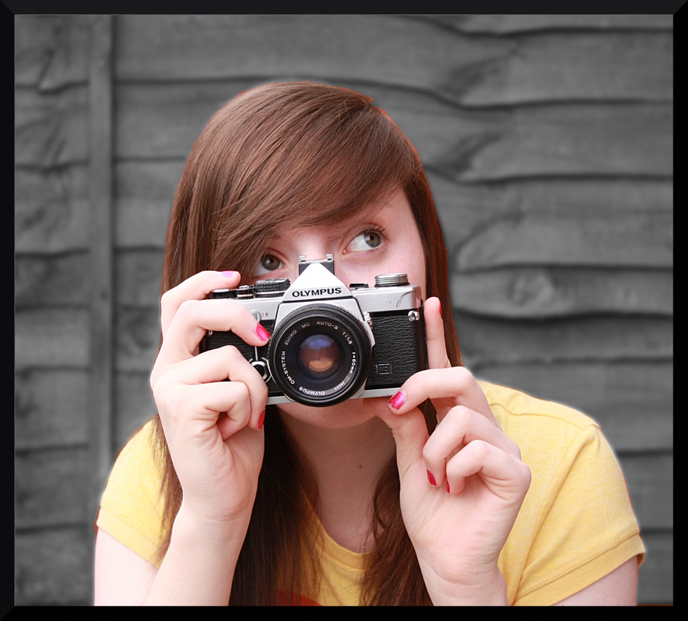
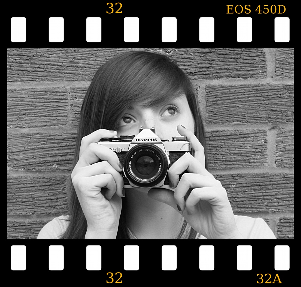
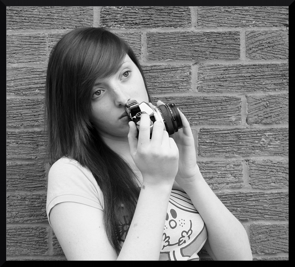
Ok in response to Atvinnys critique on the use of the modern camera. Here are a couple more with an OM2N
The first image has the background desaturated but I seem to be getting a fair bit of interference around the edges...any suggestions. Second image is over the top with the 'slide ' border but I dont have time to rectify at the mo. I seem to be getting a fair bit of glare off the skin how do I avoid this? Exif is provided for info.
[COLOR="Gray"]Camera: Canon EOS 450D
Exposure: 0.013 sec (1/80)
Aperture: f/5.0
Focal Length: 44 mm
ISO Speed: 400
Exposure Bias: 0 EV
Flash: Off
[COLOR="Gray"]Camera: Canon EOS 450D
Exposure: 0.04 sec (1/25)
Aperture: f/11.0
Focal Length: 55 mm
ISO Speed: 400
Exposure Bias: 0 EV
Flash: Off
[COLOR="Gray"]Camera: Canon EOS 450D
Exposure: 0.05 sec (1/20)
Aperture: f/11.0
Focal Length: 41 mm
ISO Speed: 400
Exposure Bias: 0 EV
Flash: Off
 Helpful Posts: 0
Results 1 to 5 of 5
Thread: Keen Eye- Retro
-
17th March 2009, 08:33 PM #1

- Join Date
- Mar 2009
- Posts
- 2,522
Keen Eye- Retro
-
17th March 2009, 11:00 PM #2
Re: Keen Eye- Retro
Whatever the merits/philosophy of the camera in the hand, the original images were way more powerful than these. The backgrounds of these 3 do nothing for her. Also, although it wouldn't be my style, the very sharp take and detail of every skin pore on the originals is what jumps out (and stops one bothering about what she is holding); not sure if you would have got that from an 80s camera? However, maybe pull away from the background so that it is out of focus and free of dominant textures for the Leica shots.
-
18th March 2009, 12:05 AM #3

- Join Date
- Dec 2008
- Location
- New Zealand
- Posts
- 17,660
- Real Name
- Have a guess :)
Re: Keen Eye- Retro
I have to say that I actually prefer these to the first ones - far more of a natural look in my opinion.
In terms of your desaturation issue, I suspect that it's simply a case of having to be more accurate with your selects and masking.
-
21st March 2009, 01:40 PM #4
Re: Keen Eye- Retro
Hi Wirefox - I think all three poses are fairly good, with a degree of nostalgia built in. The first would be my favourite of the three, with the desaturated background, and simple colouration for the model. However, given that it is a posed shot I would have placed the girl such that the vertical bar in the background was not n the frame. With the other two shots I would have brought the model forward from the wall and blurred the resulting background. Given the limitations of posted images, I can't see any problem with the edges in the first image, but Colin's suggestion is probably the way to go. Similarly for skin glare.
Cheers
David
-
21st March 2009, 07:27 PM #5

- Join Date
- Mar 2009
- Posts
- 2,522
Re: Keen Eye- Retro
Thanks for the comments guys. These things seem very obvious when they are pointed out. I guess that is the trick to becoming a good photographer. When all these things become intuitive.


 Reply With Quote