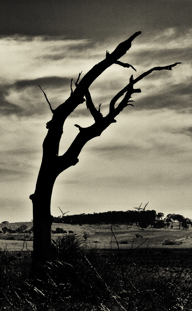
1. I'm not sure about the foreground in this one. Is there too much light? I thought about making the foreground darker but I was concerned that it would make it too dark and unbalanced.
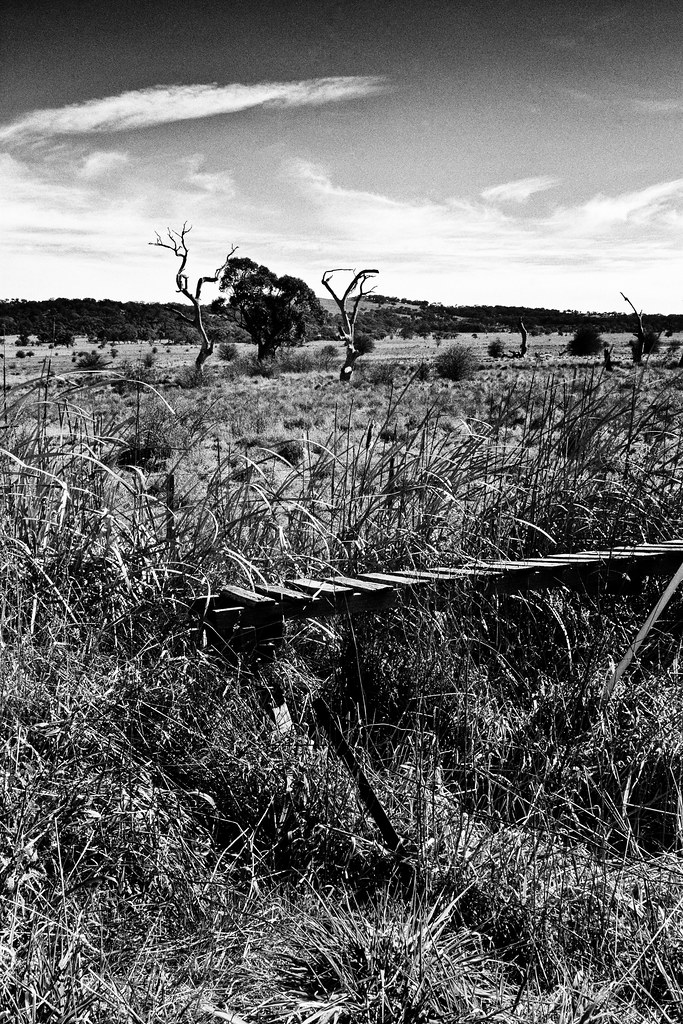
2. I was trying to achieve a sense of depth in this one.
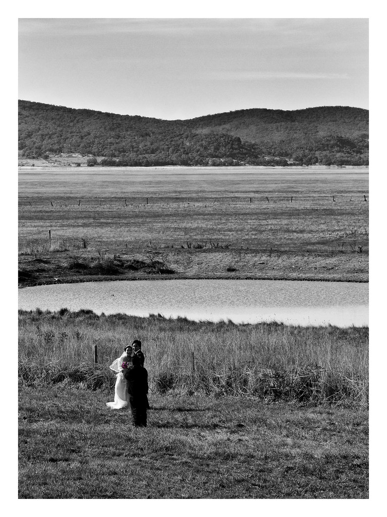
3. I'm not sure about the dimensions of this one. I think it's too wide (and shouldn't have the frame). I liked the idea of the bride and groom being dwarfed by the surrounding landscape. I also liked them being the only vertical elements with the horizontal lines.
This is my first foray into landscape photography so I'm learning.
Thanks for looking.
R
 Helpful Posts: 0
Results 1 to 8 of 8
Thread: Something different from me
-
31st July 2011, 11:13 AM #1
Something different from me
Last edited by Camellia; 31st July 2011 at 11:43 AM.
-
31st July 2011, 01:27 PM #2
Re: Something different from me
Very nice.
1. Not a lot of detail in the dead tree but a lot of detail in the foreground. I think the detail in the foreground helps as everything else has a flat appearance.
2. You've achieved your goal however the horizontal lines have a bit of a halting effect on the eyes. Try diagonals with the available elements.
3. Very nice although we as wedding attendees are used to seeing the backs of the bride and groom.
-
31st July 2011, 02:19 PM #3
-
31st July 2011, 03:16 PM #4
-
31st July 2011, 04:50 PM #5

- Join Date
- Mar 2009
- Posts
- 2,522
Re: Something different from me
Raylee
The first one is the best of the three for me.
My thought exactly. I think you would need to crop some off the bottom if you did that. I am not keen on the foreground as it stands. Taking the wind turbines out may be an idea too. For this kind of shot to work well it needs to be very simple.I thought about making the foreground darker
The second shot is too complex for a bear of little brain like me.
I think with the third shot the people are competing unsuccessfully with the landscape. The problem here is that if you are going to include people they either need blend with the scene or they need to dominate the scene. In this shot we are a bit between - the people are dominant enough that the eye automatically seeks more detail and that detracts from the image as a whole. I get the idea because there is the contradiction between the landscape and the bride and groom but for this to work we need to be closer so that the brain does not have to hunt out the definition.
-
31st July 2011, 05:58 PM #6
-
1st August 2011, 11:02 AM #7
Re: Something different from me
Thanks John, Giannis and Steve - very useful feedback. I'm playing with the first one a bit more.
R
-
1st August 2011, 11:49 AM #8Moderator


- Join Date
- Feb 2009
- Location
- Glenfarg, Scotland
- Posts
- 21,402
- Real Name
- Just add 'MacKenzie'
Re: Something different from me
Sorry Raylee, missed this yesterday.
It's already been said and you've acknowledged it, but I'd echo Steve's comments. Although in darkening up the foreground in the first one, you don't want to go too far and lose all detail. I think would kill it.


 Reply With Quote
