 Helpful Posts: 0
Results 1 to 13 of 13
Thread: White feather...
-
4th August 2011, 05:53 PM #1
White feather...
-
4th August 2011, 07:12 PM #2

- Join Date
- Mar 2009
- Posts
- 2,522
Re: White feather...
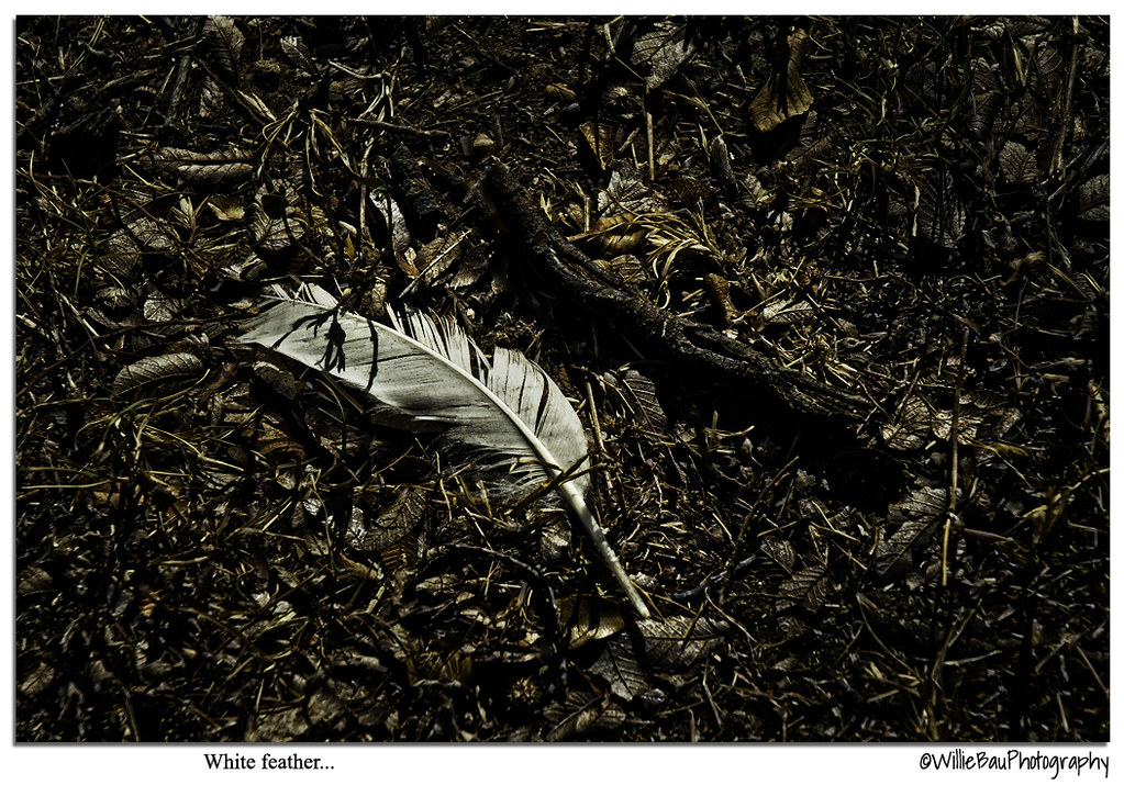
I like it Jiro. The last couple from you seemed a touch over processed but this one has a really good melancholy feel to it. I often think looking at the ground beneath your feet always has a story to tell and we tend to ignore this view point most of the time
-
4th August 2011, 07:26 PM #3
Re: White feather...
Thanks a lot, Steve. When I saw this, at first I don't have an idea what to do with it. But then, I noticed the nice difference between the color of the dried twig against the white feather and also the grunginess of the dead leaves. An idea immediately came to me - take a shot, render it as a very dark scene then introduce selective lighting to highlight the feathers portraying a bit of sadness to it. Most of the time, the vision that I had simply guides me on what to do with the image on the post processing. I'm glad you like this one. Cheers.
-
4th August 2011, 08:19 PM #4

- Join Date
- Mar 2009
- Posts
- 2,522
Re: White feather...
That is exactly what I try to do. If the the PP is not envisaged at the time of capture it is always going to be a lottery whether you get a desirable result. In fact I strongly believe it is essential if you are going to put any feeling into an image. This is an excellent example. You started on here with very up beat happy images but as I saw your processing develop it became obvious that the techniques would far better suit the darker more moody imagesMost of the time, the vision that I had simply guides me on what to do with the image on the post processing.
oh and if you applied this type of PP to people I think you would get some very desirable results if done with care
-
4th August 2011, 08:39 PM #5
Re: White feather...
That's exactly the path that I am trying to take right now, Steve. When I see something that interests me, I try to see in my mind exactly how I want to alter it on the PP to make it work. I still have a long way to go but I am determined to learn and get better if possible. Small steps as how they say it. Thank you very much for your encouragement, Steve.

-
4th August 2011, 09:08 PM #6Moderator


- Join Date
- Feb 2009
- Location
- Glenfarg, Scotland
- Posts
- 21,402
- Real Name
- Just add 'MacKenzie'
Re: White feather...
I wish I had just looked at the image and then replied before reading the exchange between Willie and Steve above, because now it just feels as if I'd be repeating what they have discussed and concluded.
So ...... see above!
What I find, on those occasions when it works, is that there is a tremendous buzz attached to realising that you have made the final image that was in your mind when you pressed the shutter.
-
4th August 2011, 09:52 PM #7
Re: White feather...
That is exactly true, Donald. In relation to that, what I have REALIZED is that the strength of your image to move your viewers WILL BE ENHANCED by how you processed it. The image captured by the camera has to be augmented by the vision you had in your mind and it can be done with the help of post-processing.
-
4th August 2011, 10:56 PM #8
-
4th August 2011, 11:22 PM #9
Re: White feather...
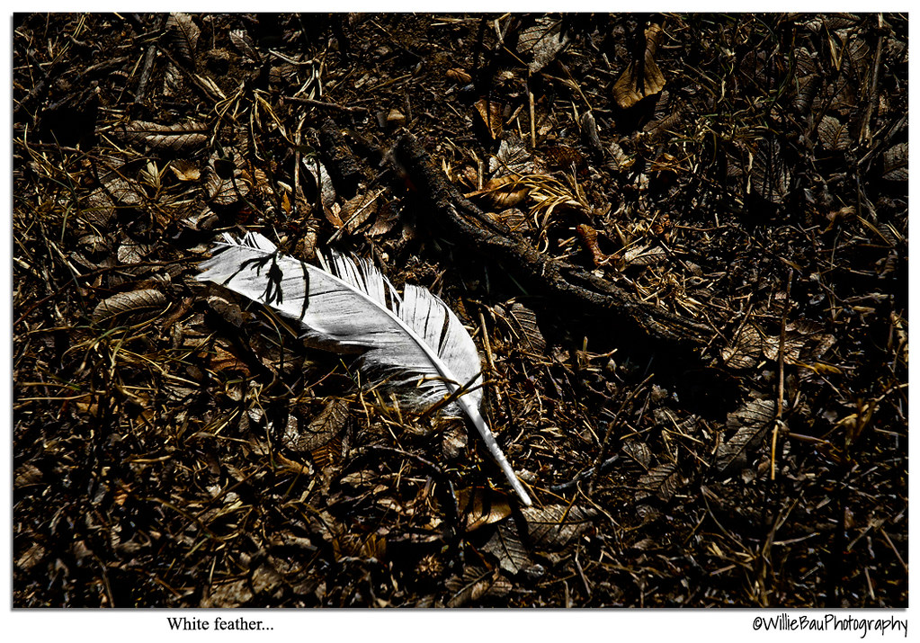
Ah Willie, I like this edit better. It is easier to see the twig and how it complements the feather. Very nice.

-
5th August 2011, 12:11 AM #10
Re: White feather...
By a small margin I seem to like this one too, Frank.

-
5th August 2011, 01:51 AM #11


- Join Date
- Sep 2010
- Location
- up on a knob above Paden City, West Virginia
- Posts
- 2,101
- Real Name
- Marie Hass
Re: White feather...
yin and yang...... I like the second edit better. Both edits speak to the heart and mind, then the eye.
Marie
-
5th August 2011, 03:34 AM #12

- Join Date
- Nov 2010
- Location
- Panama City, FL
- Posts
- 3,540
- Real Name
- Chris
Re: White feather...
Actually, I didn't like either edit...oh contrary me. I didn't see where the curvature of either the feather or the twig was enhanced by all the surrounding dead space..............so, of course, I removed it, went to a square compositional study where the dead space (negative space) pushes each object to the center, yet allows a non-constrictive environment where each can seemingly expand, as per Marie's suggestion of the Ying/Yang.

-
5th August 2011, 09:38 AM #13
Re: White feather...
Hi Jiro,
I find it is a wonderful subject. I feel that the first one is just fine. The 'happy' colours remove something from the mood. The first makes me (or forces me) spend more time looking at it.


 Reply With Quote

