
I was having no luck tweaking my bee photo as per Willie's instructions, so I decided to process some of tonight's harvest from the local park. C&C welcome.
 Helpful Posts: 0
Results 1 to 13 of 13
Thread: In the Pink
-
13th August 2011, 07:13 AM #1


- Join Date
- Oct 2010
- Location
- Canada
- Posts
- 1,990
- Real Name
- Janis
In the Pink
-
13th August 2011, 04:25 PM #2Moderator

- Join Date
- Feb 2009
- Location
- Glenfarg, Scotland
- Posts
- 21,402
- Real Name
- Just add 'MacKenzie'
Re: In the Pink
That is gorgeous. The low position not only gets us down and close, but it creates a sense of mystery as we wonder what else is just beyond what we can see.
I think the composition is wonderful because you've got that very strong element running right up the right-hand third vertical. And that's beautifully balanced by the strong vertical stem over on the left-hand side. And those two provide us with a frame through which we can look into the middle and background. But what is to the right of the RH third vertical is not lost or surplus. It shows us that we can actually run round the side of that strong edge to the 'frame' and get to whatever is behind. And the inclusion of just that glimpse of sky keeps it 'open' and not claustrophobic.
I love it. I think it's a beauty.
-
13th August 2011, 07:00 PM #3
- Join Date
- Oct 2010
- Location
- Canada
- Posts
- 1,990
- Real Name
- Janis
Re: In the Pink
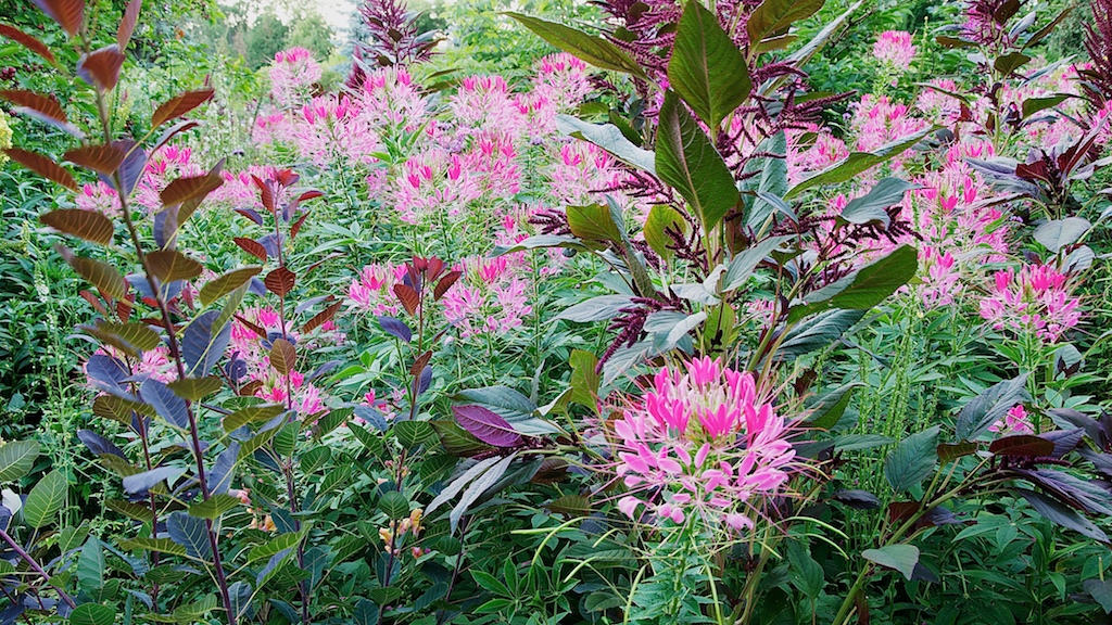
Thank you, Donald. I'm glad you like it. I like the composition, too, which is why I chose it over the generally sharper one I shot a few secs later (see below). A bit of a breeze had bent that LH vertical element on an angle and I rushed to catch it before I had chosen the focal point I had intended (blossom on the right). Quite a lot in that first frame was stirring, judging by a comparison with the second set of bracketed shots that this one came from:
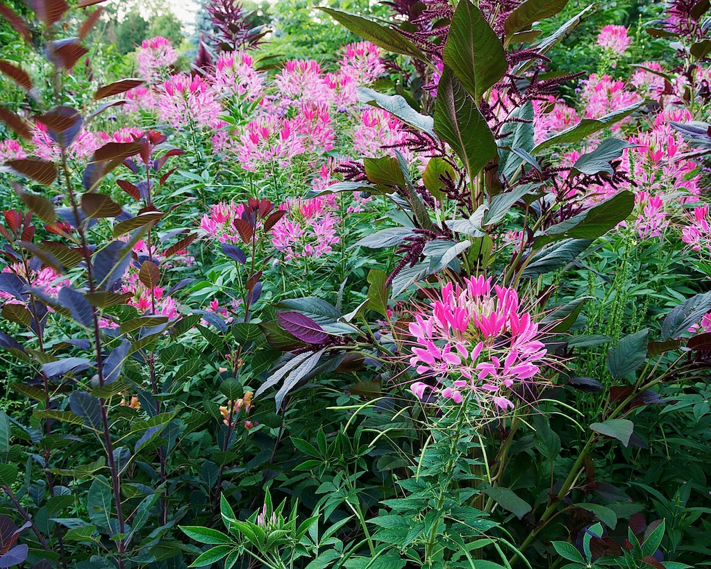
You'll notice that the LH element is more vertical, and so the other crop doesn't work with it. I suppose someone more experienced would have increased ISO to get a faster shutter speed and/or more depth of field, but I was stubbornly sticking to the D90's best. And I suppose if I had stopped to change the ISO, I would have missed the shot altogether.
While I'm here, I might as well ask people which frame they prefer and why. (Both images should be viewed in the lightbox.) Thanks.
-
13th August 2011, 07:04 PM #4
- Join Date
- Sep 2010
- Posts
- 2,064
Re: In the Pink
Oooooo, Janis! I like these - both of them. The color in the second one is just what I needed, today!

-
13th August 2011, 07:15 PM #5
- Join Date
- Oct 2010
- Location
- Canada
- Posts
- 1,990
- Real Name
- Janis
Re: In the Pink
Thanks, Katy. The first one struck me as mildly impressionistic and so I was hoping it would please you and Wendy.
Do you think I should bring the first one more in line with the second in terms of tonal values (i.e. weighted more on the darker end)?
-
13th August 2011, 07:28 PM #6
- Join Date
- Aug 2009
- Location
- Canada
- Posts
- 3,113
- Real Name
- Wendy
Re: In the Pink
Nice Janis and you are right I do like the impressionistic look of the first one. The colours in the second have a lot going for them too though so it might be worth trying the same tones in the first. I do like the first one best in terms of composition, but the more I look at the second shot, the more I like it. At first glance it is a bit busy looking and not as balanced as the first. Really hard to pick one, both are very pleasing to look at. Great job.
Wendy
-
13th August 2011, 07:41 PM #7Moderator

- Join Date
- May 2008
- Location
- Windsor, Berks, UK
- Posts
- 16,749
- Real Name
- Dave Humphries :)
Re: In the Pink
Hi Janis,
I was struck by two things;
the great composition (as Donald explains)
but also; it looks about 1/2 stop over exposed, like the colours might have clipped but been rescued in PP.
I have got bitten by that so many times I am now paranoid about checking blinkies and RGB histograms.
Hope that's helpful,
-
13th August 2011, 07:52 PM #8
- Join Date
- Sep 2010
- Posts
- 2,064
Re: In the Pink
I think Wendy said it well so I can just leave it at that!
(Also, I always listen to Dave yes, I do! although, of course, I can't tell if it was overexposed just by looking at it, myself - that's why I love the histogram in Lightroom - it has little warning triangles about being overblown or under - then, I can highlight the trouble spots and adjust - love it! I just thought I'd throw that in - it's one of the things that I'm enjoying working with, at the moment. I think Dave is talking about "in camera", though. Ack! I'm rambling terribly!)
-
13th August 2011, 07:59 PM #9
- Join Date
- Oct 2010
- Location
- Canada
- Posts
- 1,990
- Real Name
- Janis
Re: In the Pink
You're right, Dave, most of the pink petals were clipping, and that was at .67EV under the matrix metering value (but at that point I did have my focus point on the dark leaves rather than the pink blossom). I have to get a more portable grey card. The one I have is too big to carry around. Besides that, I was composing through the viewfinder, so no blinkies. Originally Posted by Dave Humphries

 Coming from the film world, I just haven't got into the habit of using the LCD screen, but I can see it has its uses. Hmmmm....
-
13th August 2011, 08:49 PM #10
- Join Date
- Oct 2010
- Location
- Canada
- Posts
- 1,990
- Real Name
- Janis
Re: In the Pink
Hey, Wendy! Where've you been? Almost missed your post. So glad you like them; thanks for the feedback. Originally Posted by ScoutR
-
13th August 2011, 08:54 PM #11
- Join Date
- Oct 2010
- Location
- Canada
- Posts
- 1,990
- Real Name
- Janis
Re: In the Pink
I feel so foolish. I use the LCD screen on my compact all the time; there is no viewfinder. Why I can't transfer that to the DSLR, I just can't figure. Originally Posted by Katy Noelle
 (My turn to ramble.
  )
)
-
13th August 2011, 09:24 PM #12

- Join Date
- Apr 2008
- Location
- London
- Posts
- 1,502
- Real Name
- Ian
Re: In the Pink
Janis, use a credit card sized grey card, they are great and there is never an excuse to be without it.
Just google it, they are quite reasonable, although I recall it was spelt 'digital gray card' as some do!.
-
13th August 2011, 09:42 PM #13
- Join Date
- Oct 2010
- Location
- Canada
- Posts
- 1,990
- Real Name
- Janis
Re: In the Pink
Thanks, Shreds. I'm going to see if I can't get one at the photo store in the mall, to use tonight or tomorrow. Originally Posted by shreds
No problem; we Canadians spell like Americans one day, and Brits the next.Just google it, they are quite reasonable, although I recall it was spelt 'digital gray card' as some do!.

 Reply With Quote