 Helpful Posts: 0
Results 1 to 20 of 42
Thread: desperate...
-
18th August 2011, 04:17 PM #1
desperate...
-
18th August 2011, 04:36 PM #2

- Join Date
- Sep 2010
- Posts
- 2,064
Re: desperate...
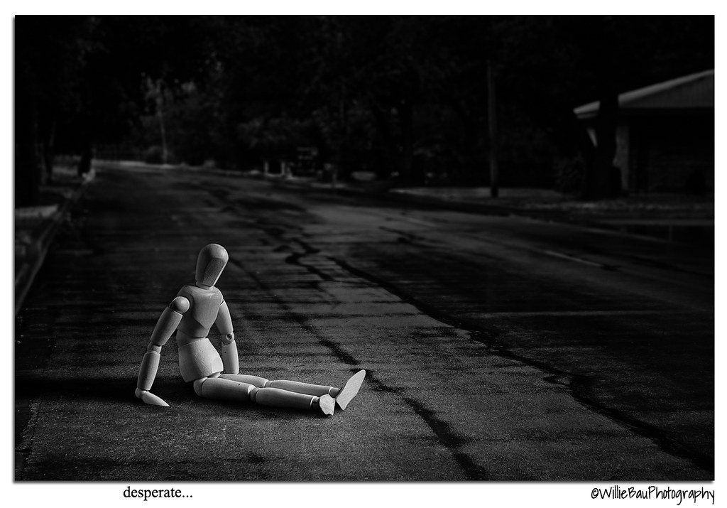
That's deep, Jiro! I've seen that before, in my mind, when I've been thinking of certain people in just super tough or odd times in their lives. This is how I've, actually, "seen" (or imagined) them in a crumbled heap - just sitting in the road.


 Insightful! Dare I say,... a powerful illustration...?
-
18th August 2011, 04:37 PM #3Moderator


- Join Date
- Feb 2009
- Location
- Glenfarg, Scotland
- Posts
- 21,402
- Real Name
- Just add 'MacKenzie'
Re: desperate...
Imaginative and creative. And marvelous management of light.
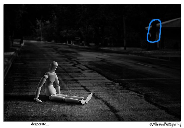
The one thing that catches my eye, Willie, is the fact that there is a vertical cutting over the roofline of the building at the top right. Don't know if you'd feel that a clone was in order?
-
18th August 2011, 04:47 PM #4
Re: desperate...
Thanks for viewing, Katy. Do you remember my post about the wet leaf on the road? Well, this shot (actually just the background) was a part of it. I like the gloominess I saw on the wet road and its kind of lonely as nobody is out on the street at that time. So, an idea immediately came to my mind - take a shot of the wet and gloomy road and use it as a background with a lonely subject. 3 days later, off I went to walmart to buy one of those artists' mannequin as that is the one that I want to use as my model for this concept. I used my DIY softbox again but this time I feathered the light by aiming it up high. The lower edge of the softbox is almost in line with the neck of the mannequin so the light tapers off from the chest downward. A lot of tweaking on levels and curves inside photoshop and this is what I came up with. I saw one of Vincent Versace's video tutorial about vision and concept and this guy is awesome. His concept of photography is really deep, more in the same wavelength as David duChemin. I am glad the message came across.
-
18th August 2011, 04:50 PM #5
Re: desperate...
Thanks for viewing, Donald. I am not so sure about the vertical element on the roofline. Care to show it to me? I tried to include the house on the right on the composition because I want the setting to be of an urban neighborhood and yet this "being" is desperate in his life. Hope this helps.
Last edited by jiro; 18th August 2011 at 06:36 PM.
-
18th August 2011, 05:09 PM #6

- Join Date
- Sep 2010
- Posts
- 2,064
-
18th August 2011, 05:16 PM #7

- Join Date
- Sep 2010
- Posts
- 2,064
Re: desperate...
One other interesting (to me, anyway) thought. I remember, a few years back, reading about lighting in interior decorating. It's important, in our homes, for setting mood, too. The article was comparing lighting that was pointed up or down, soft or harsh, warm or cold to stage lighting. For a comedy, it should be from above and bright. for tragedy and more drama - it is often more 'angled up' ( the 'footlights') and sharply with more focus and surrounding darkness. I don't remember exactly everything that it said but that was the general idea of it all.
-
18th August 2011, 05:20 PM #8

- Join Date
- Nov 2009
- Location
- Chandigarh, India
- Posts
- 1,541
- Real Name
- Sahil Jain
Re: desperate...
Wow.. Thats a very interesting shot, Jiro.
-
18th August 2011, 05:38 PM #9
Re: desperate...
Nice creation Willie..I like how you use the mannequins slumped-over posture to amplify the emotional impact of the whole scene.
Mike
-
18th August 2011, 05:48 PM #10
Re: desperate...
Yes, it certainly does. It's funny that it was only until somebody donated a flash unit to me and played with it that I really came to see why the light is very important on every shot. The light gives the image LIFE! No wonder that among the best landscape photographs that I have seen from numerous books all of them shows this magnificent play of light in them. I really admire these guys who sacrifices a lot of convenience and returns to the same spot over and over again just to wait for that marvelous light to shine upon their subject. Since I don't have the means and resources to travel, I tried to learn about light using my flash and cardboard backgrounds.
 With the proper kind of light, it can really help you keep the message of your shot consistent. hard light can denote tension like anger, hurt and even loneliness. Soft light can denote love, belongingness, sweetness, and in some cases given the right subject a very subtle form of loneliness. I'm really studying a lot about light right now so I'd probably post a few images from time to time as there are a lot of things to learn. I just wish I can buy a remote wireless flash triggering device soon so I can place the flash farther than what the flash cable can reach.
-
18th August 2011, 05:49 PM #11
-
18th August 2011, 05:51 PM #12
-
18th August 2011, 06:38 PM #13
-
18th August 2011, 06:40 PM #14
-
18th August 2011, 06:43 PM #15
Re: desperate...
Negative, Mike. The wooden material used is not that hard so an alteration would probably just destroy it. My issue with the mannequin was that the joints are all being kept together by springs. Bend the joints too much and the spring will exert too much force to make it return to the same position instead of the pose you want it to take. Not a big issue for me but it would help me a lot if I can mimic some human pose that I have in mind.

-
18th August 2011, 06:44 PM #16
-
18th August 2011, 07:13 PM #17

- Join Date
- Mar 2009
- Posts
- 2,522
Re: desperate...
Jiro
i do like this. The only gripe I have is that the doll looks too clean against its backdrop. Some PP texturing would give the doll a more neglected look. I would have also removed the head of the doll...buts that just me
It does work though and this use of figurines does intrigue me.
-
18th August 2011, 07:22 PM #18
Re: desperate...
-
18th August 2011, 07:37 PM #19
-
18th August 2011, 07:42 PM #20

- Join Date
- Nov 2010
- Location
- Panama City, FL
- Posts
- 3,540
- Real Name
- Chris
Re: desperate...
Not to mix metaphors, but....desperation (anxiety, worry, fear, distraction) and despair (hopelessness, misery, gloom) are two completely different emotional states. While there are overlapping areas (like circles of confusion), they really represent two different states of being.
I say despair fits perfectly...so now you have to go change your title...cause I know these thngs...


 Reply With Quote


