 Helpful Posts: 0
Results 1 to 11 of 11
Thread: 2 towers 2 cranes
-
20th August 2011, 11:53 PM #1
-
21st August 2011, 07:02 AM #2
-
21st August 2011, 11:04 AM #3Moderator


- Join Date
- Feb 2009
- Location
- Glenfarg, Scotland
- Posts
- 21,402
- Real Name
- Just add 'MacKenzie'
Re: 2 towers 2 cranes
Mark
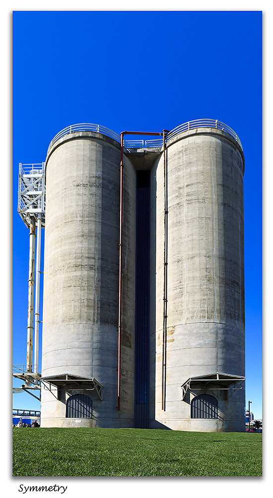
Have to confess that the first one doesn't really get me going. I'm not sure that there's enough of interest to hold it up as a strong image, albeit it's been very well made.
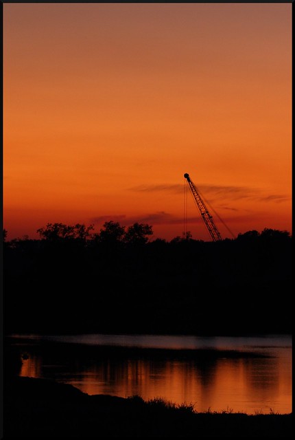
But the second one ...........! Now, that is a beauty. You've really nailed it. Exposure is excellent. Detail on the structure of the cranes is spot-on. Composition is top-drawer - just that hint of reflection right at the bottom give us the context - tells us where we are.
Definitely one for the wall.Last edited by Donald; 21st August 2011 at 11:21 AM.
-
21st August 2011, 11:44 AM #4
Re: 2 towers 2 cranes
The problem with #1 for me Mark is the way the top of the towers have been made oval by straightening the verticals. It could probably be corrected witht the Warp tool however.
Now the next image, #2, is an absolute peach of a shot, lovely How much did you have to pay the crane drivers to park with such symmetry?
-
22nd August 2011, 04:01 AM #5
Re: 2 towers 2 cranes
I agree. I will break with the concensus a little bit though...
I don't know how much this is cropped if at all, but I would be interested to see just a little more space at the right as I think this would accentuate symmetry, and perhaps the empty space of the sky is just a little too much? Just a little.
It's funny to see this photo, as I noticed a similar sight on the way home from work the other day and thought, hmmm, that might make a good photo!
Good work.
-
22nd August 2011, 09:14 AM #6
Re: 2 towers 2 cranes
Thanks for the comments guys. I agree with your comments. The first image was taken in an exercise to see how close I could get to the structure with a wide lens and still get it all in. The second image was taken on the spur of the moment, when I noticed a ship with its cranes berthed oppsite a spot when I was taking some evening cityscapes. The more I see it the more I like it. I tried a horizontal crop initially but it just didn't work. As soon as I tightened it onto a tall vertical crop it made sense.
-
23rd August 2011, 03:02 AM #7
-
23rd August 2011, 09:05 AM #8

- Join Date
- Nov 2009
- Location
- New Zealand
- Posts
- 98
Re: 2 towers 2 cranes
Hi Brian
Yeah they do these things don't they? No consideration for others. I would write them a letter to the effect "Now look what you've done to my photo!"
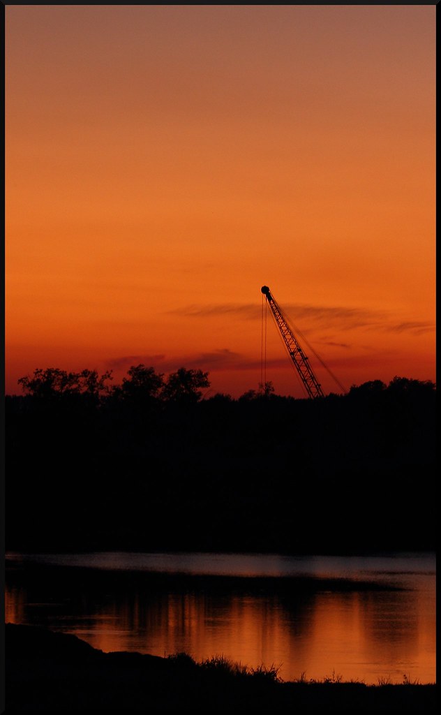
I like the composition of this photo, with its sole crane. I love the colours orange/amber melting into grey at the top - or was that a vignette?Just a small niggle - pity about the dark reflection reaching all the way across the river at the left hand edge of the crop.
Cheers
Nihia
-
23rd August 2011, 10:42 AM #9
Re: 2 towers 2 cranes
Nihia,
No vignettes, haven't learned that trick yet, though I have added a gradient a time or two in other photos.
About the shadow on the left, I agree that doesn't quit fit does it. At first I was thinking of it as a framing... Lol but that aint workin out! I was hoping to compliment Mark's second photo.
Thanks for your comments.
-
24th August 2011, 01:49 AM #10
-
25th August 2011, 09:02 AM #11

- Join Date
- Nov 2009
- Location
- New Zealand
- Posts
- 98
Re: 2 towers 2 cranes
Better, but ... what about taking some of the next shadow out, just a teensy? Angle the reflection I mean. so that it's more like the first peaked reflection?
Luck
Nihia


 Reply With Quote


