 Helpful Posts: 0
Results 1 to 6 of 6
Thread: Petals
-
23rd August 2011, 11:42 PM #1

- Join Date
- Apr 2011
- Location
- Ontario (mostly)
- Posts
- 6,667
- Real Name
- Bobo
Petals
Last edited by Bobobird; 24th August 2011 at 01:53 AM.
-
24th August 2011, 07:19 AM #2Moderator


- Join Date
- Feb 2009
- Location
- Glenfarg, Scotland
- Posts
- 21,402
- Real Name
- Just add 'MacKenzie'
Re: Petals
Bobo
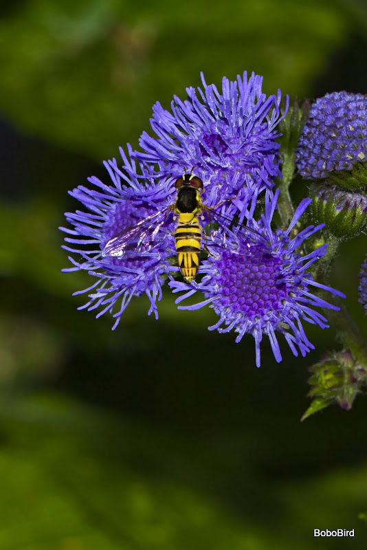
The vibrancy in the first one certainly attracts attention. And you've captured the detail very well.
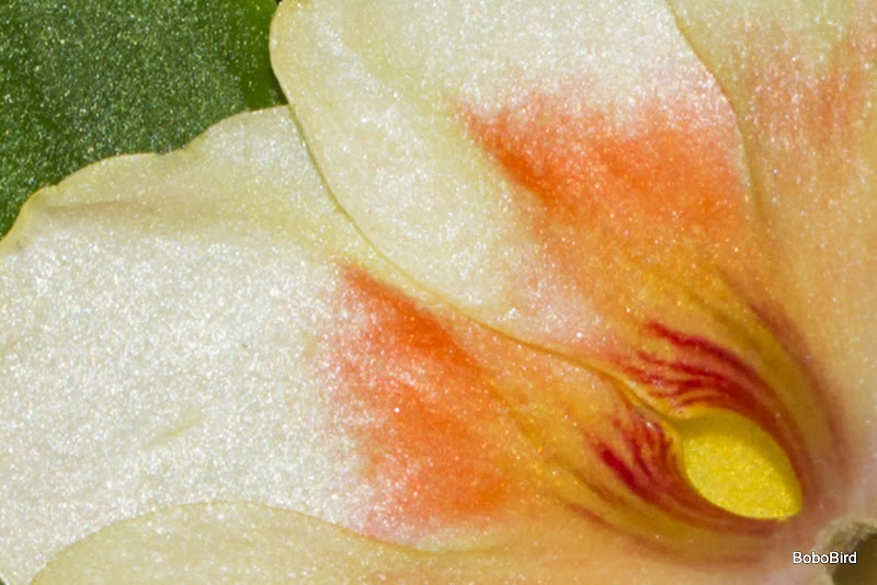
The other two don't have the same impact for me and #3 feels a bit 'squeezed' into the frame. I realise you went in tight, but I wonder if, particularly at the top, it needs a bit more space around it?
-
24th August 2011, 11:37 AM #3
Re: Petals
Hi Bobo,
I agree with Donald's suggestion on #3, but I do like the 'natural' gemetric shapes in this, but things that I think could be improved;
What Donald said: more edge space, but not a lot, but a bit on top, left and slightly less on right and bottom
Don't watermark it like that - and especially on this image, where it covers one of the three edge curls that form part of the composition - it's almost a crime

More local contrast in the petals to reveal detail
More sharpness for same reason, but be careful, it would be easy to get wrong
Hope that helps,
-
24th August 2011, 01:33 PM #4

- Join Date
- Apr 2011
- Location
- Ontario (mostly)
- Posts
- 6,667
- Real Name
- Bobo
Re: Petals
Thanks Donald and Dave.
Will redo as suggested.
As for the watermark - I will have to set the Picasa uploader to not include that bit in future.
Yellow is a real pita to get right (for me at least). What would be a good way of going about it without it looking blown?
-
24th August 2011, 06:18 PM #5
-
24th August 2011, 07:15 PM #6

- Join Date
- Apr 2011
- Location
- Ontario (mostly)
- Posts
- 6,667
- Real Name
- Bobo


 Reply With Quote

