 Helpful Posts: 0
Results 1 to 11 of 11
Thread: Old man painting...
-
26th August 2011, 08:50 PM #1

- Join Date
- Aug 2011
- Location
- Portugal
- Posts
- 11
- Real Name
- Pedro
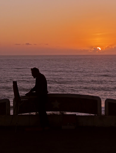
Old man painting...
Last edited by Pereirinhaped; 26th August 2011 at 09:07 PM.
-
26th August 2011, 08:55 PM #2

- Join Date
- Jul 2011
- Location
- Toronto
- Posts
- 228
- Real Name
- Michael
Re: Old man painting...
Awesome.... myself, I would crop some of the bottom to make him more prominent.
-
26th August 2011, 11:13 PM #3

- Join Date
- Aug 2011
- Location
- Portugal
- Posts
- 11
- Real Name
- Pedro
-
26th August 2011, 11:28 PM #4
Re: Old man painting...
Beautiful images Pedro.
I like them both, and the second one where he is located further from the Sun, with the lamp gone, focuses all of my attention on the painter. I think his slightly slumped position really adds character to it.
MikeLast edited by Dizzy; 27th August 2011 at 03:55 PM.
-
27th August 2011, 10:51 AM #5
Re: Old man painting...
I love simple but bold and strong silhouettes like this and the only thing I would change, and here's an editing challenge Pedro, would be to lift the horizon a touch so that it didn't chop the top off the artist's head. Other than that little niggle I love it, well spotted!

-
27th August 2011, 11:11 AM #6Moderator


- Join Date
- Feb 2009
- Location
- Glenfarg, Scotland
- Posts
- 21,402
- Real Name
- Just add 'MacKenzie'
Re: Old man painting...
Last edited by Donald; 27th August 2011 at 12:16 PM.
-
27th August 2011, 11:45 PM #7
Re: Old man painting...
Very nice. Great shot
-
28th August 2011, 10:15 PM #8

- Join Date
- Aug 2011
- Location
- Portugal
- Posts
- 11
- Real Name
- Pedro
Re: Old man painting...
Thank you all for your comments and sugestions.
Cheers!
-
31st August 2011, 10:44 PM #9
Re: Old man painting...
Hi Pedro,
This is an amazing image. The pole is absolutely necessary I think. Including it helps to place the figure correctly in spacetime( ). Without it, it seems a little lost and uninteresting. You may want to try a complete black silhouette in this one. It might be interesting... But it's already a wonderful image.
-
2nd September 2011, 06:04 AM #10

- Join Date
- Aug 2011
- Location
- Portugal
- Posts
- 11
- Real Name
- Pedro
Re: Old man painting...
Hello Giannis,
Thanks! After trying a few crops without the street lamp I decided ti keep as it is, because I was feeling precisely what you said. Without it, the painter just seems to be there out of nowhere...
I'll try the full black silhouette as you suggested and post it shortly (as soon as I get some free time during the weekend).
Thanks once again,
Cheers,
-
3rd September 2011, 03:53 AM #11


 Reply With Quote

