
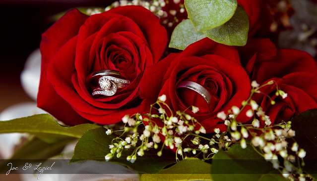
Friend got married and I did their wedding photos.
I need comments if I should use this image for their album's main cover?
 Helpful Posts: 0
Results 1 to 8 of 8
Thread: Roses + Rings
-
28th September 2011, 09:43 PM #1

- Join Date
- May 2010
- Location
- Nashville Tennessee USA
- Posts
- 386
- Real Name
- Chriss Goyenechea


Roses + Rings
-
28th September 2011, 10:16 PM #2

- Join Date
- May 2011
- Location
- Brisbane Australia
- Posts
- 4,636
- Real Name
- Dave Ellis
Re: Roses + Rings
Hi Chriss
It's a very nice shot - elegant with very good image quality in my opinion.
I think it would look nice on an album cover particularly a black or dark coloured one. It would fit best on one with "landscape" shape. Perhaps the couple's names could be a little larger ?
However I must caution that I'm way out of my depth on wedding albums and that sort of thing.
Cheers Dave
-
28th September 2011, 10:21 PM #3

- Join Date
- Jul 2011
- Location
- Concrete, WA. USA
- Posts
- 686
- Real Name
- Mike
Re: Roses + Rings
Chris,
I think it's a beautiful shot, but the white in the middle-left background is a definite eye catcher. Any chance you can clone that out?
Mike
-
28th September 2011, 10:48 PM #4

- Join Date
- Jun 2010
- Location
- Missouri, USA
- Posts
- 2,454
- Real Name
- Terry
Re: Roses + Rings
That's a great shot Chriss and I think it would make a great album cover.
But as has been said, you might consider tweaking the white a little. I think I would go back to the photo before the text bar was added, either clone and/or burn down the white to the left and underneath the flower. If that didn't look good to me, I might make the flowers/leaves a selection put it on a new layer to lose the white, or possibly invert the selection and deal with it that way. Looks like it wouldn't be too hard or time consuming to make the flowers/leaves a selection and the nice thing is that it takes up the vast majority of the frame. I'd probably stay with a black background
Then come back in with the text bar with the same font (very elegant and perfect for the occasion) only a little larger (text and bar) so its a little more prominent. The opacity of the bar looks great the way you have it. And I think it might be a little more prominent still yet if the lettering were over the black background.
But either way I think its a great shot to use for an album cover of this kind. Thats the shot that will be seen most while the book is sitting on the coffee table. Your friends are lucky to have had you shooting their Special Day.
-
28th September 2011, 10:54 PM #5

- Join Date
- Jan 2011
- Location
- Seattle Washington
- Posts
- 3,550
- Real Name
- Paul
Re: Roses + Rings
Quite a nice shot. I agree with the above, but I also wonder how it would look if a little of the extra space on that side was to be cropped off and the names place in another color against the white just a little further over....... sans the bar? I am no wedding photog, so take my thought for what it is worth.
-
29th September 2011, 12:24 AM #6
- Join Date
- May 2010
- Location
- Nashville Tennessee USA
- Posts
- 386
- Real Name
- Chriss Goyenechea
Re: Roses + Rings
Thanks for the input guys! I can't count the number of times i have looked at this image and I didn't even notice the blurred white background. hehehehe I would definitely burn it down to lower it's obviousness. I'll try to crop it too and see how it would look.
once again thanks!
will be back with the updated images.
-
29th September 2011, 12:38 AM #7

- Join Date
- May 2011
- Location
- Ann Arbor, MI
- Posts
- 471
- Real Name
- Scott Benz
Re: Roses + Rings
Chriss,
I just started a thread about cliche' photos. I remarked about how I would never want to be a wedding photographer because timing is so critical, the lighting is often terrible but mostly there are so many cliche' shots that you are basically obligated to take. BUT... I don't know that I've seen an image like this for a wedding. I find it very refreshing and well constructed. I agree the white areas should be addressed and the names should be enlarged but it certainly merits consideration as the cover shot. Very well done!
-
29th September 2011, 02:09 AM #8

- Join Date
- Jan 2011
- Location
- southern New Jersey
- Posts
- 365
- Real Name
- George Montgomery
Re: Roses + Rings
With the tweaks that have been suggested, this shot would be fantastic as the album cover.

 Reply With Quote