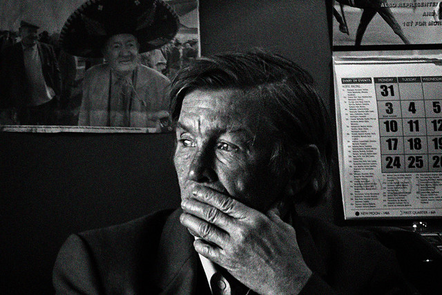
SETTING: dark Irish Pub. I don't want to intrude but can't help notice the apparent angst on this man's face, especially juxtaposed between the happy man in the sombrero, and the calendar hinting at the remorseless passage of time. It's so conflicted that I want the image contrasty, and as the only color in this man's life would seem to be vicarious, I desaturated all the color except hwat was beyond him- the photo and the calendar on the wall.
QUESTION: did this work, or am I overreaching? Try as I might, I am sometimes not
as objective toward my owN images as I would like. (Kinda like my kids)
Any thoughts or suggestions appreciated
 Helpful Posts: 0
Results 1 to 15 of 15
Thread: Pub Man
-
13th October 2011, 10:50 AM #1
Pub Man
-
13th October 2011, 11:09 AM #2
Re: Pub Man
Excellent shot. I think no color at all would be better. To my eyes, it creates an annoying distraction from the main theme which is powerful by itself.
-
13th October 2011, 11:24 AM #3
Re: Pub Man
thank you, stg. I kicked this around, and kept a B&W version- maybe I wasnt giving the viewers enough credit to notice, and just shoved it into their faces
-
13th October 2011, 11:32 AM #4Moderator


- Join Date
- Feb 2009
- Location
- Glenfarg, Scotland
- Posts
- 21,402
- Real Name
- Just add 'MacKenzie'
Re: Pub Man
Kevin
I agree with Steve. I'm not a great fan of selective colourisation and on this one I definitely think that the impact would be much greater if it was a B & W image.
Whta you might want to think about is putting some film grain into it to add to the feeling of grittiness. I don't know what software you use and whether it offers you the chance to choose film grain.
-
13th October 2011, 11:42 AM #5
Re: Pub Man
Thanks, Don. I use PSE9 and will conjure up some images as you and Steve suggest
-
13th October 2011, 11:56 AM #6
-
13th October 2011, 12:10 PM #7Moderator


- Join Date
- Feb 2009
- Location
- Glenfarg, Scotland
- Posts
- 21,402
- Real Name
- Just add 'MacKenzie'
Re: Pub Man
Yes - On the conversion and the grain. But you've lifted up the tone a bit. I preferred the darker, 'moody' look.
-
13th October 2011, 12:17 PM #8
Re: Pub Man
Much much better for me. Distraction gone. But I prefer the black wall and the softer skin tones of the first picture than this brighter version. As I see it, this kind of noise is not "convincing", but I'm sure Donald has much more to say about this!
-
13th October 2011, 12:24 PM #9
Re: Pub Man
thank you, Steve and Donald
-
13th October 2011, 12:30 PM #10
-
13th October 2011, 12:47 PM #11Moderator


- Join Date
- Feb 2009
- Location
- Glenfarg, Scotland
- Posts
- 21,402
- Real Name
- Just add 'MacKenzie'
Re: Pub Man
Kevin
I hope you don't mind, but I pulled a copy down and did a couple of things.
1) I put in Local Contrast Enhancement (LCE) on the man's face
2) Gave his face and the numbers on the calendar a bit of a sharpen
(NB - I used layer masks to hide off the bits I didn't want to affect)
Just gives some additional things things to think about.

ps - If you'd rather I didn't put this up here, please do just say so and I'll remove it.Last edited by Donald; 13th October 2011 at 01:01 PM.
-
13th October 2011, 12:53 PM #12
Re: Pub Man
Donald
I would never mind your assistance, and love what you did with it. I have about 6,000 more images you might like to fiddle with; I could pay you 1 Eur/hr! On my way to reading about LCE. Thanks
kevin
-
13th October 2011, 06:34 PM #13
Re: Pub Man
Hi Kevin,
The problem with the noise is that it is coloured (except in Donald's version)
Just do another monochrome conversion after the noise is applied.
Personally, I'd also do a bit of dodging and burning - the calendar is too bright and the smily faced man on poster is too dark in my view.
HTH,Last edited by Dave Humphries; 13th October 2011 at 10:04 PM.
-
13th October 2011, 07:21 PM #14

- Join Date
- Jan 2009
- Location
- South Devon, UK
- Posts
- 14,553
Re: Pub Man
Personally, I would try a version with the calendar slightly darkened.
To me, it now looks like the most important part of the scene and over rides the man.
But the way Donald has increased the contrast on his face is excellent.
-
13th October 2011, 09:10 PM #15
Re: Pub Man
thanks, Geoff and Dave, I agree. And I hadnt even noticed the noise is colored. And I thought a golf swing was tough to keep track of!


 Reply With Quote

