Results 1 to 20 of 22
Thread: The streets of Hong Kong
-
21st October 2011, 03:10 AM #1

- Join Date
- Apr 2011
- Location
- Ontario (mostly)
- Posts
- 6,667
- Real Name
- Bobo
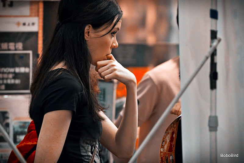
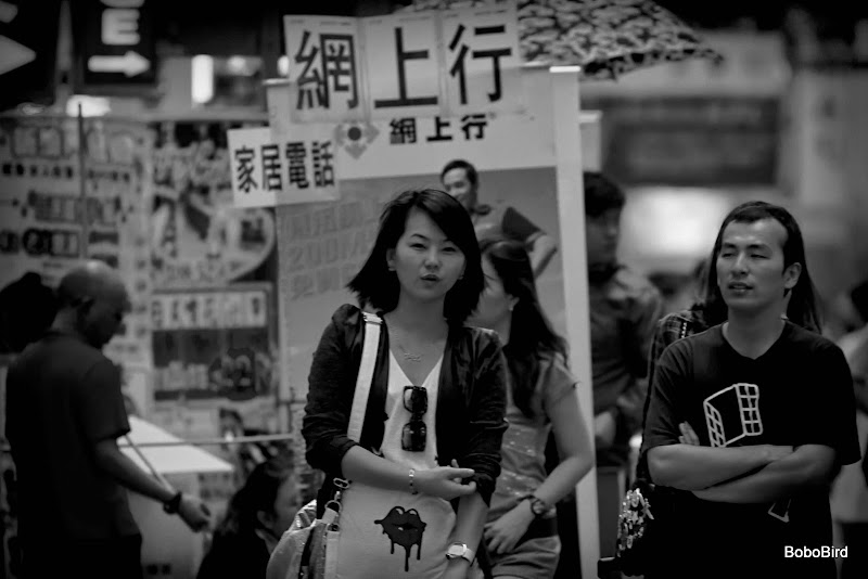
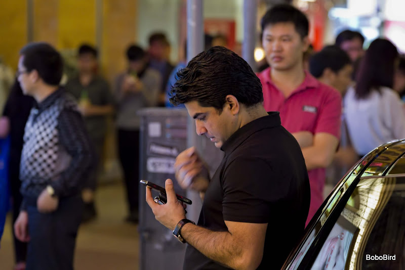
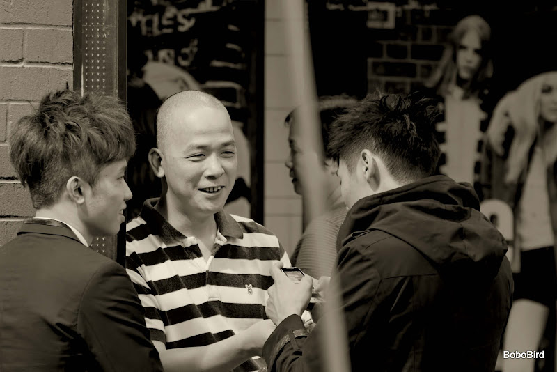
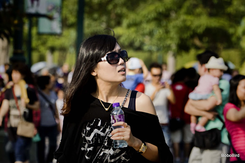
The streets of Hong Kong (updated regularly)
Last edited by Bobobird; 30th October 2011 at 05:06 PM.
-
21st October 2011, 07:27 PM #2
Re: The streets of Hong Kong
Ah, sweet memories

-
21st October 2011, 07:51 PM #3
Re: The streets of Hong Kong
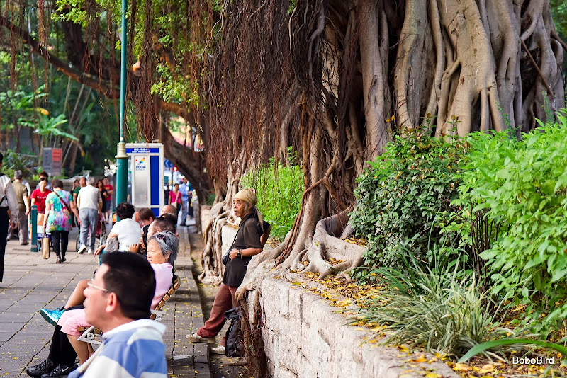
Neat shots... The street looks like one that runs off from Stanley Market to the Bay. Those tree roots are magnificent.
-
21st October 2011, 07:55 PM #4

- Join Date
- Apr 2011
- Location
- Ontario (mostly)
- Posts
- 6,667
- Real Name
- Bobo
Re: The streets of Hong Kong
Thanks guys.
Stanley Market is still there but the bay area has been "upgraded". Now it looks like any other manufactured tourist spot. NIce but...
The banyans are along Nathan Road.
-
25th October 2011, 02:54 PM #5

- Join Date
- Apr 2011
- Location
- Ontario (mostly)
- Posts
- 6,667
- Real Name
- Bobo
-
25th October 2011, 03:45 PM #6
Re: The streets of Hong Kong
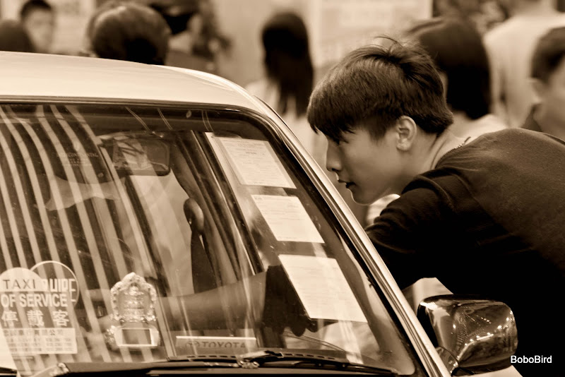
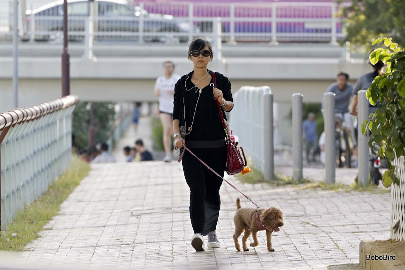
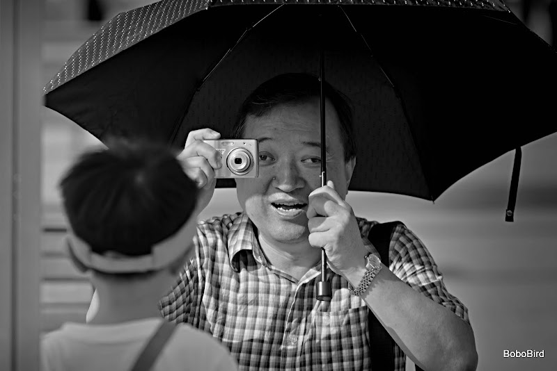
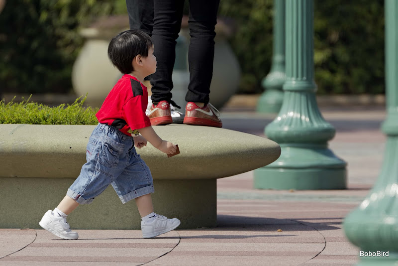
Bobo, I love images of an area that show the people. IMO, far too many folks bring home vacation shots of buildings, trees, landscapes, flowers and those ever present sunsets with no people included. My one complaint with my two week tour to China was that the tour concetrated on "things" rather than on "people".
Luckily, when visiting "tourist sights" in China, the majority of the tourists are Chinese so, they in themselves make interesting subjects. That is opposite to say, visiting the ruins in Greece where the majority of the tourists are American, British, German or some other group that looks no different from tourists visiting a smiliar tourist attraction in the USA.
-
25th October 2011, 05:25 PM #7

- Join Date
- Apr 2011
- Location
- Ontario (mostly)
- Posts
- 6,667
- Real Name
- Bobo
Re: The streets of Hong Kong
Was out to an old fishing village today and the "tourists" were all either Chinese or foreigners who are familiar with HK. Tourists do not have much flexibility in their schedule to roam off the beaten track - which translates into the same pictures of anywhere they go.
Will post the pics later and people may be shocked to see the other side of this ultra-modern city.
-
30th October 2011, 01:47 PM #8

- Join Date
- Apr 2011
- Location
- Ontario (mostly)
- Posts
- 6,667
- Real Name
- Bobo
-
31st October 2011, 06:31 AM #9

- Join Date
- Apr 2011
- Location
- Ontario (mostly)
- Posts
- 6,667
- Real Name
- Bobo
-
31st October 2011, 05:23 PM #10
-
1st November 2011, 02:43 AM #11

- Join Date
- Apr 2011
- Location
- Ontario (mostly)
- Posts
- 6,667
- Real Name
- Bobo
Re: The streets of Hong Kong
Thanks Donald - it is this d**m notebook monitor. If it is tilted exactly straight up the pics come out looking a bit washed out, tilt it back a bit they seem fine here, but end up like 5-8. Wish I had not bought one of the bright screen ones but guess will have to live with it until end-Nov. Grrrr
-
1st November 2011, 08:34 PM #12
Re: The streets of Hong Kong
I'm really drawn to 2.1, perhaps because there is a lot less 'going on' in it.
It captures love in a very simple way.

-
2nd November 2011, 02:00 AM #13

- Join Date
- Apr 2011
- Location
- Ontario (mostly)
- Posts
- 6,667
- Real Name
- Bobo
Re: The streets of Hong Kong
Thanks Brian.
"Less going on" - impossible here unless we get into the backstreets or alleys.
-
2nd November 2011, 03:44 AM #14

- Join Date
- Dec 2008
- Location
- New Zealand
- Posts
- 17,660
- Real Name
- Have a guess :)
-
2nd November 2011, 09:00 AM #15
Re: The streets of Hong Kong
The tilt of a notebook screen is a problem when viewing photographs. Although probably a subjective thing, I find the following picture useful:
For images to look right for me, I tilt the screen until I can see a lighter square in the black field and a darker square in the white field. The idea can easily be adapted to suit by changing the shade of the smaller squares.
Philip
-
2nd November 2011, 12:29 PM #16
Re: The streets of Hong Kong
Nice series of photos.
-
2nd November 2011, 01:51 PM #17

- Join Date
- Sep 2011
- Posts
- 674
Re: The streets of Hong Kong
These are great to see Bobo

-
2nd November 2011, 05:16 PM #18

- Join Date
- Apr 2011
- Location
- Ontario (mostly)
- Posts
- 6,667
- Real Name
- Bobo
Re: The streets of Hong Kong
Thanks John.
Thanks Dave.
And thanks Colin and Philip for the notebook tip - trying it out right now.
And the VERDICT - fantastic. Both your suggestions produced the same results.
Here the nb is on a coffee table and raised a couple of inches with one of those Belkin thingies bringing it up from butt-level to about tummy-level.
Was tilting it straight up to mimic a monitor but that is at eye-level now the tilt is exactly right. Will see how the pics turn out for the next pp.
Thanks guys.
Now I can see that ALL the pics on this post ARE a tad on the darker side.Last edited by Bobobird; 2nd November 2011 at 05:29 PM.
-
7th November 2011, 04:31 PM #19

- Join Date
- Apr 2011
- Location
- Ontario (mostly)
- Posts
- 6,667
- Real Name
- Bobo
-
8th November 2011, 05:01 AM #20

- Join Date
- Apr 2011
- Location
- Ontario (mostly)
- Posts
- 6,667
- Real Name
- Bobo

 Helpful Posts:

 Reply With Quote