Hi
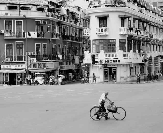
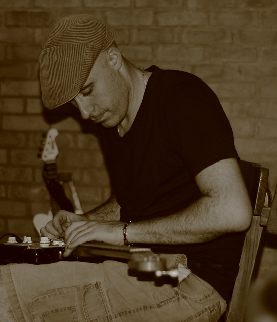
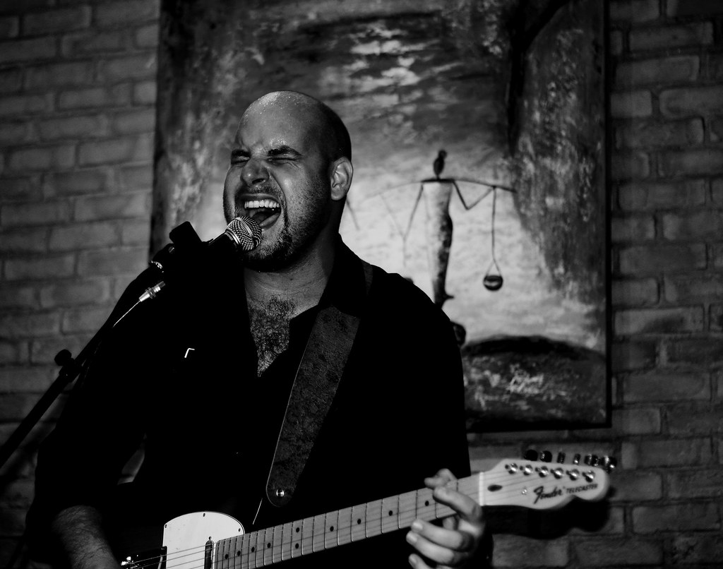
Here's a few pictures taken in Hong Kong and Shanghai and the local hangout in Shenzhen. I mainly use the software that came with the camera (Digital Photo Professional) to make a few adjustments. And I also use a little program called Opanda to apply some filters.
Any and all critique is welcome, I joined this site to learn, so please don't hold back.
The picture of the Vespa has a lot of noise because I forgot to change the ISO back to a lower setting after taking some indoors pictures, silly me. Is the big highlight on the front too much?
Shanghai
La Casa
...more La Casa
 Helpful Posts: 0
Results 1 to 5 of 5
-
28th October 2011, 11:45 AM #1

- Join Date
- Oct 2011
- Location
- Pretoria, South Africa
- Posts
- 42
- Real Name
- Paul Sevenster
First post, some recently taken pictures.
Last edited by psevenster; 28th October 2011 at 11:48 AM. Reason: pasted a url instead of insering image
-
28th October 2011, 01:57 PM #2
Re: First post, some recently taken pictures.
I like your way of seeing. Composition in the 2nd is eye-catching.
-
28th October 2011, 03:18 PM #3

- Join Date
- Aug 2008
- Location
- Ariege, France
- Posts
- 558
- Real Name
- Paul
Re: First post, some recently taken pictures.
1 & 2 for sure, both really interesting. For no. 1 if you had Photoshop you could just maybe darken down the background a little perhaps, I think it distracts from the Vespa a tad. Very nice shot though. The highlight on the front didn't bother me until you mentioned it
 Never tell people what you think is wrong with your picture - let them find out and then explain to them very patiently why it was an artistic decision
  Having done it though consider how you would (a) notice it when you took the shot ... and ... (b) avoid it or correct it.
For no. 2 again very nice shot, I'd straighten the verticals though - everything leans left a degree or two. Being really picky a little more foreground to really isolate the guy with the bike - but that may not have been possible.
Those two were definately my favourites - a real sense of time and place to both of them.
No. 3 a bit flat and lacking contrast - my guess underexposed a little and for me it's just missing something - composition maybe - but lacking the spark of the first two for me anyway (sorry).
No. 4 didn't quite work for me until I cropped off some of the right hand just sort of up to the edge of the guitar - then it came together - just slide your browser off the right side of the screen and see if you agree. Not sure about the conditions you took this in but the dark areas have lost detail - agreed it should be high contrast but a little detail in the dark areas would be good. Notice how the microphone and his shirt aren't separated at all for instance. How did you process this one ?
-
29th October 2011, 09:48 AM #4

- Join Date
- Oct 2011
- Location
- Pretoria, South Africa
- Posts
- 42
- Real Name
- Paul Sevenster
Re: First post, some recently taken pictures.
Paul
Thanks for the advice. I found my mistake with #4, I increased the shadows too much and that caused the loss of detail. So the only adjustments were contrast and shadow. And I can see that it actually looks better with some detail in the darker areas. Also I agree with the crop.
-
29th October 2011, 10:06 AM #5Moderator


- Join Date
- Feb 2009
- Location
- Glenfarg, Scotland
- Posts
- 21,402
- Real Name
- Just add 'MacKenzie'
Re: First post, some recently taken pictures.
Not really got anything to add to what Paul has said.
DPP is a fine tool and one that is more than capable of allowing you to create the images you want. Using Opanda alongside it, does give you further options. As you develop, you may wish to start looking at post-processing software that will open up even more options for you in terms of RAW processing. But that can be for another day.
I look forward to seeing more images from you.


 Reply With Quote