 Helpful Posts: 0
Results 1 to 8 of 8
Thread: Bird on a Branch | Morning light
-
29th October 2011, 03:48 PM #1
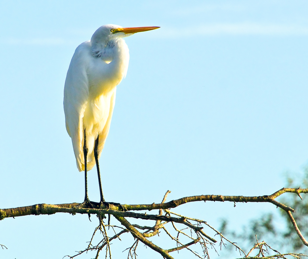
Bird on a Branch | Morning light
-
29th October 2011, 04:18 PM #2Moderator


- Join Date
- Feb 2009
- Location
- Glenfarg, Scotland
- Posts
- 21,402
- Real Name
- Just add 'MacKenzie'
Re: Bird on a Branch | Morning light
Rob
Looks like we're trading comments on branches/trees over to one side of a frame, but I wondered about cropping to inside that 'y' junction towards the right on the branch to get rid of that background tree?
-
29th October 2011, 05:33 PM #3
-
29th October 2011, 07:00 PM #4
Re: Bird on a Branch | Morning light
Since you are asking about the adjustment of the colours. . .
I did 2 as examples.
Cropped using rule of thirds. I like the branch and the background since otherwise, there is not much of interest besides the bird.
Adjusted white balance and colours, especially the yellows, greens and blues that distort the actual colours of the bird.
Adjusted hue of feathers that appeared a cold blue on its back.
Warmed up the photo since all the blues seemed so cold. That, of course is rather subjective.
Added a warm vignette in order to spotlight the bird.
The other vignette is more toward the gold of morning.
Sharpened with unsharp mask.
Both are a bit exaggerated, but you get the idea. Have fun fiddling with this.


-
29th October 2011, 07:31 PM #5

- Join Date
- Jan 2009
- Location
- South Devon, UK
- Posts
- 14,544
Re: Bird on a Branch | Morning light
I don't think I would have cropped quite as tight as you have done in your second image, Rob. I think you can have slightly more background and any few remaining bits of the background tree could be easily cloned out.
I'm not sure about that colour cast though. I suppose you could try starting again with a 'cooler' white balance but I'm not sure how much it would help.
Alternatively, would it work in B&W?
-
30th October 2011, 12:47 AM #6
-
30th October 2011, 12:49 AM #7
Re: Bird on a Branch | Morning light
Since you are asking about the adjustment of the colours. . .
I did 2 as examples.
...
Thanks for samples Viana, very exciting adjustments! Your post processing kung-fu exceeds my own, I look forward to that degree of experiementing in the future...
-
31st October 2011, 01:32 AM #8

- Join Date
- Aug 2009
- Location
- Canada
- Posts
- 3,113
- Real Name
- Wendy
Re: Bird on a Branch | Morning light
Hi Robert, I love this shot but i find everything a bit dark looking, even on your rework and the highlight on the bird does appear to have a greenish colour cast that is hard (for me to correct) Anyway here is my attempt using Lightroom. Basically I have made some adjustments to white balance and also increasec brightness. I still wish the highlights on the bird had a yellow or even a pinkish cast, but I can't get that without creating a mess.
Still love the shot though, they are beautiful birds.

Wendy
Edit: I kind of like what Viana has done with her second rework, except of course that it gets a bit too far from reality, but I do like the way she/he has adjusted the coloursLast edited by ScoutR; 31st October 2011 at 01:34 AM. Reason: See Edit


 Reply With Quote


