
 Helpful Posts:
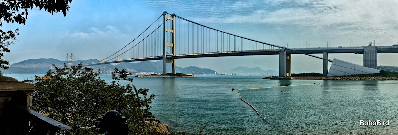
 Bridges from mainland to airport (and Disneyland) - the longest suspension bridge in the world. Was when opened, not sure about now. Trains run on the lower deck.
Question - what could be causing the slightly yellowish tinge in the middle of #3? It is close to blowing but is'nt. Can it be fixed? and how?
Thanks.
1.
2.
3.
4.
Results 1 to 7 of 7
Thread: Bridge
-
3rd November 2011, 07:48 PM #1

- Join Date
- Apr 2011
- Location
- Ontario (mostly)
- Posts
- 6,667
- Real Name
- Bobo
Bridge
Last edited by Bobobird; 4th November 2011 at 04:30 AM.
-
4th November 2011, 08:06 PM #2Moderator

- Join Date
- Feb 2009
- Location
- Glenfarg, Scotland
- Posts
- 21,402
- Real Name
- Just add 'MacKenzie'
Re: Bridge
Bobo
Sorry, I saw this thread yesterday and then it fell off the Latest Threads list and I forgot to get back to it.
The first one doesn't really excite me, I'm afraid. The others (I see you have added a fourth), however, do make me look again.
#4 is, I think a very good 'commercial' image. I'm sure the bridge owners/managers would be interested in it.
#2 and #3 have got good strong lines and shapes. #2, particularly with its more 'minimalist' approach is, i think, very striking. I like the composition you have chosen for it.
I can't comment on the yellow tinge you refer to, because I can't see it (but that's probably my colour vision).
-
4th November 2011, 11:56 PM #3
- Join Date
- Apr 2011
- Location
- Ontario (mostly)
- Posts
- 6,667
- Real Name
- Bobo
Re: Bridge
Thanks Donald.
Appreciate the feedback.
-
5th November 2011, 08:10 AM #4

- Join Date
- Nov 2010
- Location
- England
- Posts
- 308
- Real Name
- Keith
Re: Bridge
In general I agree with Donald's comments although for me, #3 is the strongest image. I really like the contrast between the rigidity of the man-made structure and the randomness of the foliage. I think a shot with the foliage cropped out and the sign cloned away would also make a powerful image. Hmm, I can't see the yellow tinge you mention either.
-
5th November 2011, 11:19 AM #5
- Join Date
- Apr 2011
- Location
- Ontario (mostly)
- Posts
- 6,667
- Real Name
- Bobo
Re: Bridge
Thanks Keith.
Seems the yellowish tinge is only apparent on the fullscreen version, not the much smaller one that CIC is showing. Should have looked at the posted pictures before asking. Sorry about that.
About a more powerful #3, the foliage is approx. 1/3 of the pic. Instead of cropping and cloning the better option would be to reshoot which I intend to do anyway as the bridge shots did not come across a bit under my expectations.
Have discovered the problem - seems the very close together steel wire and the high contrast background contribute to some slight blowing out. It has'nt blown entirely but is close. The same effect if one tries to burn in blown spot, it will appear as yellow.
-
5th November 2011, 01:45 PM #6

- Join Date
- Mar 2009
- Location
- Atlanta, Georgia
- Posts
- 157
Re: Bridge
If you are seeing yellow, its probably your monitor. Areas that are blown out should appear as pure white. I'm using a calibrated monitor and I dont see yellow. Just to be sure I downloaded your photo (#3) and checked the RGB values in a number of places - they all were equal (e.g., 122,122,122 or 38,38,38; etc.) so they should be pure grey (or white or black). I also did a count of the colors, which was 256, implying that the photo was pure grey scale. Try viewing it on a different monitor, or possibly reset yours to factory default settings.
By the way, I like photos #3 and #4 best. The patterns in #3 actually make a good B&W photo. Your choice of framing with the foliage at the bottom and lower right helps offset the strong lines of the concrete and wires.
#4 would have been better if the left hand side of the bridge was not obscured by the trees. The colors are great and I like the foreground framing by leaves in the upper left side. The photo shows great distance foreground to background.
-
5th November 2011, 06:56 PM #7
- Join Date
- Apr 2011
- Location
- Ontario (mostly)
- Posts
- 6,667
- Real Name
- Bobo
Re: Bridge
Thanks John for the tips. Will be handy when I reshoot probably next week.
Then monitor on this notebook has been causing problems for a while. Thanks to members here about how best to tilt the lid the problem is resolved. Will know if it is with the next set of pics to be posted.


 Reply With Quote