 Helpful Posts: 0
Results 1 to 6 of 6
Thread: Learning to Paint
-
27th December 2011, 11:48 PM #1
-
27th December 2011, 11:57 PM #2
Re: Learning to Paint
Hi Brian,
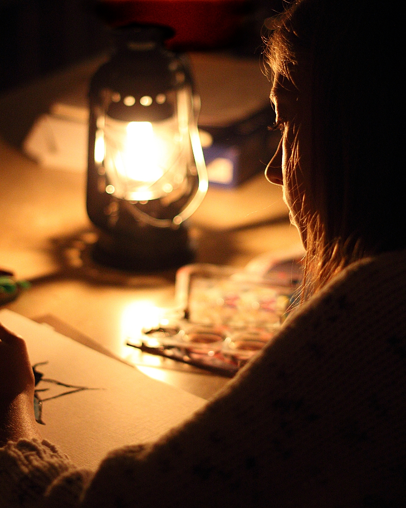
I see what you mean, there is just a bit too much space to left of the lamp isn't there?
There are a few other things that distract my attention though;
the green thing on left
blue folders in background
the dark line in centre lower third
not being able to see quite as much of the drawing as I'd like to
Nice idea, good composition of artist, good DoF and focus, but with some room for improvements.
Beware moving the lamp may lose the necessary highlight on artist's forearm.
Inspiring,
-
28th December 2011, 12:09 AM #3
Re: Learning to Paint
Thanks for your comments Colin.
Err, Dave
-
28th December 2011, 12:17 AM #4
-
28th December 2011, 07:50 PM #5

- Join Date
- Mar 2011
- Location
- California
- Posts
- 39
- Real Name
- Peter
Re: Learning to Paint
I wanna see more of what's she's painting!
-
28th December 2011, 08:33 PM #6
Re: Learning to Paint
Hi Peter,
I didn't know how much to show - I thought too much would distract. Anyway, this photo wasn't composed well from the start


 Reply With Quote

