My goal for this project is to improve my compositions and subject matter to create compelling images that express the beauty, emotion and opportunity of the place I live, and the people that live here; to take my art to the next level.
Results 1 to 20 of 23
Thread: Project 52 by Toby Leeson
-
1st January 2012, 01:44 AM #1
Project 52 by Toby Leeson
Last edited by Tobman; 2nd January 2012 at 02:56 AM.
-
5th January 2012, 03:02 PM #2

- Join Date
- Aug 2009
- Location
- Canada
- Posts
- 3,113
- Real Name
- Wendy
Re: Project 52 by Toby Leeson
Tick tock tick tock, Looking forward to that first image Toby.
-
7th January 2012, 12:58 AM #3
Re: Project 52 by Toby Leeson
Thanks Wendy! But it's only the 6th; gotta get that perfect image before posting, hey.
 Ironically, the one I'm going to post is from Jan. 1. Go figure. So here goes ...
-
7th January 2012, 01:29 AM #4
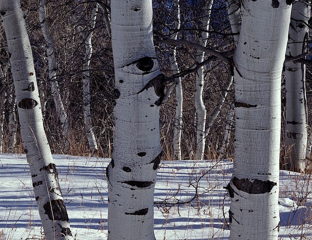
Week 1 - Aspen Shadows
Here in the Rocky Mountain West, Populus tremuloides, otherwise known as the Quaking Aspen, a form of poplar tree, is ubiquitous, or at least it used to be (see NYT link below). In the summer they shimmer and shine with greens and a soulful rattle, in the fall they turn orange, yellow, brown and red, and in winter their shape and pattern reign supreme in the dark forests. I find them to be most beautiful in the forest, as they reflect the ambient light and colors, and cast shadows all about. They have much depth and mystery. And they are very hard to capture accurately on film, in a compelling way. The challenge is that typically they are in deep forest, surrounded by scrub oaks, conifers, and all sorts of undergrowth that can make for a very busy and distracting scene. And the lighting tends to be very contrasty with lots of shadows and depth. I took this picture as a first cut at improving my composition and portrayal of these stately beings of the forest.
Location
Spring Creek ridge, Steamboat Springs, CO
Links
Killer of Aspen Trees
39 Degrees North
...........................
-
8th January 2012, 04:46 PM #5

- Join Date
- Aug 2009
- Location
- Canada
- Posts
- 3,113
- Real Name
- Wendy
Re: Week 1 - Aspen Shadows
Great subject matter Toby. Have you thought of trying the same type of shot in the fog (to give you a nice background) with the sun shining through or some fill flash. Sounds like you plan on making a study of these trees. If so, I am very interested, and will be following along.
Wendy
-
13th January 2012, 09:51 PM #6
A Bridge Over Turbulent Waters
Week 2
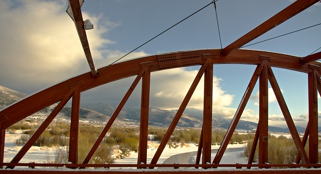
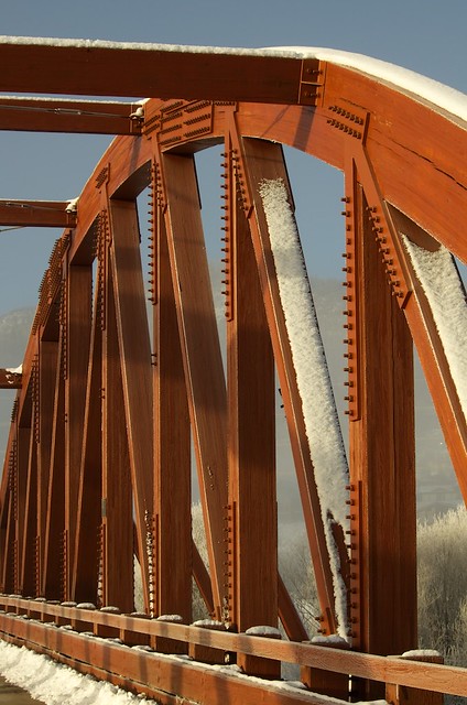
In order to keep things interesting and to challenge myself beyond taking landscape/nature shots, which I am most comfortable with, I thought I would mix things up a bit and each week of the month focus on a different theme; something like this:So this week I chose a local bridge over the Yampa River that has a wonderul geometry to it, and great texture on the wood and steel. I tried it from different angles, different light and different lenses. In the end I had 20+ images and honestly couldn't decide which single one I wanted to share; so here are several. The biggest challenge was the composition and what to include, a part of the bridge, or the whole bridge, from close up or from afar. From afar is a bit of a challenge as unless one is along the road, you'd be in deep snow or deep water, or deep bushes, and along the road is an oblique angle. Anyway the ones below are my favorite. In the end I realized that, while the subject is quite different, the compositional style is very similar to what I posted week 1. Please let me know what you think, and thanks for looking.
1 - landscapes and nature
2 - something anthropogenic
3 - people, wildlife and sports
4 - something different, abstract, or a new technique for me
Last edited by Tobman; 18th January 2012 at 12:48 AM. Reason: Fixed broken links
-
14th January 2012, 12:47 AM #7
Re: A Bridge Over Turbulent Waters
Toby, I think you did well in the second and third images. The lighting is great.
Last one is a little dark for me and loses a little bit of detail. I think the first one is almost there. The background is perfect but I don't think the bridge shines through as well as your other shots and the bridge is a bit flat.
Hoe you are having fun!
-
14th January 2012, 03:49 PM #8

- Join Date
- Aug 2009
- Location
- Canada
- Posts
- 3,113
- Real Name
- Wendy
Re: A Bridge Over Turbulent Waters
Good exercise Toby. I like 2 and three, but I think you've done a great job with perspective on all of them. Did you have to do much correction in PP. I can never get shots with strong verticals and horizontals to look right and don't have much luck (skill) correcting the problem in PP.
What a beautiful location and the light in the first three is stunning
Wendy
-
14th January 2012, 06:43 PM #9
Re: A Bridge Over Turbulent Waters
Great angles in #2, #3, and #4. #1 is a bit flat to me and doesn't give a great 3D perspective. I agree #4 appears dark but I don't mind that - I think it's just missing something in the frame - maybe a wider angle on the bridge would work with this light.
Wendy - have you been using the Lens Corrections adjustments in PP - both Lightroom and Photoshop have them. I'm pretty sure the 18-200 VR has a lot of distortion when it's wide that PP can fix up easily.
-
15th January 2012, 11:33 AM #10
Re: A Bridge Over Turbulent Waters
#3 for me Toby,
Great colours and angles with little to distract me from the main subject.
Nice
Greg
-
16th January 2012, 02:40 PM #11
Re: A Bridge Over Turbulent Waters
Thank you all for the comments. I agree that #2 and #3 are the best for the intended subject. Those two were taken during sunrise and the other two were taken during sunset. The light on that bridge during sunrise is much better due to where and when the sun rises above the eastern mountains. for the first and last I was trying to add to the picture by including an interesting background, which is interesting, but takes the focus away from the bridge. #3 IS the strongest image, with good light, the best angle of the lot, and the bridge as the focus.
The only PP I did was to adjust the highlights and shadows a bit using the curves tool in Aperture, adjusted the white balance slightly to warm it some, and I used the level tool to get the vertical lines to look right. And I cropped it slightly to remove distracting elements of the road and dirty snow.Last edited by Tobman; 16th January 2012 at 02:45 PM. Reason: Added PP steps
-
17th January 2012, 08:10 PM #12
Laughter in the Sun (Week 3)
I am posting a bit early this week, in anticipation of starting a Digital Photography class tomorrow at our local community college, and wanted to give myself the next week and half to get started on whatever exercises are assigned for that class, and hopefully incorporate that into this thread. The following picture I took as a "portrait" while volunteering for a local cross-country ski race we had here over the weekend. It is a candid snapshot and not a true portrait. I realize the background isn't great, although I do like the bokeh effect. The picture was not taken in the shade, and I did not use a reflector. The shot was taken in bright sun, and the only PP I did was crop it. It came out like this straight from the DNG file. I like the even lighting, and I think the tone of "model's" skin is good, if slightly over exposed. And I like that I captured a happy moment of laughter.
Last edited by Tobman; 18th January 2012 at 03:12 AM.
-
17th January 2012, 08:45 PM #13

- Join Date
- Jan 2012
- Location
- Mid Atlantic coast, USA
- Posts
- 541
- Real Name
- Natalie
Re: Laughter in the Sun (Week 3)
I cannot see the images in post 6......I was hoping to see what people were talking about so I could learn.....did you remove them?
-
17th January 2012, 09:18 PM #14
Re: Laughter in the Sun (Week 3)
I did not remove them. They are showing fine on my computer. Do you see the photos in posts #4 and #12?
-
17th January 2012, 09:25 PM #15

- Join Date
- Jan 2012
- Location
- Mid Atlantic coast, USA
- Posts
- 541
- Real Name
- Natalie
Re: Laughter in the Sun (Week 3)
I see the birches, the smiling person in snowcap and the bridge. The others say "Photo is currently unavailable." Hmmmm...not sure what is going on.
-
17th January 2012, 09:34 PM #16

- Join Date
- Aug 2009
- Location
- Canada
- Posts
- 3,113
- Real Name
- Wendy
Re: Laughter in the Sun (Week 3)
I'm seeing or Not Seeing the same. I know the shots were there at one time, but now 3 of the bridges are missing. The only one I can see is the third bridge. The birches and the skier are still there
Wendy
-
17th January 2012, 11:21 PM #17
Re: Laughter in the Sun (Week 3)
It was my fault; I changed the permissions in Flickr, forgetting that the images here were linked to Flickr. They shoud be working now. BTW, the trees are Aspen trees, a member of the Poplar Genus, not birches. :-)
-
18th January 2012, 03:16 AM #18
Laughter in the Sun (Week 3) - Post-Processing Retake
-
18th January 2012, 03:23 AM #19

- Join Date
- Jan 2012
- Location
- Mid Atlantic coast, USA
- Posts
- 541
- Real Name
- Natalie
Re: Laughter in the Sun (Week 3) - Post-Processing Retake
I like your second version of the smiling person. I also like bridge #1, nice colors and better contrast than the others. As for the aspens, I love trees with white bark, like aspen and birches..but not sure the composition is strong enough.
-
18th January 2012, 12:17 PM #20
Re: Laughter in the Sun (Week 3) - Post-Processing Retake
Hi Toby, Bridge #2 and #3 both have great lighting and detail, both look good with the misty background, great scenery by the way,
I like the reprocessed portrait shot, very natural looking with great skin colour,the crop has made a difference, filling the frame with more face, and it also eliminates that white spot that was quite bright.
well done

 Helpful Posts:
 Reply With Quote


