In terms of elements in the photo I prefer this version - it's a bit simpler and with the fence and two trees framing the men and horse off in the distance I think you end up there. I prefer the colours in this version as well.
I also agree with Wendy that the the lines in the shot tend to lead you across the photo and out of the frame rather than to your subjects - mainly the fences. It's almost a zig zagging effect up the photo however because the lines don't ever converge you end up off the frame. The foreground is quite dominant too - not necessarily a bad thing as you I end up seeing two distinct areas in the photo now. Whether that was your intent though only you'll know
Results 81 to 100 of 184
Thread: Project 52 by Dave Humphries
-
3rd March 2012, 07:53 PM #81
Re: Week 6 of Project 52 by Dave Humphries
-
3rd March 2012, 11:59 PM #82
Re: Week 6 of Project 52 by Dave Humphries
So, most things were an improvement - except for the crop - or arguably, the whole shot

Culling shots for week 7, I can tell you what it won't be though
Thanks for all the feedback, it is appreciated and of course I can see that you're both right, especially with that hedge (what was I thinking?) Originally Posted by Goldcoastgolfer
Thanks,
-
10th March 2012, 01:40 PM #83
Re: Week 6 of Project 52 by Dave Humphries
Hi Dave. Sorry I'm late to seeing your Week 6 post but it does give me an advantage of being able to read the comments that have been posted and view the reworked image. I think I prefer the original for a number of reasons.
First, I see the image as a series of layers, each one more muted by the fog from the ones in front. Second, I am far more 'comfortable' with the landscape orientation of a landscape, it just feels better to me. Third, each layer has interesting subject matter on its own and yet the complement each other beautifully. Fourth, I tend to judge how effective an image is by how much time I invest in viewing and this is an image I took a relaxed amount of time to explore. Lastly, I look for emotion in an image and this one conveyed the sense of a cold, crisp day and the warmth of the interaction between the people, horses and other wildlife so I found it to be invigorating and refreshing.
Would I have made changes after looking and seeing the comments of others? Yes, most likely - but the changes would have been very subtitle, a hint more color to the foliage and fence posts in the foreground, not wanting to affect the feeling of the fog, and maybe, just maybe, experiment with the white balance ever so delicately. Lastly, I would experiment with trying to find a frame the would complement the image without changing the feeling of it. All in all, I would have been proud to have taken this shot and although you can't please everyone, this entry certainly pleases my eye. Thank you for posting!
-
10th March 2012, 06:55 PM #84
-
11th March 2012, 05:55 PM #85
Re: Week 7 of Project 52 by Dave Humphries
For week 7, I went back to Ray Mill Island (Maidenhead) on the river Thames.
Quite a few photo opp.s, just not sure I made the best I could of them.
It was, for southern England, unusually cold back then on the 11 February (gosh, I'm a whole month behind but I digress), I was immediately struck by the ice alongside the flowing water by this scene.Overnight temperatures were -10 celsius from memory.
Aside from the snow that was about, I found it interesting how the water splashes had frozen on the streamside vegitation and where the sun had melted this it was white and yet clear beside the stream.
This is an uncropped composition (unusual for me), I was constrained by needing to show enough waterfall/stream in lower left corner and the neat end to the ice top right.
The scene is side lit by a low sun from right and the shadows were quite dim, so as I was close enough, I tried some fill from the on-board flash in i-TTL mode, but with -1 stop FEC (Flash Exposure Compensation), this has added a bit more sparkle and lifted some more detail.

Nikon D5000 + Nikon 70-300mm VR: 122mm, 1/125s, f/11, iso400, EC -1 with Flash at - 1 FEC (220-46028)
F11 and click image to see at 1,506px × 1,000px.
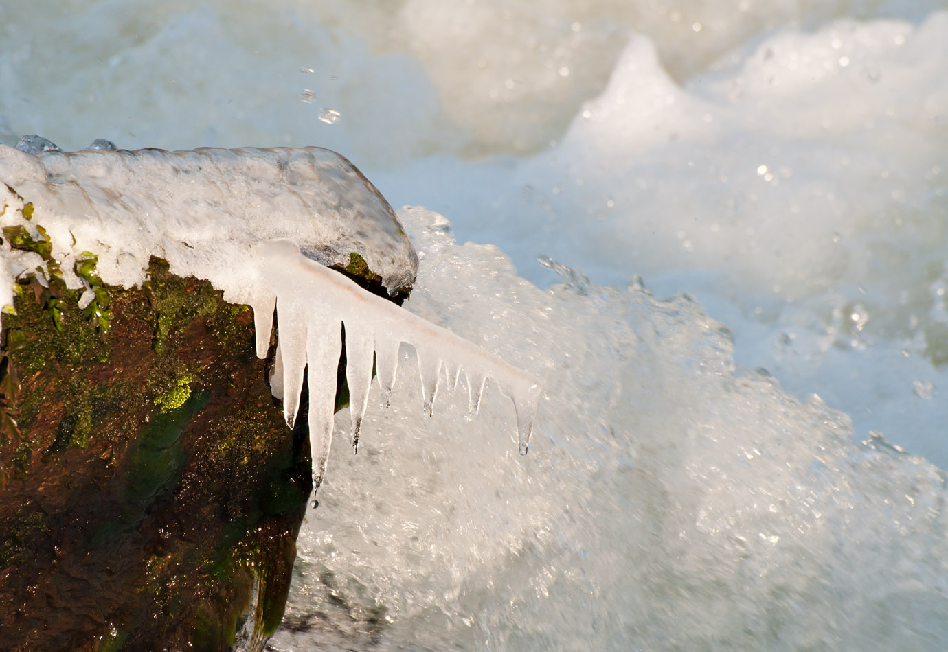
Then I walked round to Boulters Weir, at the northern end of the island, the place where I shot the water in Week 3.
There is a kayaking water chute there, this is the extreme end of it where it empties into a basin. I found sunlight and shadows on foaming water in the background, hence the different colours of 'white', I settled on a WB of 6,000K (-1) for this series as a compromise that didn't make the shadow water too blue, nor the sunlit water too yellow, as would have been the case had I balanced on one or the other. I remember Wendy having similar issues in her Week 9 series. Some muddy water probably added to the colours

Nikon D5000 + Nikon 70-300mm VR: 300mm, 1/350s, f/11, iso400, EC +1(220-46049)
F11 and click image to see at 1,380px × 950px
In fact, in the one above, I was trying to catch a drip as it fell from the icicles, this was as successful as I got; view in the Lytebox and have a look at the one in front of the end of the chute.
I thought I could do better with the contrast between moving water and frozen ice by slowing the shutter speed, so;

Nikon D5000 + Nikon 70-300mm VR: 300mm, 1/180s, f/16, iso400, EC +1(220-46056)
F11 and click image to see at 1,316px × 950px
Then I thought I'd try the opposite and opened up to get a high shutter speed and try to 'stop' the moving water and see what that looked like relying on DoF to provide the separation and some out of focus sparklies;

Nikon D5000 + Nikon 70-300mm VR: 300mm, 1/1500s, f/5.6, iso400, EC +1(220-46067)
F11 and click image to see at 1,007px × 950px
The shots in this week 7 series have had minimal (for me) PP, just basic ACR, LCE and sharpening, little cloning or selective effects, which either means I am getting more right in camera, or lazier in PP.
Bonus Picture
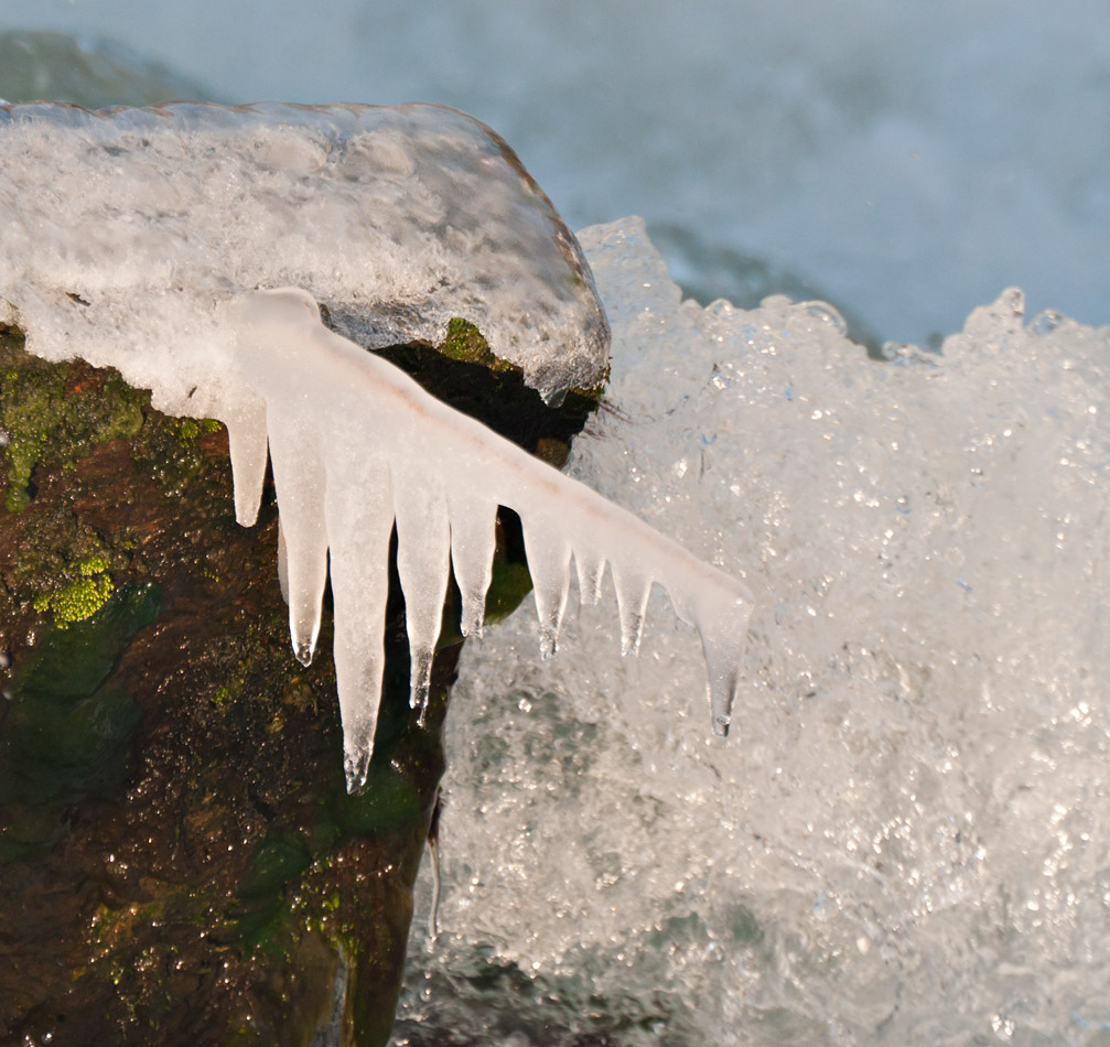
The weir had captured some driftwood compared to how it was back in week 3.
This was shot in exactly the same place as those shots and show a bit of rotting tree trunk caught and unable to fall over the weir and the flow of water and air rushing past had resulted in this angled icicle, you can see where 'down' is from the drip on the end. I wish I'd got there in the morning when it was no doubt much bigger.

Nikon D5000 + Nikon 70-300mm VR: 210mm, 1/90s, f/11, iso400, EC +0.5(220-46077)
F11 and click image to see at 785px × 950px
It took several shots to get the necessary darker bit of water behind the edge of the icicle in order that it didn't get lost in the whiteness (as seen with the blade of grass in the chute shots above). The shot was over exposed on the tree trunk, so I had to put that on a different layer so it didn't get LCE'd and brightened further - the icicle and water behind it had the same PP treatment, the isolation is purely down to shutter speed, DoF and tone of water (which as I said, had to be picked from a series).
Well, that was week 7, hope it was worth the wait, I learnt stuff shooting and PPing it, I hope others do too.
Cheers,Last edited by Dave Humphries; 11th March 2012 at 06:08 PM.
-
13th March 2012, 06:56 PM #86
Re: Week 7 of Project 52 by Dave Humphries
Wow - a seriously interesting challenge there. I looked at these last night and then I decided I was too tired to look at them properly so I'm revisiting them this morning. Sharing your thought process was very worthwhile I think - it helps show what you were trying to achieve and how you eventually got there.
I think you managed to bring out the sparkles in the ice with the flash - it seems to have worked very well and there's certainly no sign in the photo that I can see of a flash being used. It actually looks likes there's just some directional light on the right.
Out of the three I think as a photo I prefer the third. I'm not sure it gives the perception of fast flowing water behind the icicle but I certainly found it the most interesting to look at and provides a clearer separation of the icicle from the water.
To be honest, it's your bonus photo that I think you achieved your aim of catching a contrast between ice and moving water. The drift wood adds a touch of colour to the photo, the ice is prominent, and the free flowing water behind it is very clearly moving quickly behind it providing that contrast. That photo would be my favourite out of your series this week - and yes - well worth the wait.
-
13th March 2012, 08:23 PM #87
Re: Week 7 of Project 52 by Dave Humphries
Hi
I really like shot number one with the contrast between the frozen ice and gushing water.
I like the three versions of the shot with the icicle. I think I prefer the third of the three, for the close up as in the others the ice perhaps gets a little lost with the similar colour background of the water.
My favourite of the five is by far the very last one. Its great that you got the depth between the icicle which is sharp and the flowing water in the background. The shutter speed has created a very nice background tone as well.
A very good week 7 series and thanks for the commentary which is helpful to understand how you arrived at the shots.
Have you got any ideas what week 8 will be?
Thanks, Rebecca.
-
13th March 2012, 08:51 PM #88
Re: Week 7 of Project 52 by Dave Humphries
Hi Dave, of the five, the first two seem a bit busy and I'm haveing difficulty getting my eyes to rest on a subject. Three and Four are clearer with four being the better defined of the two, but Five?
Five tells an interesting story. It is sharp and clear, has excitement, and captivates interest more than the others. All in all it is a great progression that just gets better with every image.
-
13th March 2012, 11:06 PM #89
Re: Week 7 of Project 52 by Dave Humphries
Hi Mal,
Thanks, I took a shot at -0.5 FEC, saw on LCD that was too much and this one at -1 stop FEC.
Yes, that being the tightest shot/crop is the best of the 3, it gives a bigger subject, but while both icicle and background are equally lit, I knew I was onto a loser. Then I turned around and saw the "bonus shot" where the angles of ligth meant the fall was somewhat dimmer.
This actually started out as the whole point of this week 7 post, I PP'd it first, but seeing the effort you, Frank and many others put into their P52 posts, I thought I'd better try harder, so started the narrative trip across the island that afternoon.
Thanks,
-
13th March 2012, 11:25 PM #90
Re: Week 7 of Project 52 by Dave Humphries
Hi Rebecca,
I think I have covered a lot of this in Mal's reply above.
I am glad you like #1 though, I know it is a busy image, I struggled to find a half decent composition in the scene before me; it had no obvious beginning or end.
Week 8, well that's when I went to Bushey Park, so I need to choose from; DoF and bokeh test shots, birds, waterfowl, parakeet sex (yes, really), model boats, very distant woodpeckers (spotted and green), deer (lots of deer) - I shot 350, so plenty to choose from.
Thanks,
-
13th March 2012, 11:30 PM #91
Re: Week 7 of Project 52 by Dave Humphries
Yes Frank, it was a case of building up to the best last - I find I tend to discover each subject, take several shots of it, but could probably save myself a lot of time in PP if I just keep the last one of each and ditch the rest. Last is usually best and once I have bagged it, I move on. Same with subjects, keep looking for better ones until the day's 'money shot' is captured and perfected. Then I tend to get lazy

Thanks,
-
14th March 2012, 02:09 PM #92
Re: Week 7 of Project 52 by Dave Humphries
Hi Dave, I must agree with the others, you have left the best till last, great composition, colour and detail, the icicle stands out very well against the flowing water which is nicely blurred, the explaination of each shot is great,
 thanks
-
14th March 2012, 07:17 PM #93
-
17th March 2012, 08:28 PM #94
Re: Week 8 of Project 52 by Dave Humphries
Week 8 took me to a local park; Bushey Park in West London (on 19 February)
It was a 50/50 sunshine/cloudy kinda day, but I just processed the best of the sunny ones
I spent a large part of today identifying species, renaming files, culling and scoring before I even got to PP.
The practice has helped my bird id skills
This week's story, fairly short and embarrassing; not having taken any WB reference when shooting - because of aforementioned sunshine and shade rendering it useless (or so I thought), I decided in PP to set them all to the same colour temp, and because these were all shot when the sun shone, I chose Daylight - seemed the most appropriate - they looked a bit red, but I persisted and of course my eyes became acclimatised to it.
Then I stopped for food - and return after to see the full horror (glad I hadn't posted)
Fortunately I had had the sense to leave all 6 open in CS5, so a quick Auto-Colour adjustment and re-save does seem to have made them look more sane (I hope - let me know).
On with the picture show then ...
(do view in the Lytebox in browser full screen mode for full effect)
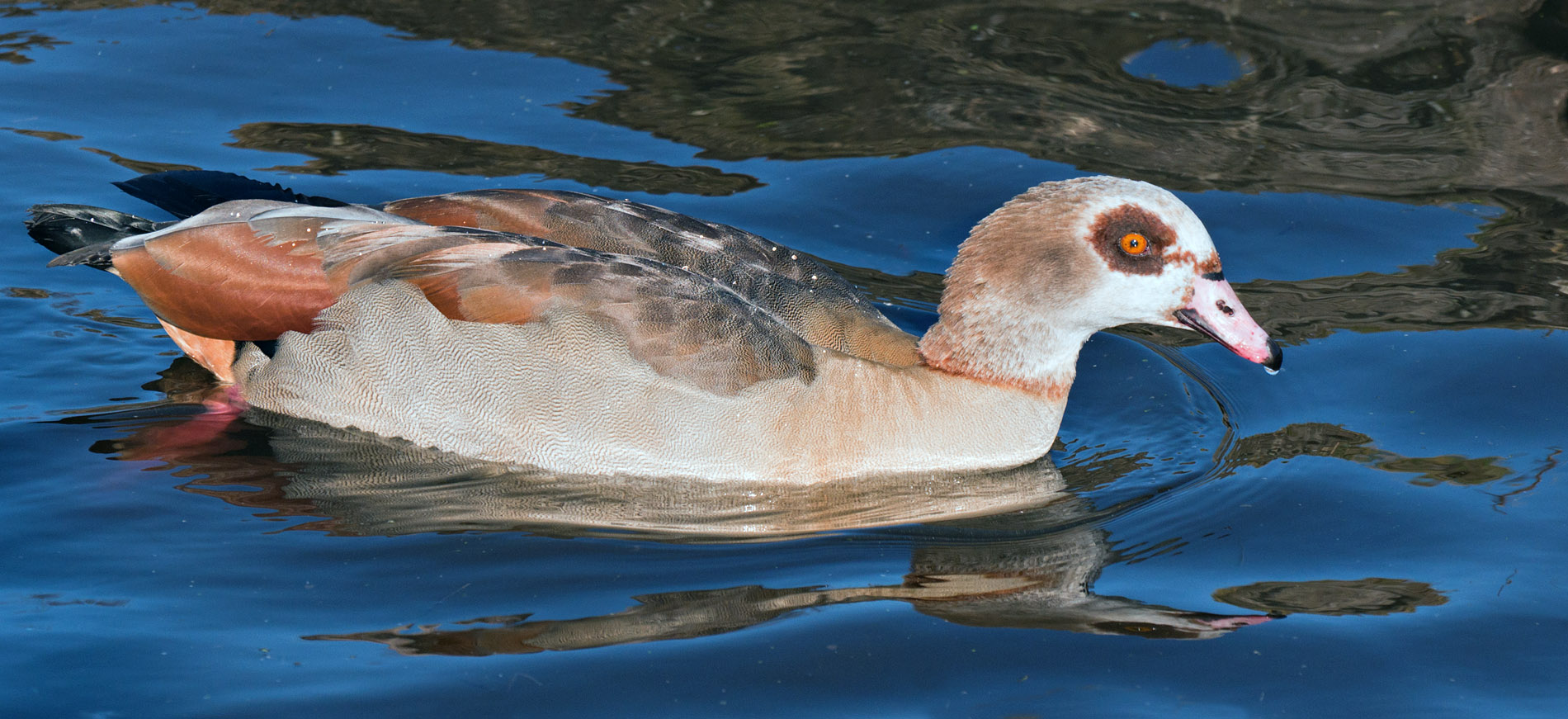
Egyptian Goose

Nikon D5000 + Nikon 70-300mm VR: 170mm, 1/1500s, f/8, iso400 (221-46154)
Hit Kbd F11 and click image to see at 1,900px × 871px
Mallard drake

Nikon D5000 + Nikon 70-300mm VR: 240mm, 1/1000s, f/8, iso400 (221-46145)
Hit Kbd F11 and click image to see at 1,545px × 1,000px
Mallard hen

Nikon D5000 + Nikon 70-300mm VR: 195mm, 1/1000s, f/8, iso400 (221-46139)
Hit Kbd F11 and click image to see at 1,628px × 1,000px
Greylag Goose

Nikon D5000 + Nikon 70-300mm VR: 135mm, 1/1500s, f/8, iso400 (221-46125)
Hit Kbd F11 and click image to see at 1,385px × 1,000px
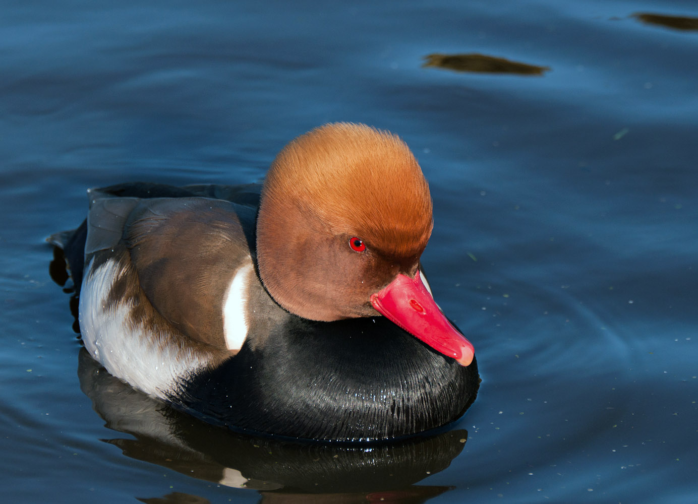
Red crested Pochard

Nikon D5000 + Nikon 70-300mm VR: 300mm, 1/750s, f/8, iso400 (221-46149)
Hit Kbd F11 and click image to see at 1,384px × 1,000px
5 birds, all by chance (?) going the same way - no not by chance, going that way because that lit their faces.
and to finish up, something different;
Fallow deer stag

Nikon D5000 + Nikon 70-300mm VR: 240mm, 1/250s, f/11, iso400 (221-46296)
Hit Kbd F11 and click image to see at 1,297px × 1,000px
All were fairly minimal PP, no layers, no selective sharpening, etc., just 'the basics' and (in some) the cloning out of distracting detritus.
As always - C&C welcome - you guys and gals always see things I don't
Many thanks,Last edited by Dave Humphries; 17th March 2012 at 08:35 PM.
-
17th March 2012, 08:37 PM #95
Re: Week 8 of Project 52 by Dave Humphries
What a fantastic set of images Dave, from the detail to the colouring to the composition and on the even the catch-lights in the eyes.
About the only thing I can think of is possibly a lower shooting angle but the difference in the background may not have permitted that. For some reason, perhaps it is a natural look for this species, the Pochared doesn't look like a happy camper!
-
17th March 2012, 09:36 PM #96

- Join Date
- Jan 2009
- Location
- South Devon, UK
- Posts
- 14,648
Re: Week 8 of Project 52 by Dave Humphries
Sharp and well focused.
-
17th March 2012, 09:45 PM #97
Re: Week 8 of Project 52 by Dave Humphries
The birds are all incredibly sharp and the colour really pops thanks to the good use of lighting you've made, particularly in the mallard and pochard (thanks for putting the names in so we can easily refer to them). My favourite is the last one, the deer, as he really stands out from the background. It looks like you had a very productive day out, so well done for getting so many good shots in one day.
-
17th March 2012, 09:56 PM #98
Re: Week 8 of Project 52 by Dave Humphries
Lovely images Dave. That Red Crested Pochard is an incredible shot as is the one of the deer in which the lightning is fantastic.
Dave
-
18th March 2012, 01:34 PM #99
Re: Week 8 of Project 52 by Dave Humphries
Thanks Frank,
Yes, I can see what you mean about the lower angle possibly being better on the deer shot.
As you know, the light is (almost) everything in a photograph, hence (to "keep up with the best" here at CiC ), I only post the ones where it all comes together - all my 'dull' shots (especially of the deer, when it got cloudier) will probably never see publication.
Thanks,
-
18th March 2012, 06:00 PM #100
Re: Week 8 of Project 52 by Dave Humphries
Thanks Geoff
Thanks Dave,
I did PP the Red Crested Pochard first (I knew it was probably the best of the day), but I like to save the best 'til last in these weekly installments. Then I added the deer on the end, which didn't turn out too bad either
Good lighting is the key for these kind of shots and having the sun as 'the key light' is essential.
What worries me though, is that I seem to be developing into a 'sunny day' only photographer, because shooting wildlife out in the open on an overcast day, or worse, when the sun goes behind a cloud on a sunny day, in effect; 'the key light goes out' and all you get is the 'fill' and that just doesn't provide adequate 'modeling' for the subject - nor catch lights in the eyes, etc.
I'm trying to decide if that's a bad thing or just a practical realisation of the fact of the matter.
I guess one can always shoot other subjects on overcast days, e.g. ramp up the iso and go some place where something (trees or buildings) provides means to model the diffuse daylight onto the subject, or take control with something like off camera flash as the key light, perhaps macro subjects.
Unfortunately, by the time I was in amongst the deer, the weather had changed and half the time the sun was missing, making a huge difference, not just to the key light aspect, but also 2-3 stops slower shutter speed (risking subject movement blur) unless I compensated manually with wider aperture or higher iso.
It was a productive day, there are several more I left out as not as good as these; Ring-necked Parakeet, Coot, Moorhen, Pochard, Tufted duck, Jackdaws, distant woodpeckers (Great-spotted and Green), Gulls on posts and a couple of model boats. But I spared you those, I thought 6 was more than enough for one week. I shot 349 that day, culling has reduced it to 161 keepers, but in practice, unless I was building a library of species shots, only another 10 are worth any effort as stand alone shots.
Thanks all for reviewing and the kind words,

 Helpful Posts:
 Reply With Quote
