I've got nothing but praise for your series of photos this week - although the Red Crested Pochard elicited a "What the hell is that?!" reaction from me. Is it's head really that big?
I was thinking about your "sunny day" photographer statement - I don't think there's anything wrong with that. If you see your vision best in bright sunlight, I think that's perhaps something unique to your photographic style.
I say that as someone who avoids the "sunny day" scenario. For me, the diffused light of an overcast day or the warm light of the morning or afternoon are my preferences. I rarely bring my camera out on a sunny day, simply because that light doesn't inspire me as much as the other situations. I think I can probably take photos that are fine in bright sunlight if I need to - but the ones that I really enjoy taking, the ones are unique to me, are the ones where the light suits my style.
I'd embrace the fact that you are a "Sunny Day" day photographer. Personally, I think it's much more difficult to take photos in bright sunlight and you do an excellent job of it. It's not necessarily about practicality - it's just who you are and the sort of photos that you like to take.
Results 101 to 120 of 184
Thread: Project 52 by Dave Humphries
-
19th March 2012, 09:46 AM #101
Re: Week 8 of Project 52 by Dave Humphries
-
26th March 2012, 08:51 PM #102
Re: Week 8 of Project 52 by Dave Humphries
I think the answer is no, looking at a couple of side shots, I believe it may have puffed up its head plumage in this one.

I do prefer the lower angles of early/late when possible and at this time of year it never gets that high in the sky anyway
Isn't it odd how we're both drawn to photograph what we see least of?
Thanks for the kind words Mal, more birds for week 9 below, but not so much sunshine - and a lot of under exposure I'll need to correct in PP on some
Cheers,
-
29th March 2012, 08:09 AM #103
Re: Week 8 of Project 52 by Dave Humphries
I like the sharpness of these shots Dave, feathers and eyes, they all show up well. The background for the birds is a bit dull, but I guess you would have to go into the water for different backgrounds, so that is out of the question I guess. Nice colours as well.
-
21st April 2012, 09:36 PM #104
-
21st April 2012, 10:26 PM #105
Re: Week 9 of Project 52 by Dave Humphries
Yikes, I have dropped back 4 weeks

This week; some (hopefully) helpful advice if you visit a bird of prey centre (or some zoos/safari parks) and want to shoot one of their bird of prey flying displays. Becky and I have done about 10 of these in last 3 years, so although we don't know everything, this list may help you on your first time.
a) Always get to the display area 10 minutes before the advertised start time to have the pick of the seats
b) If you can, sit on the 'up sun' side of the display area (so you're not shooting into it so much)
c) Choose the front row or (higher) back row - combined b) and c) will put you in a front or back corner
d) check out where any seat side perches are, make sure you can focus and frame any birds there
e) check out backgrounds of likely flight paths and other perches, check you can pan around of lens is long without injuring someone and if necessary, adjust your seating position
f) set the aperture to a nominal value, I use f/8 as a rule, but looking at some of below, f/11 might have been better for more DoF
g) set the iso so you get a good shutter speed, aim for 1/1000s min. for sharp birds, although as you'll see below, less is sometimes better for panning blur to separate subject from background
h) AF = centre point only if shooting against any background other than sky, if sky only, 3D tracking may help. Also use continuous AF ("AF-C" in Nikon-speak and, I think, "AI-servo" in Canon-speak)
i) shooting mode = Continuous (high if there's a choice) - this isn't the time for single shots
j) they usually have morning and afternoon displays - go to both; more practice, different sun angle and the birds flown will usually be different too
k) if you're squeamish, be advised that the rewards given to the birds are normally parts of, or whole, baby (dead) chicks and the birds can be messy eaters - owls tend to gulp things down whole, but an eagle will sit there and tear it to shreds taking 5-10 minutes to eat it
l) it should go without saying you follow the venue's display rules (there for everyone's safety) primarily; don't stand up! (and don't eat food or have it visible)
If you want to shoot big birds, up close, like this, something like an 18-200mm would be fine (on a crop body) and allow you to go wide when the keepers bring them into the crowds. That said I shot these with a 70-300mm because I also knew there would be some far more distant action in the field to shoot.
These pictures from one such display were taken at Gauntlet Birds of Prey Eagle and Vulture Park in Knutsford, Cheshire, UK - nice and central if any other UK CiC member fancies a visit (just off M6 J19 or M56 J7). PM me if you want more details.
These are all of a Great Grey Owl - a real silent flyer with all those soft feathers. Shot back in late February on a rather chilly 'sun in/out' day.
1) Waiting

Nikon D5000 + Nikon 70-300mm VR: 140mm, 1/1000s, f/8, iso400 (223-47078)
Hit Kbd F11 and click image to see at 999px × 1,000px
2) Ready
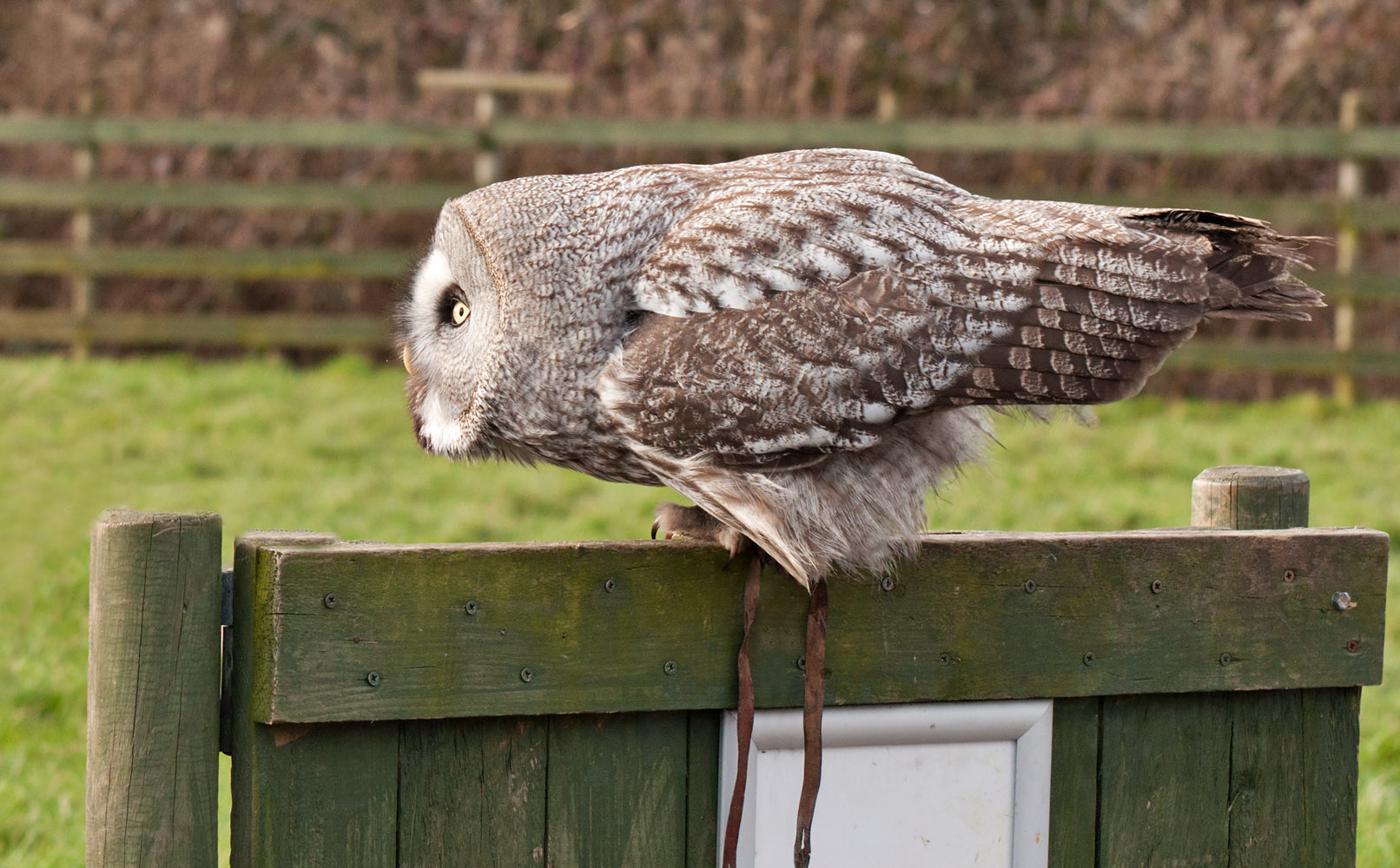
Nikon D5000 + Nikon 70-300mm VR: 85mm, 1/350s, f/8, iso400 (223-47073)
Hit Kbd F11 and click image to see at 1,612px × 1,000px
3) Incoming
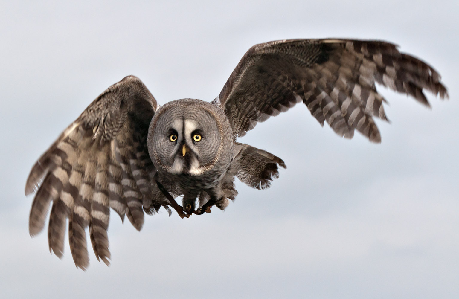
Nikon D5000 + Nikon 70-300mm VR: 135mm, 1/1500s, f/8, iso400 (223-47085)
Hit Kbd F11 and click image to see at 1,535px × 1,000px
The sky caught me out on this and it needed raising two whole stops in PP
4) Heads down please!

Nikon D5000 + Nikon 70-300mm VR: 70mm, 1/350s, f/8, iso400 (223-47100)
Hit Kbd F11 and click image to see at 767px × 893px
Having processed this last one, I felt the bird was not big enough in frame, so I cropped it further and even now I remain unconvinced whether to leave the girl in pink jacket there, or crop her off, to place the bird on the lower third?
On these, I cloned out some distractions, I might have done the tethers, but since you know it was a display, they are expected, but I did clone out the yellow radio tracker and aerial that was also dangling down below.
Thanks for any comments received, always appreaciated,Last edited by Dave Humphries; 22nd April 2012 at 08:02 AM. Reason: added link to Gauntlet BoP
-
21st April 2012, 11:11 PM #106
Re: Week 9 of Project 52 by Dave Humphries
Thank you for the tips, Dave! I love the set! In #2 and #4 I have never seen a bird that looks like he had a close encounter with a brick wall before, very interesting! I think I like #1 best, perhaps because that is what I expected an owl to look like and this one is sharp and clear.
-
22nd April 2012, 07:56 AM #107
Re: Week 9 of Project 52 by Dave Humphries
Wonderful series Dave, all have great detail and spot on focus
I like #3, the incoming, great focus with just enough wing movement, I agree with Frank, does look like it has hit a brick wall, especially #2, look like the head has been cut of and replace with a face, thanks for the tips on bird flying displays, they are great
-
22nd April 2012, 10:59 AM #108
Re: Week 9 of Project 52 by Dave Humphries
Nicely done Dave, your images show the magnificence of the owl. As has been said great detail and spot on focus.
-
22nd April 2012, 11:55 AM #109
Re: Project 52 by Dave Humphries
Dave, as others have mentioned, the lighting underneath the bridge does it for me.
I would also keep the flag, for me it adds to the image.
this looks like a perfectly executed shot, and a lot of thought and work have gone into it
Superb.
-
28th April 2012, 07:21 AM #110
Re: Project 52 by Dave Humphries
Great shots and great advice Dave. I love that head on shot - it's awesome.
-
28th April 2012, 08:24 AM #111

- Join Date
- Dec 2011
- Location
- Reigate, Surrey, UK.
- Posts
- 419
- Real Name
- Gary
Re: Project 52 by Dave Humphries
Great series of images Dave, No.3 Incoming works best for me, Those eyes! Yikes, I glad I'm not a mouse!
Cheers for now
Gary
-
28th April 2012, 01:04 PM #112
Re: Project 52 by Dave Humphries
Frank, Wendy, Joe, Glenn, Mal and Gary,
Thank you all for the kind words.
I hope the advice will be useful - and now it is written down, even I know where to come back to for a refresher before I visit again
I do have a confession though, on the full sized RAW, it is obvious I (or the camera/lens) didn't quite nail the focus on #3 but by careful selective sharpening of the eyes, a downsize of more than 2:1 and further sharpening, I seem to have got away with it (whadda relief)
No-one is as practiced at rescuing shots as I am
They don't have to be!
Once again, thank you all,
-
13th May 2012, 01:13 AM #113
Week 10 Project 52 by Dave Humphries
Hi all,
Late again!
Back in late February, I took out the Canon S100 for a short night shoot walk after a meal in Salford.
Therefore these are more test shots to see what was possible and how decent they might look after processing the RAWs, rather than being of any particular photographic note.
Braced handheld at 0.8 seconds - I shot three and this one was actually pretty free of shake/movement during the exposure. (Grrr, why didn't I see wthat white slither on left before posting?)
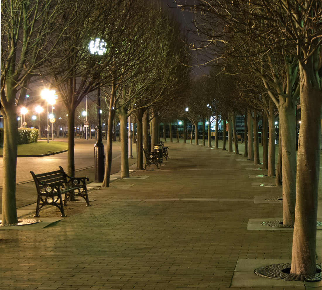
Canon S100 at 10.4mm: 48mm (FFE), 0.8s, f/3.5, iso400, EC -2/3 (20120226_0270_nr)
Hit Kbd F11 and click image to see at 1,100px × 992px
This is lit by colour changing lighting, seemed to photograph better when red than blue/purple!
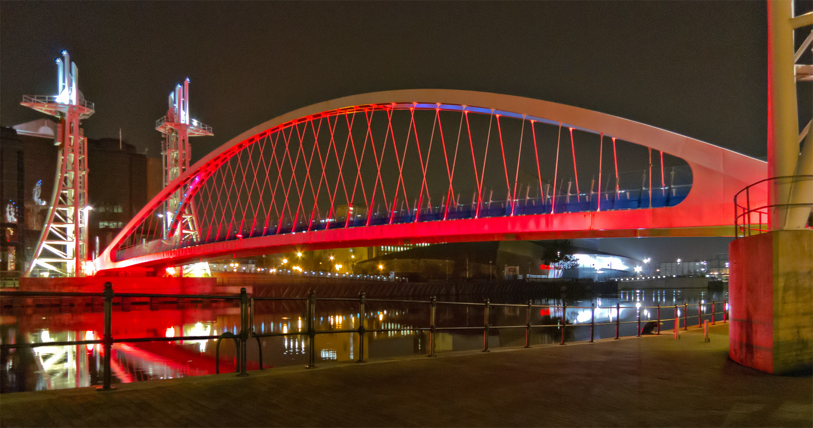
Canon S100 at 5.2mm: 24mm (FFE), 1/3s, f/2.8, iso400, EC -1 2/3 (20120226_0262_nr_ed1)
Hit Kbd F11 and click image to see at 1,600px × 844px
Lit by blue light, which seems to stop just short of the top, giving the grey/green colour to the top three balconies.
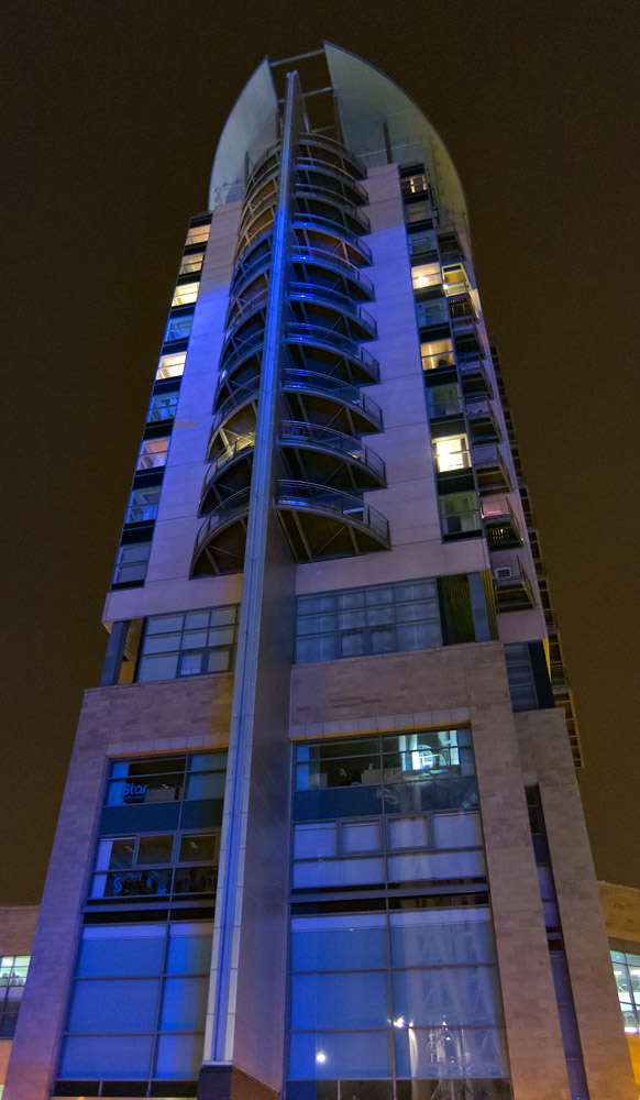
Canon S100 at 5.2mm: 24mm (FFE), 1/4s, f/2, iso400, EC -1 2/3 (20120226_0267_ed2)
Hit Kbd F11 and click image to see at 582px × 1,000px
The typical waterfront scene, looking at it now, perhaps I have raised the shadows too much?

Canon S100 at 5.2mm: 24mm (FFE), 1/25s, f/2, iso400, EC -1 -2/3 (20120226_0256_ed2)
Hit Kbd F11 and click image to see at 1,597px × 1,000px
Even though I stuck to what I had hoped was a conservative 400 iso, all needed noise reduction (with Neat Image) despite being downsized more than 2:1 and not unduly cropped from their 4,000 x 3,000 (12 MP) captures. I guess the subject matter and night sky didn't help.
As usual, C&C (or questions on the S100) appreciated.
Thanks for viewing,
-
13th May 2012, 01:53 AM #114
Re: Week 4 of Project 52 by Dave Humphries
Cool shot!
Chuck
-
13th May 2012, 03:39 AM #115

- Join Date
- Jan 2012
- Location
- Jackson Hole, Wyoming, USA
- Posts
- 959
- Real Name
- Chuck
Re: Week 10 of Project 52 by Dave Humphries
Dave, very nice shots. I especially like the first one. I like the way the sidewalk curves around and the lights through the trees. Your photo is the next best thing to actually strolling down that walkway.
chuckLast edited by Dave Humphries; 20th May 2012 at 04:03 PM. Reason: correct week number in post title
-
13th May 2012, 10:47 AM #116
Re: Week 10 of Project 52 by Dave Humphries
Hi Dave, #1 is a great shot , the curve leads your eye around nicely, all in focus, I would be tempted to pp out the lights shining through the trees straight in front, #2 nice reflections, but not sure of the composition however, perhaps a different or more dramatic angle, the last two the blue photographs well with great looking reflections
Last edited by Dave Humphries; 20th May 2012 at 04:03 PM. Reason: correct week number in post title
-
16th May 2012, 08:26 PM #117
Re: Week 10 of Project 52 by Dave Humphries
Well done for getting another week done

I really like the first photo, which is definitely my favourite. I wish I had been able to spot this shot when I was out with you. I must train my eye to identify nice shots like this! I love the curve of the trees taking you into the photo and the benches on the left.
I love the colours in the other three and they look great considering they are handheld on the canon with much less noise than I would expect. I particularly like the vibrant scene of the last picture.
A very nice set of pictures and great to see something a bit different.
Thanks, RebeccaLast edited by Dave Humphries; 20th May 2012 at 04:04 PM. Reason: correct week number in post title
-
16th May 2012, 08:56 PM #118
Re: Week 10 Project 52 by Dave Humphries
Another very nice set Dave!
I particularly like the first one but would consider toning down the bright yellow lights on the left (and the brightly lit pavement below them) as that seems to be out of context with the other muted tones of the image. The blue lamp showing through the trees doesn't impact the feeling of the image as much as the yellow ones do. I might be tempted to blur the '5's in the street signs as they don't contribute and text is an eye grabber.
The second image also works very well and I am rather fond of night photography. The bright lights in the back on the right do take the eye away from the bridge so I'd be tempted to try it with the brightness approximating that of the left side of the bridge for a more balanced feel.
The structure of the third image is very interesting. What do you think about darkening the sky and/or lightening the building just enough to make a cleared definition of the building against the background?
The fourth one has a beautiful skyline, colours, and a great reflection to set it off. Here too, my feeling is that the sky is a bit weak and might look better if it more closely approximated the shade of the sky in the reflection.
In fact, now that I look closer, the sky in the last three all look like they are being affected by the light pollution from the city lights and might look more refreshing if it had a darker, crisper look.
Hope this helps!
-
17th May 2012, 08:58 PM #119
Re: Week 10 Project 52 by Dave Humphries
Those are all beautiful. I have an A1100 IS. Doesn't seem to be as fancy as yours, as it doesn't shoot in RAW, but I love the quality of photo I get out of the camera.
-
17th May 2012, 11:21 PM #120
Re: Week 10 Project 52 by Dave Humphries
Thanks Chuck,
Thanks Chuck, I think that feeling comes from it being shot at 48mm (FFE), a focal length that is almost same as the human eye and taken at the same height. Originally Posted by Teton Chuck
Thanks Wendy, not bad for 0.8s hand held (braced against another of the trees) is it. Originally Posted by Wendy Stanford
Initially I missed this, but then included your idea to ditch the lights ahead - thanks.
Thanks, I did wonder if anyone would suggest having some human interest on one of the benches (e.g. you and Tom), but no-one has. Originally Posted by beckyhumphries

Hi Frank, Originally Posted by FrankMi
I took a bit more care on the second processing (below) with those lamps and did tone down the bright yellow pool on distant left. I had to lighten and blur the '5's, blurring alone still left them too readable.
Yes, It was overcast, probably with quite low cloud, so it would pick up the sodium lighting in the skies on the last three.

Canon S100 at 10.4mm: 48mm (FFE), 0.8s, f/3.5, iso400, EC -2/3 (20120226_0270_nr_ed3)
Hit Kbd F11 and click image to see at 1,088px × 1,000px
This has come out a slightly different crop and colour, I hope it is an improvement.
I knew when I took it this that it was the one I most wanted to PP and show - and although I normally save the best shot to last in this thread, I didn't this week
Thanks John. Originally Posted by johnbharle
Yes, with right subject and good light, especially wide angles can be quite amazing for the size of lens and sensor
Thank you all for your feedback,Last edited by Dave Humphries; 17th May 2012 at 11:29 PM. Reason: Replaced image with Mk.3

 Helpful Posts:
 Reply With Quote

