Geesh, I really gotta start keeping up better. Dave the Owls are fantastic and the last bunch are very nicely done as well, The last being my favorite.
Results 121 to 140 of 184
Thread: Project 52 by Dave Humphries
-
18th May 2012, 03:39 AM #121
Re: Week 10 Project 52 by Dave Humphries
-
18th May 2012, 06:46 PM #122
Re: Week 10 Project 52 by Dave Humphries
Hi Paul,
I wasn't sure whether you meant the 'last one' in the original Week 10 post, or the re-working of the street scene in the Week 10 follow up which took on everyone's advice?
Glad you like the owls, they were a hoot to shoot (groan!)
Thanks,
-
19th May 2012, 12:18 AM #123
Re: Week 10 Project 52 by Dave Humphries
Sorry Dave, I like the re-worked version best. Who who doesn't like Owls. lol There's a groan for ya.

-
20th May 2012, 02:07 PM #124
Re: Week 11 Project 52 by Dave Humphries
Hi all,
This week I am looking at "making the most of bird feeder pictures", these were shot on 12 March in my garden/backyard.
The final result #1:

Nikon D5000 + Nikon 70-300mm VR: 300mm, 1/350s, f/5.6, iso400 (225-47303)
Hit Kbd F11 and click image to see at 800px × 877px
Which was edited from this capture;

Now, as you can see, the result was quite a crop down.
You can also see that having many feeders too close to each other just gets in the way and means you waste time in PP cloning them out!
After the general levels were done in ACR, the feeder and birds were enhanced and sharpened on a separate layer from the background, then the two combined, which avoids making the background any more intrusive and contrasty than necessary.
When I looked yesterday, I noticed this feeder was almost empty, so it has taken them 2 months to eat all these nuts (although there is a second peanut feeder elsewhere in garden), mind you, the Blue Tits had help from a variety of other birds including Robins, Ring Necked Parakeets, Jackdaws, to name but three.
The final result #2a:

Nikon D5000 + Nikon 70-300mm VR: 300mm, 1/2000s, f/5.6, iso800 (225-47369_ed1)
Hit Kbd F11 and click image to see at 1,000px × 892px
OR final result #2b:

Nikon D5000 + Nikon 70-300mm VR: 300mm, 1/2000s, f/5.6, iso800 (225-47369_ed2)
Hit Kbd F11 and click image to see at 1,000px × 892px
I can't make my mind up whether the simpler 'one twig' version is better, or the first - the original idea of retaining the other twig was it showed the sun angle and justified the warm tones in some parts of the image. I'd be interested to hear what people think; do view in the Lytebox, so you can switch between them easily.
The original for this was;
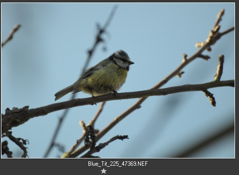
As you can see, this one was (2 stops) under exposed and only got a 1 star rating as a capture, but "needs must" (for P52) and I'm quite pleased with the result achieved (I'd call that almost a 3 star result)
Again, the subject was treated separately from the background (such as it is).
As always, any comments appreciated, especially on the question.
Cheers,Last edited by Dave Humphries; 20th May 2012 at 02:32 PM.
-
20th May 2012, 03:25 PM #125
Re: Week 11 Project 52 by Dave Humphries
Dave, I can see where the choice between the two is unclear. I like both for different reasons. I think in this case I would work with the origonal and try a couple different crops, maybe a square crop. I like the light shown on the branches although some selective trimming of OOF backround braches might be in order. I tend to stick to very minimal trimming. Which means I end up binning a buch of good shots of a bird because of the background clutter. Thank god I don't pay per click. lol
-
20th May 2012, 03:54 PM #126
Re: Week 11 Project 52 by Dave Humphries
Hi Dave! The first one is really well done! I like it!
I think the reason for the difficulty in choosing between 2a and 2b is not the subject, which is nicely detailed, but rather the plain background. The twig in 2a helps to overcome this but if you could replace the background with one with some appropriate pattern to it that is not as detailed as the blurred twig, that it may make the image more appealing.
I'm thinking of a background that is soft (out-of-focus, low contrast, pastel) using foliage that is complementary coloured and of the same type as the branch the bird is setting on. You may need to be careful to make sure that the lighting of the background matched the bird even if the background has been blurred.
When I shoot a subject like this I will often pop off a shot or two of a complementary background at the same time just in case I need to clone in or out some part (or all) of the background. I don't always use it but it provides options just in case and the DoF is easily controlled by using a Lens Blur where needed.
-
20th May 2012, 07:08 PM #127

- Join Date
- Jan 2009
- Location
- South Devon, UK
- Posts
- 14,589
Re: Week 11 Project 52 by Dave Humphries
Blue Tits are always a nightmare to photograph. They just won't stay still and those soft feathers are so difficult to get looking sharp.
With regard to these options. With a plain background, I would prefer the simpler 2b shot. However, much along the lines of Frank's comment, if the background contained more in the way of foliage I would probably pick 2a as being more natural.
Incidentally, nowadays I just half fill my nut containers because I have found that at certain times of the year the bottom nuts were starting to go rotten before being eaten. And when they are hungry, it is easy to top them up regularly.
In which case, I usually remove the bottom nuts, break them up and scatter on the ground or a table type feeder so they get quickly eaten.
-
20th May 2012, 08:05 PM #128
Re: Project 52 by Dave Humphries
Hi
I like the background you have achieved with number 1, I know how difficult it can be not to have something distracting in the way so well done.
I think I prefer 2b without the second twig, but saying that having looked at 2a first I wouldn't have suggested the twig needed removing so either are great shots. The detail on the blue tit is really good on these, I like the cross-hatch feathers they have just below the wings. It might have been nice to create a bit of a 'blue sky' tint to the background but I don't know how easy this would be without distorting the birds colour after adjusting for the under exposure.
A really nice set of shots altogether and thanks again for the originals and commentaries which are very useful.
Thanks, Rebecca
-
21st May 2012, 09:47 PM #129
Re: Week 11 Project 52 by Dave Humphries
Hi Paul,
I did consider other crops, but as the pose is quite low, rather than 'standing up', I decided on this. Originally Posted by jeeperman
Hi Frank,
Now there's something I hadn't thought of doing
You are on the right lines, my thought was that it was too bland, but one extra branch wasn't enough and so not worth having, which led to 2b at the last minute.
Hi Geoff,
Yes I cleared them out when I refilled in March because they suddenly became popular, oddly it is in winter when they eat little. Originally Posted by Geoff F
Hi Rebecca,
Yes, in hindsight, I guess I could/should have excluded the sky from the raising of the exposure and it would have retained the original blue shown in the smaller 'capture' shot. Originally Posted by beckyhumphries
Thank you all for taking the time to comment and make 2b (just) the winner.
Cheers,
-
21st May 2012, 10:29 PM #130
Re: Week 11 Project 52 by Dave Humphries
Hi Dave, as you once said to me "you are really getting serious about this". Number 1 is excellent, concerning 2a and 2b I prefer 2b. I like the simplicity, nothing competes with the bird for attention. The detail and color of the bird is excellent, I think I would rate it higher than 3 stars. Good work, nice captures.
-
23rd May 2012, 08:21 PM #131
-
23rd May 2012, 08:24 PM #132
Re: Week 12 Project 52 by Dave Humphries
Shooting Grey Heron at Windsor Lock
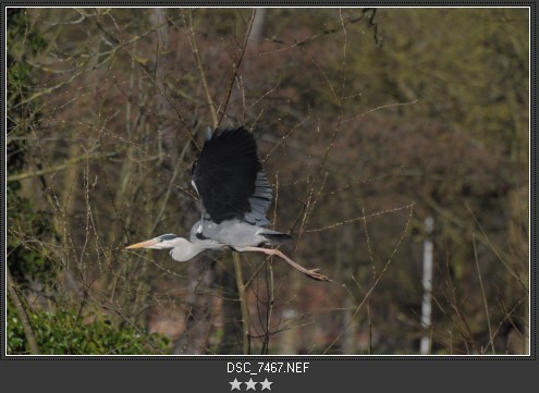
I took a stroll down by Windsor Lock on the 19 March and 'got lucky' - I found this Heron perched on one of the recently renewed posts. He stayed quite a while and tolerated me getting as close as I could, given that s/he was on the opposite bank from me
The biggest problem shooting was that it was quite close to a very busy 'overgrown' background, I had plenty of time to try different apertures from f/5.6 (wide open) to f/11, probably this lens' "sweet spot" at 300mm, although that renders a sharper background, while it snoozed. On balance, there not being much difference between f/8 and f/11 shots, this f/11 shot won out to appear here.

Nikon D5000 + Nikon 70-300mm VR: 300mm, 1/1000s, f/11, iso400 EC -1(226-47443)
Hit Kbd F11 and click image to see at 615px × 950px (recommended)
It eventually flew off when a narrow boat came along to use the Lock, I was prepared for the take off and have some shots, but it turned away from me which resulted a few unattractive 'rear' shots
By the time it got settled into stable flight it was further from me but closer still to a different busy background
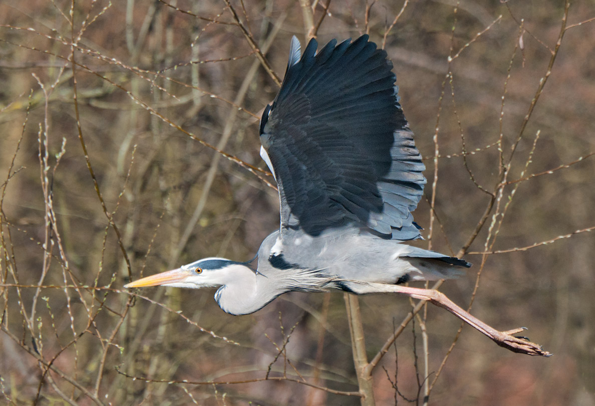
Nikon D5000 + Nikon 70-300mm VR: 300mm, 1/3000s, f/8, iso400 EC -1(226-47467)
Hit Kbd F11 and click image to see at 1,188px × 810px (recommended)
Both shots had:
Time spent cloning out the worst offending branches appearing directly behind the subject, not that you'd have known due to the sheer amount of what's still left!
Sharpening and Local Contrast Enhancement applied to the bird only
... all in an effort to provide 'separation'.
I stopped short of actually blurring the background on the second because I felt it was so close to subject, it would have looked false.
At the time I shot these, they were probably my best/closest Grey Heron shots ever, but since taking these, I got even luckier six weeks later, so look out for Week 18 (when I catch up here some more).
As always, C&C welcome, thanks,Last edited by Dave Humphries; 24th May 2012 at 07:32 PM. Reason: correction
-
23rd May 2012, 08:38 PM #133

- Join Date
- Jan 2012
- Location
- Jackson Hole, Wyoming, USA
- Posts
- 959
- Real Name
- Chuck
Re: Week 12 Project 52 by Dave Humphries
Dave, very nice shots. I like the second the best. I actually enjoy the "clutter" of the natural vegetation. I don't know how much was there before you started the removal process, but there is enough left to help tell the story of where this bird lives. The sharpness is very nice. I loved enlarging the image just to look at the eye. Isn't it fun to get such a nice photo?
Chuck
-
24th May 2012, 07:30 PM #134
-
24th May 2012, 08:29 PM #135
Re: Week 12 Project 52 by Dave Humphries
Hi
You have captured some great heron shots in these two. The first looks incredibly sharp, especially given that they are usually so far away. I don't think the background it distracting, the light colour of the bird against the dark background really makes it stand out. The eyes look really sharp too. I must remember in future to make more of an effort to sharpen the eyes as they really make the bird stand out. You did well with your cloning of the background twigs, you can really see the difference and how much better the edited version is from the original.
Your flying shot is also very good, I always miss these even when I'm posed and ready for it!
Well done on a nice set of pictures.
Thanks, Rebecca
-
24th May 2012, 08:41 PM #136
Re: Week 12 Project 52 by Dave Humphries
Hi Dave! You have two great captures there and I don't think the backgrounds are too distracting given that you have good separation in the colours, textures, and sharpness between the subjects and their backgrounds. Great job on getting the Heron's really sharp!
If you felt up to it, in both cases you could mask the subject and apply a mild lens blur to the background which could help both of them.
-
26th May 2012, 07:44 AM #137
Re: Week 12 Project 52 by Dave Humphries
Thanks,
I did spend quite a bit of time on the first shot ensuring it had an unbroken outline against the dark background by 'toning and cloning' anything that 'touched' it. A look at the little pic reveals several light toned twigs passing close behind it in the area of bill and body.
Good, that's what I aimed for in capture and especially PP. Originally Posted by Frank Mi
I have already done that on #1, but not #2, maybe next time Originally Posted by Frank Mi

Thanks both forr your thoughts on the pics, it helps make what follows better (I hope) and is helpful to others reading this later.
Cheers,
-
27th May 2012, 09:47 PM #138
Re: Week 13 Project 52 by Dave Humphries
Hi all,
This week's theme is swans, Mute swans, to be precise.
All shot on the River Thames at Windsor and Maidenhead.
This first from Windsor would be fairly unremarkable except for the patterns of sunlight thrown up from the water's surface onto the underside of the wing.
Week 13-1

Nikon D5000 + Nikon 70-300mm VR: 300mm, 1/4000s, f/8, iso400 EC -1 (226-47479)
Hit Kbd F11 and click image to see at 1,252px × 850px (recommended)
One of my favourites spots on the Thames is Boulters Weir in Maidenhead, by going down the steps there, you can get below the height of the water upstream of the weir and this gives the opportunity to shoot at very low angles across the water. Of course, you are dependent upon the wildlife co-operating and being in the right place - 19th March was my lucky day, a couple of swans were 'having fun' in just the right place.
We'll start with a preening shot for this unusual angle:
Week 13-2

Nikon D5000 + Nikon 70-300mm VR: 270mm, 1/4000s, f/8, iso800 EC -1 (227-47488)
Hit Kbd F11 and click image to see at 1,609px × 850px (recommended)
I couldn't decide which of the two splashing shots were the best, each has its merits, so you get both
Week 13-3
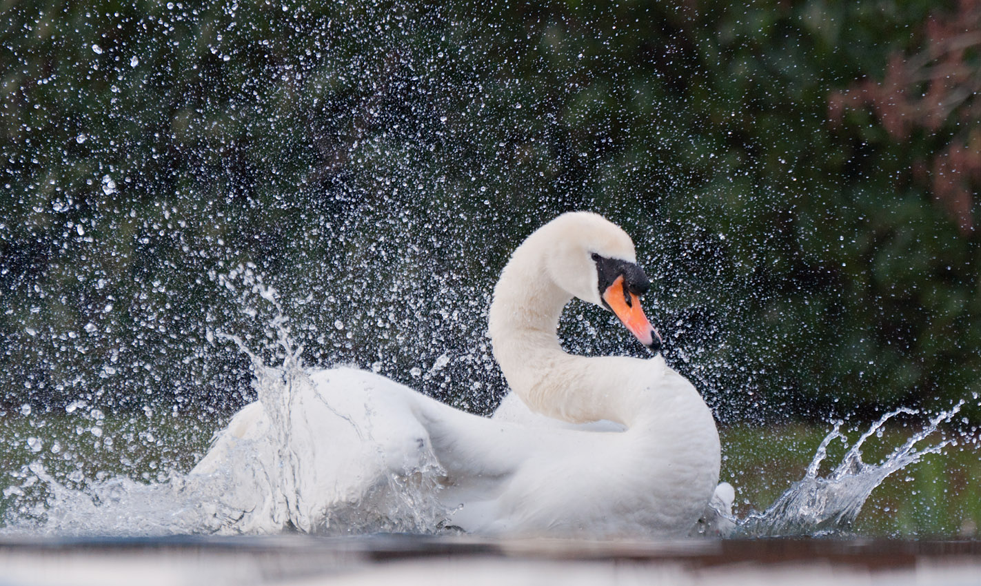
Nikon D5000 + Nikon 70-300mm VR: 270mm, 1/2000s, f/5.6, iso200 EC -1 (227-47498)
Hit Kbd F11 and click image to see at 1,423px × 850px (recommended)
Week 13-4

Nikon D5000 + Nikon 70-300mm VR: 270mm, 1/2000s, f/5.6, iso200 EC -1 (227-47500)
Hit Kbd F11 and click image to see at 1,420px × 850px (recommended)
May not look it now, but both the above were seriously under exposed captures and had to be 'rescued', I think the sun had just been obscured by a cloud and I didn't re-meter while continuous shooting the series from the sunlit half-press. Also, f/5.6 wasn't the best choice of aperture given the depth of field required for all the splashes.
I did say they were "having fun" above, didn't I?
Well here's the proof, they repeatedly kept letting the water rushing over the weir drag them to the brink of being washed over before swimming/paddling forward a little. They kept this up on and off for a couple of hours.
Week 13-5
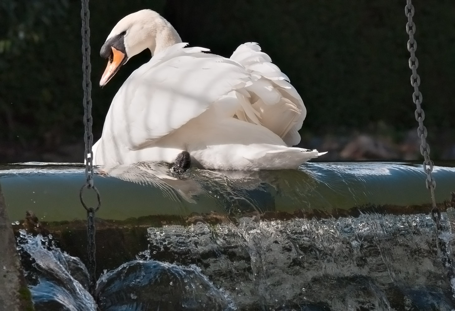
Nikon D5000 + Nikon 70-300mm VR: 185mm, 1/3000s, f/11, iso200 EC -1 (227-47606_ed2)
Hit Kbd F11 and click image to see at 1,460px × 1000px (recommended)
You can see the paddling effort in the ripples going over the edge.
I left it framed by the chains which are part of the weir's flow/level regulating devices, I believe they attach to another board (out of shot) which can be pulled up alongside the fixed one seen through the water on the lip of the weir.
I had to separately process the swan and foreground to get the full tonal range as I remembered seeing it.
As ever, your C&C is invited
-
27th May 2012, 10:04 PM #139Moderator


- Join Date
- Feb 2009
- Location
- Glenfarg, Scotland
- Posts
- 21,402
- Real Name
- Just add 'MacKenzie'
Re: Week 13 Project 52 by Dave Humphries
Dave - These are, quite simply, a joy to look at. I think 13-4 is a bit frantic, but that is just personal taste. I am full of admiration for them all, but particularly 13-1. My efforts at birds in flight are, in the main, miserable failures.
-
27th May 2012, 10:36 PM #140
Re: Week 13 Project 52 by Dave Humphries
A bit of Father-Daughter competition with swans I see! Another excellent set of images. I love the reflections on the wing of the first one and the action in the remaining three. Great vision, Dave! I'm really enjoying the rivalry images very much as both you and Becky continue to push the bar ever higher.

 Helpful Posts:
 Reply With Quote

