 Helpful Posts: 0
Results 1 to 14 of 14
Thread: White Background
-
14th January 2012, 12:15 AM #1

- Join Date
- Mar 2011
- Location
- California
- Posts
- 39
- Real Name
- Peter
White Background
-
14th January 2012, 12:41 AM #2
Re: White Background
The background looks very white to me
 I like it.
I also like the shadow on the floor in front of the subject.
-
14th January 2012, 12:53 AM #3
Re: White Background
Nice!
-
14th January 2012, 07:48 PM #4

- Join Date
- Jan 2009
- Location
- South Devon, UK
- Posts
- 14,589
Re: White Background
Is that colour fringing that I am seeing particularly on her arms and legs?
That is a common problem with mixed lighting sources particularly when light is coming from behind. But I will leave this to the real experts who are more familiar with this type of shot.
-
14th January 2012, 11:14 PM #5
Re: White Background
I think I see it too, especially when I hit the 'expand' button. Its should be fixable in processing. I like the expression, pose, white background and shadow.
-
14th January 2012, 11:25 PM #6
-
15th January 2012, 12:02 AM #7
Re: White Background
Most is, but I don't think that's the whole story here.
This isn't the classic manifestation of CA.
I think the background is too blown and has bled around the subject edges and the sharpening may have introduced further effects.
It's a good start Peter, but it can probably be improved upon. I say that as an observer, not a doer though
(meaning it's better than my first attempt would be)
-
15th January 2012, 12:09 AM #8

- Join Date
- Dec 2008
- Location
- New Zealand
- Posts
- 17,660
- Real Name
- Have a guess :)
Re: White Background
Just don't over-power the background, as it results in loss of hair fine detail as you can see around the yound lady's hair. Normally just go 1/3 to 2/3 above a normal exposure for the background -- not 2 stops as some people suggest (no need to nuke it half off the planet as it's a highlight anyway).
-
15th January 2012, 12:37 AM #9

- Join Date
- Mar 2011
- Location
- California
- Posts
- 39
- Real Name
- Peter
Re: White Background
Thanks, everyone,
I'm almost tempted to get a light meter at this stage.
Maybe I'll experiment with different lens and speedlight power next...It's not work if you're having fun, right?
-
15th January 2012, 12:43 AM #10
Re: White Background
Haha. Hackers (Like computer programmers who enjoy it) would disagree.
Will the light meter be actually useful?.
-
15th January 2012, 01:52 AM #11

- Join Date
- Mar 2011
- Location
- California
- Posts
- 39
- Real Name
- Peter
Re: White Background
Interesting discussion. I don't claim to have a sure answer.
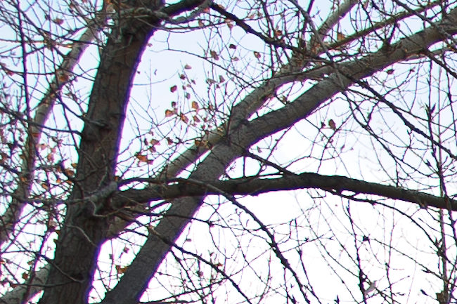
Here's a magnified section of my photo showing the fringe effect...

Here's a picture I got from looking up "chromatic aberration" from Google images...

Finally, an example from a subject with fringing from an overexposed white background (credit to zackarias.com)...

Whatever that is, I can make it go away by desaturating the purples and magentas in lightroom.
-
15th January 2012, 05:07 AM #12

- Join Date
- Dec 2008
- Location
- New Zealand
- Posts
- 17,660
- Real Name
- Have a guess :)
Re: White Background
Light meters in the studio are ESSENTIAL, unless you want to waste a LOT of time getting lighting ratios correct. Case in point - had a big shoot last weekend - I setup the lighting while the MUA was working on the model - setup backfround lights first (white seamless) @ F11 + 0.6 stop - setup key @ F11 - setup fill @ F11 (was using light table, so not the usual fill @ approx -1.5 stop) - setup hair light at F11 + 2 stops.
Took an overall reading (the light is cumulative) - took a test shot (dropped hair light down by 1 stop) and "Job Done". Trying to do that without a lightmeter would be nigh on impossible.

-
15th January 2012, 10:40 AM #13
Re: White Background
Hi Peter,
I did the search you did and unfortunately that is right in the top row of results
However, I feel it's a bad example of the most commonly observed artefact, which is lateral CA.
Much further down is this example;

(image source credit)
Have a look at the tutorial on Using Lens Corrections here at CiC. Scrol down to section 3, which covers CA very well.
So yes, the problem could be axial CA and blooming, Sean's tutorial suggests things to try to reduce these (in addition to not having the background too over exposed).
Hope that helps,
-
15th January 2012, 07:02 PM #14

- Join Date
- Mar 2011
- Location
- California
- Posts
- 39
- Real Name
- Peter
Re: White Background
Thanks Dave!
Good luck on your project 52.
Peter


 Reply With Quote
