 Helpful Posts: 0
Results 1 to 14 of 14
Thread: Off to Work
-
27th May 2009, 07:48 AM #1

- Join Date
- Dec 2008
- Location
- New Zealand
- Posts
- 17,660
- Real Name
- Have a guess :)
Off to Work
-
27th May 2009, 10:27 AM #2
Re: Off to Work
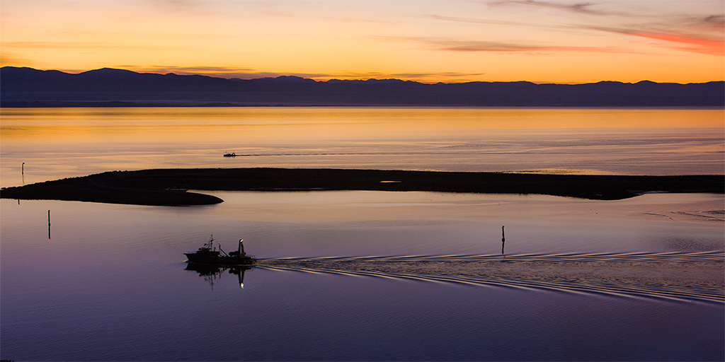
there are lots of intruiging and beautiful elements in this one Colin, just slightly wondering if there are too many. Tried cropping off the righthand (those wavelets breaking detract from the clear wake from the ship?) and some off the top (seems stronger with just a strip of yellow sky above the mountains?)....but then want to add a bit on the left to get the end of the sandbank. I bet if you had a hundred people with the crop tool you would get 100 variations, but you did ask!
Particularly like the near boat and its wake
-
27th May 2009, 11:25 AM #3
-
27th May 2009, 07:00 PM #4

- Join Date
- Mar 2009
- Posts
- 2,522
Re: Off to Work
Excellent composition. It certainly complies with the rule of thirds. If it were me (and this is a personal thing) I would shop out the poles and the craft in the middle distance. Superb image either way up.
-
27th May 2009, 08:09 PM #5

- Join Date
- Jan 2009
- Location
- South Devon, UK
- Posts
- 14,633
Re: Off to Work
My first thought was crop a bit from the right side; but that would lose the best of your sky. Although just a little might still work.
-
28th May 2009, 12:10 AM #6

- Join Date
- Dec 2008
- Location
- New Zealand
- Posts
- 17,660
- Real Name
- Have a guess :)
Re: Off to Work
Thanks for the comments folks.
Just as a bit of a follow-up ...
Commercial work like this gets printed onto canvas - usually 11 x 22 inches or 22 x 44 inches - and portions of the image get wrapped around the sides of the frame, which tends to give a psudo-crop to the image (from a frontal perspective) ...
... so I have to leave extra space when composing - which is what your seeing here. I also tend to leave in things like the small posts; they can look distracting at this size and resolution, but show good amounts of detail when printed large.
-
28th May 2009, 12:16 AM #7
Re: Off to Work
Very nice Colin,
That's interesting to know; I've often wondered about such things you have left inI also tend to leave in things like the small posts; they can look distracting at this size and resolution, but show good amounts of detail when printed large.
Now, if only you'd do us a special crop before posting here, to stop us querying stuff at the edges everytime

Excellent as ever, well done,
-
28th May 2009, 12:20 AM #8

- Join Date
- Dec 2008
- Location
- New Zealand
- Posts
- 17,660
- Real Name
- Have a guess :)
Re: Off to Work
Thanks Dave. It takes a bit of getting used to as it works both ways; sometimes detail like that is worth leaving in for a large print, whereas at other times, things that look good when printed small don't translate well into a large print -- the rules of local contrast seem to change at some point.
I could do special crops just for posting here, but basically, I'm just too lazy!
-
28th May 2009, 01:54 AM #9
-
28th May 2009, 03:23 AM #10

- Join Date
- Nov 2008
- Location
- Gorokan NSW Australia
- Posts
- 408
Re: Off to Work
Nice work Colin, I like the style you are pursuing.
-
28th May 2009, 04:03 AM #11

- Join Date
- May 2009
- Location
- Southern California
- Posts
- 466
Re: Off to Work
its nice i like it...
-
28th May 2009, 10:22 AM #12
-
28th May 2009, 06:21 PM #13

- Join Date
- Mar 2009
- Posts
- 2,522
Re: Off to Work
That makes perfect sense Colin. So much our viewing is web based that it is easy to forget the other output media. I am obviously not a commercial photographer but I do have one question. How do you decide what will look right in large printed format? I could well see me spending a small fortune on prints that did not cut it when viewed full sizeI also tend to leave in things like the small posts; they can look distracting at this size and resolution, but show good amounts of detail when printed large.
-
28th May 2009, 09:19 PM #14

- Join Date
- Dec 2008
- Location
- New Zealand
- Posts
- 17,660
- Real Name
- Have a guess :)
Re: Off to Work
Just by experience really. It really comes down to 2 areas (for me anyway) ...
- The amount of detail in small things (re: whether they have sufficient detail to look meaningful) - you can get a fairly good idea by looking onscreen at the right magnification.
- The area of colours - case in point ...

It's a "companion" shot to my Avatar (they're "sister" lakes in my region). Small it looks quite OK, but printed large, there's just too much gray (gray sky that's also reflected in the water).
Ironically though, I've sold to large canvases of it!
The other "gotcha" is dust spots - they can become really obvious at 44 x 22" if you forget to zap them!


 Reply With Quote

