 Helpful Posts: 0
Results 1 to 14 of 14
Thread: Trying hand with ash and coal.
-
30th January 2012, 07:25 AM #1

- Join Date
- Apr 2011
- Location
- Ontario (mostly)
- Posts
- 6,667
- Real Name
- Bobo
Trying hand with ash and coal.
-
30th January 2012, 07:39 AM #2
Re: Trying hand with ash and coal.
Well, whilst definitely no expert, I just thought I'd put my 2 cents in LOL.
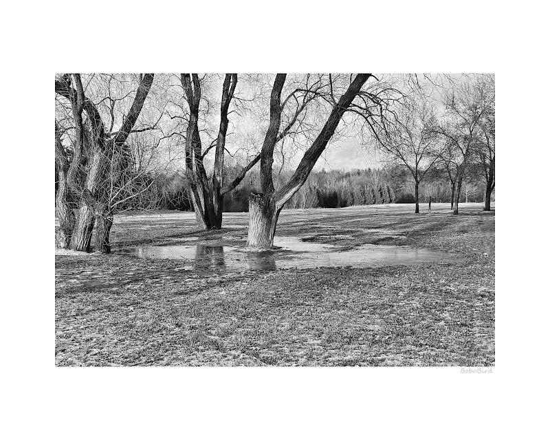
No 1, to me it looks like there should have been more trees, perhaps, your intention was the puddle and the trunks of the trees, but I would have liked to have seen a bit more of the trees? I like the lines (my eye goes through the trees,) and the b&w looks great.
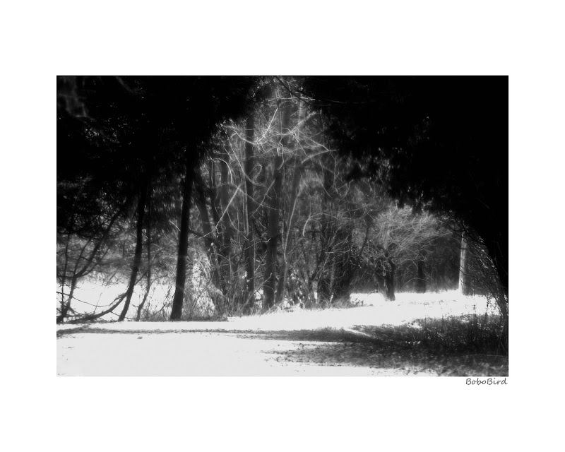
No 2 - I really like, you can see more of the trees and my eye travels to the deep dark space at the far end of the photo, it leaves you wondering whats out there.
No 3 - I like your idea, but I think the path is way too bright.
Nice pics though, and I like the way they are presented with the white frame
-
30th January 2012, 07:56 AM #3

- Join Date
- Apr 2011
- Location
- Ontario (mostly)
- Posts
- 6,667
- Real Name
- Bobo
Re: Trying hand with ash and coal.
Thanks Kerry for taking the time.
#1 - I do have a few with more of the trees, no idea why this got selected for pp, it was the only one!
#3 - yes, missed the bright bit in front, probably concentrating to much on the background and forgot to balance out the front. Thanks, that is an easy fix, guess snow can be shown in darker white.
Thanks about the frames - never done them much but was trying to learn how to make some and came up with this so thought maybe it was worth a try.
-
30th January 2012, 07:57 AM #4
Re: Trying hand with ash and coal.
Bobo I agree with Kerry's assessment - I like the B&W treatment in 1 and 2 - nice sharp images with strong textures. Sorry but 3 doesn't do much for me.
To be honest, I'm not sure about the frames - they are a bit storng for me I think.
Dave
-
30th January 2012, 08:17 AM #5

- Join Date
- Apr 2011
- Location
- Ontario (mostly)
- Posts
- 6,667
- Real Name
- Bobo
Re: Trying hand with ash and coal.
Thanks Dave.
#3, I thought it had a sort of xmas tree type feel to it.
Frames - idea was stuck in my head for a few months after seeing an exhibition of b/w at the central library in Hong Kong. Theirs were of course mounted and framed. Normally I find frames hard to justify spending the time but at least now I have learned how to do them.
-
30th January 2012, 07:24 PM #6

- Join Date
- Jan 2009
- Location
- South Devon, UK
- Posts
- 14,589
Re: Trying hand with ash and coal.
Just a thought, Bobo, but I think with the first two I would have preferred a fraction less dull foreground and a little bit more tree; but only slightly. The foreground area may look better with that amount of space in colour but it looks plain and loses impact in B&W.
The third I'm afraid is just one of those good ideas at the time, but doesn't quite make the change to a two dimensional photograph.
-
30th January 2012, 08:27 PM #7

- Join Date
- Nov 2010
- Location
- Panama City, FL
- Posts
- 3,540
- Real Name
- Chris
Re: Trying hand with ash and coal.
Perhaps you are thinking too broadly and might want to look to other parts of your photo for opportunites. For me, all these images have way too much foreground and no real particular point of focus.

I used the three trees at the right to counterbalance the larger tree to the left. I also darkened the foreground as a better lead in and deepened the shadows on the left to have them direct the eye back to the larger tree. I did take a liberty with the larger tree but only to give the impression the outside limb was attached to the bigger tree and not just having wandered in from nowhere.
-
30th January 2012, 10:27 PM #8
Re: Trying hand with ash and coal.
RE: broad frames… that was brought up here some time ago… Large white frames look good on a wall, but for some reason they dont look good on the computer screen… maybe it has to do with the amount of white that overpowers the image… Thats why when you work on images on your monitor, it is suggested you use a graphite background so all the focus is on the image without glaring distractions.
Chris put up an example with a thinner white border, that looks less intense and distracting. Just thought Id share
-
30th January 2012, 11:26 PM #9

- Join Date
- Apr 2011
- Location
- Ontario (mostly)
- Posts
- 6,667
- Real Name
- Bobo
Re: Trying hand with ash and coal.
Thanks Geoff, Chris, Mike.
All welcome and very sensible suggestions.
Chris - thanks for taking the time on the edit. On seeing it first time, said wow that is a nice one not for a moment realising that it was #2. As I said in the opening "I SUCK AT LANDSCAPES". Why is that I cannot see things the way you guys see things???
I know a good scene when I see one but never manage to convey it properly. The 2 tree shots - wow the trees look great in the light, lets take a pic. Errrr, what do I support them with??? Then everything falls apart.
Gad, makes me want to go back to my usual bugs and birds. BUT what is fun then - will just have to keep on plugging...and bore you guys with more feeble attempts. ONE day things WILL click!
-
30th January 2012, 11:49 PM #10

- Join Date
- Jan 2011
- Location
- Tennessee
- Posts
- 1,732
- Real Name
- james
Re: Trying hand with ash and coal.
Bobo I am no expert ... But I believe in Chris' eye, he has a strong sense for photographic composition and its not just his landscapes. Funny that he portrayed what you saw better but dont despair cause I hope to take pics of birds as well as yours and maybe one day see the scenes Chris and Geoff and Paul and countless others that post here see. Please take no offense to this post cause I do admire your eye for the wildlife portrait. oh yea I like a slightly thinner frame too.

-
31st January 2012, 12:43 AM #11

- Join Date
- Nov 2011
- Location
- Nebraska
- Posts
- 949
- Real Name
- Kathy
-
31st January 2012, 01:44 AM #12

- Join Date
- Apr 2011
- Location
- Ontario (mostly)
- Posts
- 6,667
- Real Name
- Bobo
Re: Trying hand with ash and coal.
Thanks James.
The frames were just a fun thing and something to learn about doing in PS. Some people use them to great effect, some include them regardless, I usually don't and that is not about to change. So not to worry, your eyes are safe...
Thanks Kathy.
Yes some people are born with a photographic eye. Wish I had that 3rd eye but...
-
31st January 2012, 01:56 AM #13

- Join Date
- Nov 2011
- Location
- Nebraska
- Posts
- 949
- Real Name
- Kathy
-
31st January 2012, 02:41 AM #14

- Join Date
- Apr 2011
- Location
- Ontario (mostly)
- Posts
- 6,667
- Real Name
- Bobo
Re: Trying hand with ash and coal.
Thanks again Kathy for the encouragement.
The main problem is a great scene makes itself. Trying to make something out of a bland nothing is really difficult.
As you said - persistence, patience, and one day..
Last edited by Bobobird; 31st January 2012 at 03:20 AM.


 Reply With Quote

